As a print designer, you probably don’t think about social media much. It’s just there in the background, providing an endless stream of photos, memes, and game requests from your crazy Aunt Gladys. Even if you also work in digital design, social media still probably isn’t your purview since it tends to focus on interaction more than design aesthetics.
You’ve probably been sitting pretty thinking that you can completely ignore social media, given that the digital and print worlds are separate. But one person will have a serious problem with your noncommittal attitude towards social media—your client.
Businesses that combine their print and digital marketing campaigns reach a wider audience and have a better success rate than those who go all print or all digital. In fact, 46% of people say that print designs have prompted them to connect with a brand on social media. This means that print designers simply can’t ignore social media just because it falls outside of their jurisdiction—you have to know how to promote social media within your print designs successfully.
Understanding how to display social media handles in print is crucial for print designers, as integrating social media icons and logos seamlessly into your designs can significantly enhance your client’s brand presence both online and offline. We made it easy for you and broke it down into these easy-to-follow tips that can turn any print designer into a social media guru.
Discover the free summary graphic of this article, including bonus examples.
Get to know your social campaign
It doesn’t matter if you work in digital or not—you’ll have to ensure that your print designs align with the brand’s personality on social media. Even if you do provide the designs for a brand’s digital presence, chances are you’re not the person who’s in charge of interacting with the audience on social media.
You need to seek that person out and be their new best friend.
Get a feeling for how the brand acts on social media and what their social media goals are. Suppose your print design is classy and elegant, but the social media presence is goofy and weird. In that case, the social voice will turn off people who expected something more refined, and you will confuse the audience members who are already familiar with the brand socially.
That might mean reeling it in a little. Of course, you want to wow your clients and your audience, but you have to be a team player, too. Make sure your design ideas integrate with the rest of the team’s ideas; there’s no room for being a diva and hogging all the attention.
But that also means keeping the social media expert in the loop with what you plan to do. Integration is a two-way street, and your print design ideas just might inspire the next social media campaign. The bottom line is that communication is key, so keep in touch.
Continue the conversation
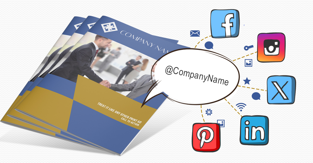
One of the best ways to keep social media and print integrated is to continue the conversation from social to print and vice versa. Social media is a great platform for interacting with the audience, but you don’t have their attention long enough to go over the finer details of a brand or product. That’s where print can come in handy, to continue the conversation from social media with a greater degree of information.
For instance, let’s say you’re promoting a new product on social media. You probably won’t be able to include all its specs in the status update—especially if you’re using X/Twitter. You’ll have room for the product’s name, one or two details (such as cost), and a call to action. But if you follow up the social post with a matching print ad, you’ll have room to tell your customers how that product will revolutionize their lives.
Likewise, when the audience is finished reading the print collateral, and they have further questions or want to follow the brand for more updates, you can direct them toward social media. By working in harmony this way, you create a balance between print and social media where the flaws of one platform are solved by the strengths of the other platform.
Place your social media info carefully
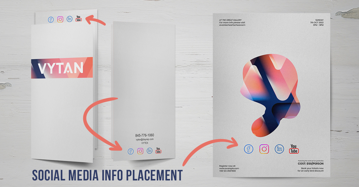
Where you place your social media info in your print work depends on whether or not you want it to dominate the design. If the whole point of your print campaign is to bring more people to your social sites, it only makes sense that social media would be the focus. For some great examples of this, check out these socially integrated print ads.
But most of the time, your print media is working to promote a product or service that your company offers. Including social media isn’t as much about gaining more followers (although that’s a nice perk) as it is about giving people a chance to engage and learn more about what your brand can offer. In those cases, where you place your social media information will depend on what type of design you’re working with.
The front of a piece is typically reserved for the things that will grab the most attention (such as an attractive logo or a graphic that draws attention to the company’s benefits), so it’s not uncommon for social info to go on the back of a presentation folder, postcard or brochure along with the rest of the company’s contact information. It could also go somewhere other than the back that’s similarly out of the way, such as the inner flap of a brochure.
Use a call to action, not just a button
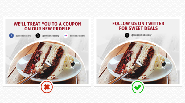
One of our biggest pet peeves is when print designers slap social media buttons onto their designs. We know that it’s tempting just to use the graphics these sites already provide you, but the problem lies in the fact that those images were created for digital use and serve as linking images.
You can’t click a social button on a piece of paper, so what’s the point of having it on there in the first place? Your message to the reader is, “Go search for our company on these social media sites.” The audience could have done that without your precious social media buttons to remind them.
Look at it this way–the audience needs things to be as simple as possible, or they won’t be inclined to act. In the digital world, these social media buttons make it easy for the audience to interact, but in print, they make it harder.
At the very least, you need to include the username or web address to any social media profile that you’re promoting, but it’s best to take it a step further and give the audience a reason to interact at all. Without a call to action telling the audience exactly what to do and why it will benefit them, nothing is guiding them toward social media.
If it helps, think of the audience as a herd of sheep that you need to wrangle from the print meadow all the way to the social media pen. If your only plan is to use a social media button, you’ve already lost most (if not all) of your sheep. A social media button with a username or link will get the sheep closer to the pen, but it doesn’t guarantee that they’ll interact on social media. Now, add a call to action that not only tells the audience exactly where to go but how to interact and why they can benefit from it. For example, you might say, “Like us on Facebook for exclusive offers” or, “Follow us on X/Twitter to receive a 10% discount on your next purchase.”
From a design standpoint, your call to action should pop out and grab the reader’s attention. Don’t assume that a social media button will be eye-catching enough to do the job independently—they see those logos a dozen times daily. Your call to action should be as visually appealing as it is compelling and enticing. Stick to the basics and follow the essential principles of writing effective calls to action to hone your skills in both social media and print design.
Keep it simple

Of course, when you start adding profile names, links and calls to action, the page can get a little cluttered. This is why you should try focusing primarily on only one or two social media profiles at a time in your design. Don’t forget—the audience is like a herd of sheep and the more social media sites you try to wrangle them toward, the less likely you’ll succeed in your mission.
As a designer, you may be too far down the totem pole to be able to make these kinds of marketing decisions, but whenever possible, try to draw a visual focus only on one primary social media site per print project. Try to talk some reason into your clients when they ask for too much.
If they still demand you load up the print design with every profile from Facebook to Pinterest, try to—for their sake—focus the spotlight on whatever profile the brand uses the most and keep the rest of them there like background characters.
Take it on a case-by-case basis. In some situations (such as a business card), it’s okay to have multiple profiles featured. But even then, you want to list them in order of importance, as most people aren’t going to view every single profile—just the one that is most relevant to them.
Mine images and testimonials from social media
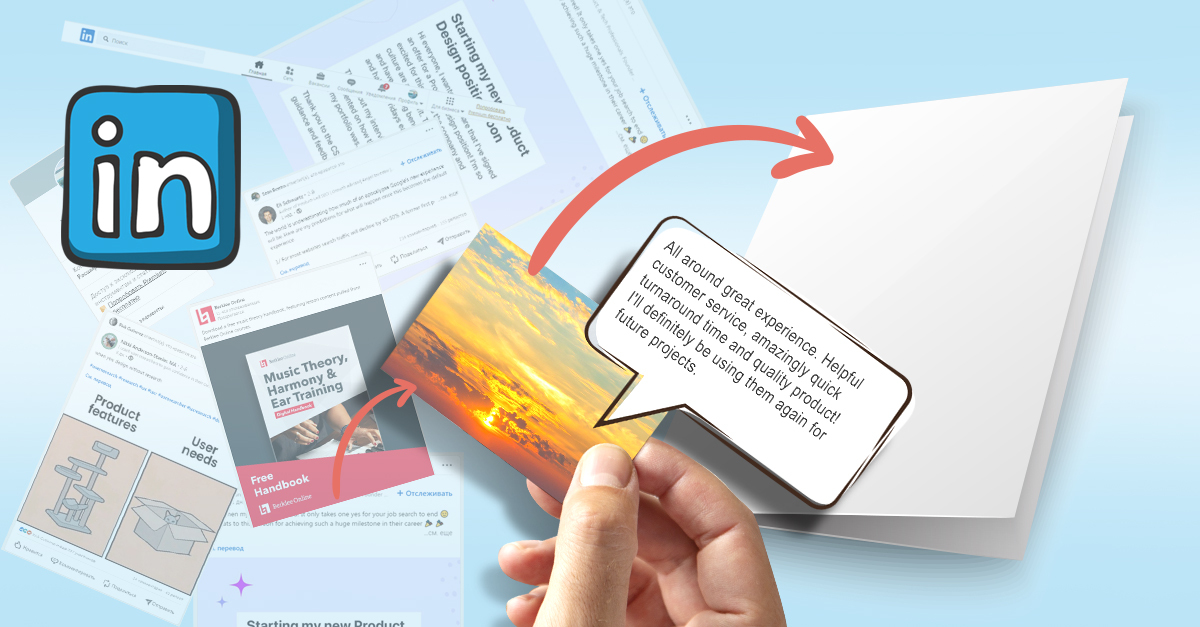
The brand’s social media site can be a goldmine of resources for your print design. For starters, getting to know the brand through social media is a good way to familiarize yourself with their style and personality. But it’s also a great place to grab pictures and testimonials.
If the brand’s social media expert happens to be a shutterbug, you can expect a glut of great pictures to use for your design. This can be the place to find pictures of the staff, the workplace, the building, special events, and even the product itself, saving you time it would take to wait for photos or take some of your own. You may need to clean up the photos, but there should be plenty of usable photos.
Even if the business doesn’t have any photos of their own, there’s a possibility that they’ve been tagged in photos by their customers and business partners. You’ll have to chase down whoever owns the rights to the photo and ask permission first, but it can be a good source in a pinch.
Likewise, if you need to include testimonials or quotes in your print design and they haven’t already been provided for you, check out social media to see what people are saying about the brand. Again, you’ll have to ask for permission, but fortunately, you’ll have a large selection if a few people say no. If possible, convince them to let you include a photo too—which you can also mine from social media. Testimonials that include pictures have a better chance of seeming trustworthy and genuine.
Hash it out with hashtags
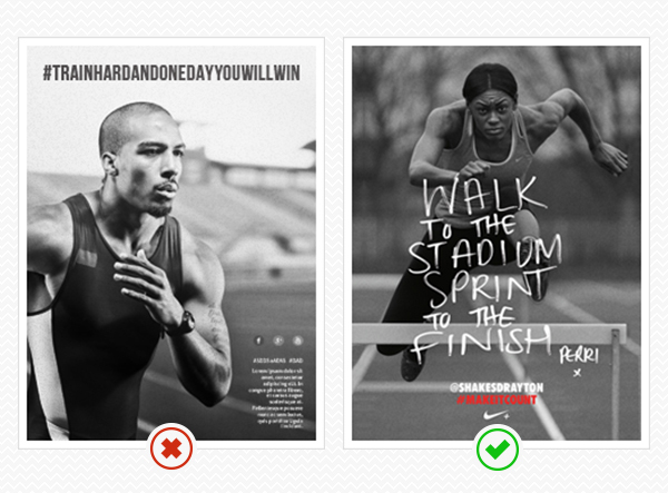
Hashtags are here to stay, and they’re becoming as important to a brand’s identity as their logo or website. Even Game of Thrones launched a cross-platform hashtag campaign that went well beyond the realm of social media. Hashtags help direct the interaction between the audience and the brand; that’s why your print designs need to carry over the most relevant hashtags.
Like anything else, hashtags must be accompanied by a call to action so the audience knows how to use them and for what purpose. Certain hashtags may be assigned to certain tasks. You might have a general hashtag for interacting with the brand, another for sending photos, or special hashtags tied to particular marketing campaigns.
Drawing focus on hashtags can be good for situations when the brand wants to promote several social media sites at once. By drawing focus to the hashtags, you essentially tell the audience how they can interact and then leave them to do so on their social media site of choice.
Even though they’re used by almost every social media site worth using (and even the ones not worth using), hashtags are still closely associated with X/Twitter. That means that if you want your herd of sheep to go to any other site but X/Twitter, you will have to direct them to it. Otherwise, the appearance of hashtags might make them pick X/Twitter by default.
Use QR codes reasonably
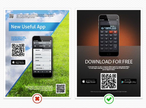
Though they’re not as popular as they once were, QR codes are still the best tools for creating a direct link from your print design to a brand’s social media presence. Recipients can scan the QR code with the camera on their phone or tablet and be taken directly to a social media profile, which is a little easier than having them look it up themselves. Including QR codes gives your sheep a little more of a fighting chance to make it into the social media pen.
But if you’re going to use QR codes, do it right. Again, you always need a call to action to get the audience actually to do something, so tell them why they should scan and what they’ll see when they do. Nobody likes to play “QR code roulette” and scan a mystery link that could lead anywhere.
Your QR codes should be big enough and clear enough to scan properly. This means you’ll need to whip out your phone and test it out. Don’t forget that ink bleeds, so try to get a printed proof to make sure the QR code works in print.
There should never be more than one QR code per page—nobody has that much patience. Make sure your QR codes aren’t placed anywhere awkwardly. And QR codes don’t have to be boring, either. You can make them colorful or integrate them into a photo to become part of the design instead of sticking out like a sore thumb.
Go big and go viral
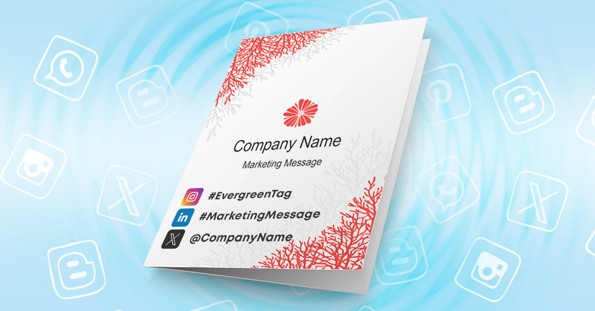
Don’t underestimate your effect on social media—your print design can make waves if it’s worth sharing. People love to share the cool things they see and experience throughout their day with friends and family over social media, so if your print design happens to be one of those cool things, it could make you a viral sensation.
If your design has vital potential, work with the brand’s social media manager to develop a strategy. You can help facilitate social sharing by including a call to action and hashtags in your print design that direct the audience to share photos of your collateral.
Of course, the first step is having a design worth sharing and taking pictures of, so you’ll need to pull out all the stops. The best print designs have a sort of immortality, as the Internet loves round-ups and showcases of the best that print has to offer. A decade from now, your print design could still inspire a whole new batch of print designers.
Stay evergreen

Social media is about what’s happening here and now, while print media is more permanent. What you say on social media now will be forgotten in a month, but a good print design can stick around in people’s homes and offices for years. People have difficulty letting go of print collateral, especially when it’s of higher quality.
You have to plan for the possible immortality of your print collateral, so keep your designs evergreen, especially where your artwork ties into social media. Sometimes, your print designs will tie into a specific campaign, which may be a limited-time deal. Your audience will understand if they missed out on a special opportunity so long as you’re clear about the timeframe.
But suppose you’re designing for a more general, long-term campaign. How are people going to be using social media six months from now or a year from now when your audience comes across your print collateral again?
People will probably still be tweeting and snapping pictures on Instagram a year from now. But the things they tweet and photograph will almost certainly change. If your print design ties closely to current trends (like trying to capitalize on a meme or a viral sensation), you’ll likely be too late to contribute to the conversation, and your design will look out of date from the get-go.
Imagine coming across a piece of print media in your home or office that references “planking” or the Ice Bucket Challenge. These subjects were once popular over social media, but the moment has passed. If you came across print collateral referencing these viral sensations, you’d be much more likely to throw them away.
Share key do’s and don’ts with a marketer or designer!

This work by Company Folders, Inc. is licensed under a Creative Commons Attribution 4.0 International License.
Embed this graphic on your site
Logging out
Social media and print aren’t as isolated from one another as you might think. As a print designer, you simply can’t ignore the digital world because what you do in print creates ripples that affect a brand’s digital presence. You have to embrace the role you play in the overall development of a brand. Your print designs are just one piece of the puzzle (and a crucial one), but if that puzzle piece doesn’t interlock with the rest of them, it can’t create a complete picture of the brand.
Have some lingering questions about how social media and print can intermingle? Leave a comment below and let’s continue the conversation about social media in print.


