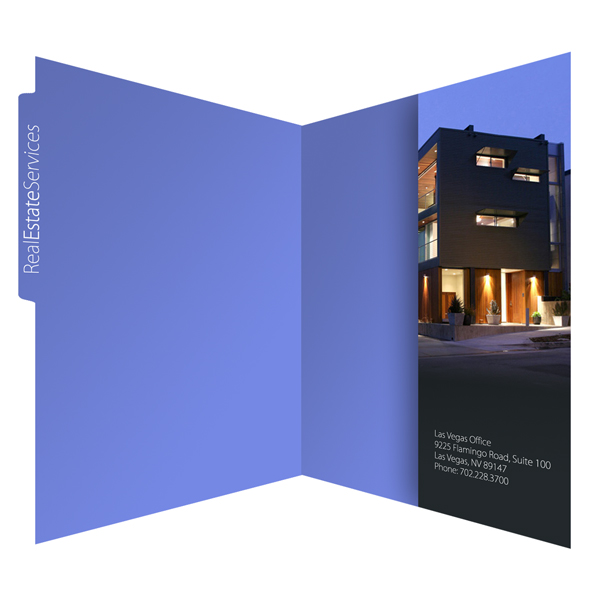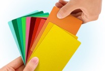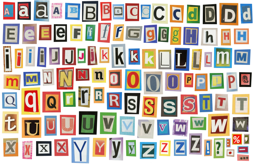
CMYK printing allows for a full spectrum of different hues in your folder design. Photo Credit: Konstantin Kokoris
4-color process printing reproduces the colors in your design by mixing different quantities of cyan, magenta, yellow and black (CMYK) ink. The ink is mixed during the printing process itself, much like a color printer from your home or office. This differs from PMS spot printing folders, which use pre-mixed ink and has a limit to the amount of colors you can use in one design.
Why use 4-color process?

4-color process is the only way to accurately reproduce color photography. Photo Credit: Chuck Nivens
However, the colored elements in your design may have a slight change in tone when printed in 4-color. This isn’t as noticeable in detailed illustrations and graphics that use multiple colors, but graphic elements like solid colored backgrounds and logos may not look as vibrant, especially when they use only a few colors.
The three color design rule
The easiest way to decide whether or not your folder design should use 4-color process or PMS spot printing is to adhere to the three color rule. If your folder design has three colors or less, then you’ll probably have better results with PMS spot printing because the colors will be richer and more exact. Four colors or more, and you’re going to want CMYK printing.
The same goes for black-and-white photography–it technically only uses one color (black) to create different tones and shades. Even though 4-color process is the only option for color photos, your black-and-white photos should always be printed in PMS for the sharpest results.
When counting colors, be sure not to count two different tones of the same hue as different colors. PMS printing can reproduce a wide range of color tones using different densities of the same colored ink. For example, a greater density of blue ink can look like dark blue, while less density comes out as light blue.
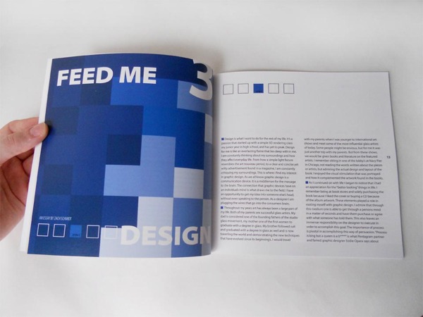
Although the design on this page contains many different tones, they're all shades of the same color, which means you could print it with PMS ink. Photo Credit: Jenelle Koles
Limitations of 4-color process printing
Although printing with 4-color process lets you use multiple colors in one design, there is still a limit to what you can do with it. This is due to the fact that some colors cannot be accurately created from a combination of cyan, magenta, yellow and black ink.
These colors include:
- Navy
- Dark Blue
- Orange
- Silver
- Metallic Colors
- Fluorescent Hues
Since 4-color process mixes inks during the printing process, the colors in your design will not be completely accurate. They may be slightly brighter or darker than you expect. This isn’t an issue in a color photograph, but it can make a difference when branding, especially if you want your brand colors to be an exact match to the rest of your marketing materials.
If your design absolutely has to feature these colors and you have to use 4-color processing, your best bet is to choose a spot printing option with PMS. This means that after your 4-color folder is finished printing, it’s run through again and a layer of PMS ink is applied to correct the color issue.
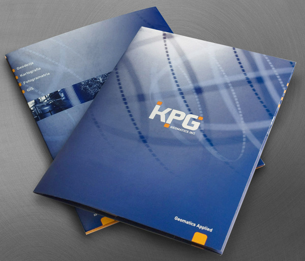
Orange can be a problematic color for 4-color process if you want it to precisely match your brand. Even if you're using CMYK printing, you may want to have areas with orange (or other problematic colors) spot printed with PMS ink. Photo Credit: Paweł Windys
Designing in CMYK mode
When designing your folder in the graphic editing program of your choice, make sure you’re working in CMYK mode instead of RGB mode. RGB mode is intended for digital images and graphics, so it’s usually the default setting; however, submitting a design to your printer in RGB mode will force the printer to convert the colors to CMYK.
It’s much better if you either design the entire project in CMYK or convert your files to CMYK yourself before sending it to a printer. This gives you a better degree of control if and when there are issues regarding a loss of color quality. You can make your own adjustments as necessary instead of leaving it in the hands of your printer.
Request a digital proof to finalize the design and to insure the colors look exactly the way you intended. The digital proof will be what the final printed product looks like, which means it will have already been converted to CMYK.
Using the right resolution for 4-color process
If you’re creating a folder design using photographs, then you want each photo to have the highest resolution possible. Low resolution photos (like the ones you find online) won’t reproduce as nicely using 4-color process printing.
All your design elements and photographs should be in at least 300 dpi, if not higher. This may require you to take your own photographs using a high resolution digital camera or to scan photographs with the scanner set to a high resolution.
If your computer can handle it, try to save the design elements in as high a resolution as possible. You can always go down to 300 dpi when it comes time to print, but you can never go back up in resolution without there being some significant loss of quality.
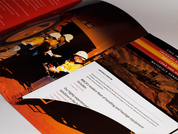
Be sure to use the highest resolution possible for your 4-color photos and images so they're reproduced with the sharpest possible clarity. Photo Credit: Highscore Creative
Text considerations
Printing with 4-color process requires you to be more careful with the way you use text–especially colored text. Any colored font on your folder should be in at least 12 pt or higher. Anything less and the ink may bleed, causing a sort of aura of color around the text.
The same effect can occur whenever you print light colored or white text on top of a dark background. However, in this scenario it’s the color from the background bleeding into the text itself.
If you’re using a photograph or detailed design as the background for your folder, you may run into some readability issues with your text. Lighten the areas of your design where your text is going to go to make it more legible.
Choosing a stock for 4-color printing

White stock is the best choice for 4-color printed folders. Photo Credit: Linda Hawkins
Printing on dark or colored stock, on the other hand, will distort the colors in your design. Imagine using yellow markers or crayon on black paper; the stock is so dark that the yellow might end up looking more like brown. CMYK ink operates on similar principles.
Likewise, textured paper can also create color distortion. Your best option for 4-color process is a white, smooth, glossy paper stock.
This doesn’t mean that your folder needs to have a white background. You can give your folder a color background that won’t interfere with color quality by incorporating it directly into your design.
Using other imprint methods with 4-color process
4-color process is compatible with any other available imprint method, which helps to compensate for its limitation. PMS spot printing can be applied to your 4-color folder to correct color flaws and to create more accurate branding.
Use embossing to add texture to your design and make certain elements pop out at the reader. Adding a textural element with embossed folders can help make up for the fact that you shouldn’t use a textured stock with 4-color process.
Metallic colors look muted when printed with 4-color process, so apply metallic PMS ink or metallic foil stamping instead. This creates a shiny, reflective effect that makes your folder design stand out.
Add a coating
Folder coatings are applied after the printing process to help the stock stay durable and to enhance the look and feel of the folder. Here is a nice guide to presentation folder coatings.
UV finish makes the colors in 4-color processing look their brightest, much like an actual photograph. However, like a real photo, it doesn’t offer the best durability.
Aqueous coatings are much more durable and different aqueous coatings create different textural effects, but the colors won’t look as bright as they will with UV coating. Choosing the best coating depends on what’s more important to you: the look of the photos or the durability of the folder itself.
Conclusion
The best aspect of 4-color process printing is the amount of options it gives you when creating a color presentation folder.

Four-color process gives you the most freedom with regard to using as many different hues as you desire. Photo Credit: Veronica Varetsa
Color is a strong aspect of design, but it also factors into branding and marketing as well. Emotion and color are strongly related, and being able to use a wide range of different colors means you can invoke a wide range of emotions from a single image.
Was this article helpful for you? Any tips related to 4-color process folders that we forgot to mention? Feel free to leave your thoughts in the comments below.
This post is a part of our Presentation Folders 101 product guide.


