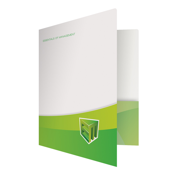
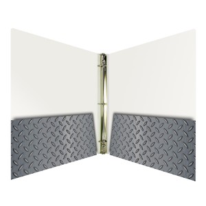
Folder styles are unique like snowflakes in that no two custom presentation folders are ever alike. Each folder is tailored to the specifications of the business it represents, both in design and function. The best folder styles fully satiate the needs of your business by giving you the organizational comfort you desire and the bold graphic design that best represents your company.
Pocket Folder
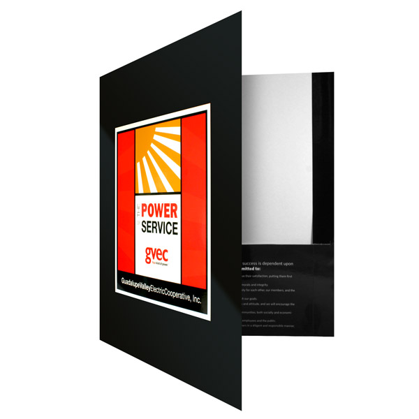
An example of a pocket folder.
The pocket folder is the standard of all folder styles. This bi-fold folder has a built-in pocket for storing documents and files. Depending on your particular needs, pocket folders can be outfitted with a single pocket to three pockets and come with a variety of special features, from CD folder slots to die cut folder windows. Not only do pocket folders keep your files secured, they are easily customizable with a plethora of options to choose from.
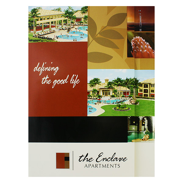
Tri-Fold Presentation Folder
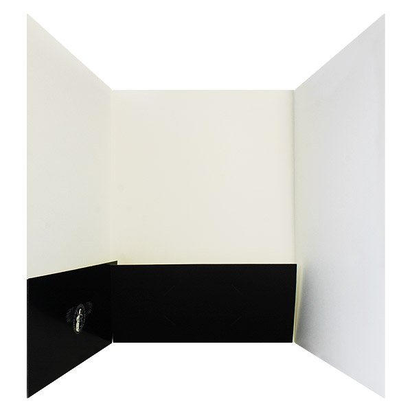
An example of a tri-fold presentation folder.
A tri-fold folder features the addition of an extra panel, giving you more room to put documents or build brand awareness. The panels fold one onto another, so it’s like having two front covers to show off your company. Each panel can be outfitted with a pocket for better storage and organization. Tri-fold gives you the option to be a little more creative with your customization options, with a design that carries over from one panel to the next.
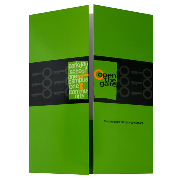
Gatefold Presentation Folder
Gatefold is one of the more creative folder styles because it opens up in the center like a gate, instead of from the side like a book. Gatefold provides you with a unique canvas for your imagination and tempts recipients to open up to see what’s inside. Gatefold folders come outfitted with one or three pockets for storage, with the center pocket unattached so that it can fold down.
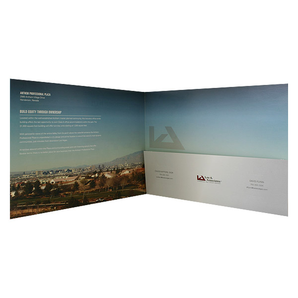
Landscape Presentation Folder
Landscape presentation folder styles are like the widescreen movies of presentation materials. The horizontal setting gives you more space to work with, letting you use bigger photos and bolder designs when customizing your folder. Most people are used to seeing folders in the portrait style, so using a landscape style of folder lets you stand out among the crowd and make a big impact.
Belly Band Folder Package
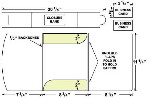
An example of a belly band presentation folder package
When you have a great deal of information to provide, you want it wrapped up in a neat package. The belly band folder package has a place for your business cards and documents, bound up with a custom folder clasp. Belly band folders are made with aesthetic in mind, giving you plenty of design options from the folder clasp to the accompanying business cards.
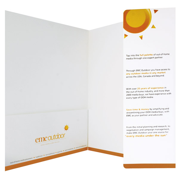
Pocket Folder with Info Flap
If you just need a little extra room to help sell your message, the pocket folder with info flap is your best choice. The additional 3 3/4″ of space can be a big help if you want to add company information, images or other important tidbits. Info flaps provide an alternative to tri-fold folders by giving you the extra design room without having to sacrifice the storage room. Since the info flap sticks out, it ensures that recipients will pay attention to what it has to say.
Vertical Pocket Presentation Folder
Vertical pocket folder styles have the pocket going up and down the folder instead of across. The vertical pocket can be customized, providing you with extra space for additional information or branding opportunities. Vertical pockets give you more interior room to work with when designing your folder. Since we read vertically down a page, information on a vertical pocket is easier to read and attracts the eye.
Tuck Tab Presentation Folder
The best folder styles reinforce your brand identity. If you have an image, logo or picture you want recipients to remember, use a tuck tab presentation folder. The cover is slightly smaller than the back, so your image will start on the front and continue in the interior, making it the focus of your design. Tuck tabs can also be customized with different closures, allowing you to keep the contents of your folder secure no matter what.
Presentations folder styles are always changing and evolving, so find out what’s available to you before you make a purchase. You just might find that breaking away from a traditional folder design is the best way to express your company’s image.
This post is a part of our Presentation Folders 101 product guide.

