 Why do so many graphic artists still fumble horribly when it comes to promoting social media with print ads? It’s not like they haven’t had plenty of time to get on the ball. Social media’s been around for over a decade now, and you’ll be hard pressed to find a company that doesn’t have some sort of presence on Facebook, Google Plus, or Twitter.
There’s really no giant, hidden secret to learning how to advertise social media, nothing that makes it more difficult to work with than a website address or a phone number. But sometimes those in the design industry get lazy and treat social media advertising like an afterthought, or even worse, they entirely forget that they’re designing for a printed medium.
We can do better than this. Promoting social media in print isn’t that hard, so long as you avoid these common but tragic mistakes.
1. How am I supposed to click on that printed social button?
You can’t “press” printed buttons, so what’s the point of using them to advertise social media in print?
Social buttons have no place in print media by their very definition—after all, a button can be clicked. How do you expect your reader to click on a piece of paper?
This is one of the most appalling print design trends in recent years. Buttons make perfect sense in web design, where intuitive interactivity is key. But using social media icons in print without any accompanying details is like giving your audience a crudely drawn map on a cocktail napkin with the words “come find me” scribbled on it—there’s not much to go on and it’s not a very tempting offer.
While you’re at it, why don’t you just remove the phone number from your print design and place a picture of a telephone instead? After all, if the audience is smart, they should be able to look up the number online, right?
You’d never do that with a phone number, so why do it with a social media profile? You can’t assume every reader is going to be technologically savvy enough to find the brand online. They might end up on some unofficial channel or following a similarly named brand. Or they might just be too lazy to come find you at all.
At the very least, integrate the actual URL or profile name next to your social media icons for print. Assume your audience is a herd of lost sheep who can’t find their way without big flashing arrows guiding them.
2. So you have a social media account…why should I care?
Oh you’re on social media? Cool story. Now, why exactly should I care about that?
It’s not enough to just announce that you’re on social media; that’s like announcing you’re open for business but never telling anyone what you do. You need to write a call to action that tells the audience what to do, and more importantly, why they should care.
For example, do you have giveaways on your Facebook page? Do you often share special coupon codes with your Twitter followers? Or are you just an authority in your field that has a lot of insight to share? Let the audience know what they can expect if they follow through to your social media page.
It doesn’t even have to be as complicated as all that—you can sometimes get away with a simple statement such as “Follow us on Twitter” or “Like us on Facebook.” It’s not as peppy as a call to action that tells the audience what to expect, but it at least gets the job done. Again, assume that your audience needs even the simplest of instructions to do anything.
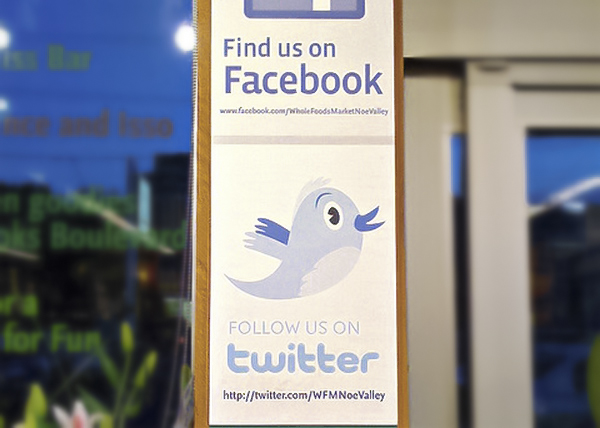
Don’t forget to include some sort of call to action (even just a simple one) when promoting social media in print. Photo Credit: Chris Messina
3. Which one of your two hundred social accounts should I visit?
Don’t overload your audience with a million different social networks to visit. You’ll end up confusing and boring them.
It’s great that you’re on Twitter, Facebook, YouTube, Pinterest, Instagram and LinkedIn, but do you really expect me to sit here for hours following you on every social media site known to man? Do you want your brand to look like a 5-star restaurant with a selective menu or an all-you-can-eat buffet with a bunch of questionable dishes?
Studies have shown that giving people too many choices makes them anxious and confused. Any given brand is likely to have multiple phone numbers, but you wouldn’t integrate every single extension into your print collateral. The audience wouldn’t know which number to call—just like they won’t know which social media account to follow if you provide a giant pile of options. This often leads to inaction—the audience is so put off by the daunting task of visiting every page that they choose to visit none of them.
Likewise, the more social pages you promote in your print marketing collateral, the more design space it takes up. You may end up having to make those promotional elements smaller, which diminishes their value. It’s better to have fewer social media options and to give them more prominence then to cram them all in.
4. Why did you link me to a dead page?
If your Twitter account only has thirteen followers and hasn’t been updated since last month, why would you waste the time to promote it? If you’re thinking that it might take off in the future and that it’s better to promote it on the off chance you might get around to updating it, that’s a dangerous strategy to play with.
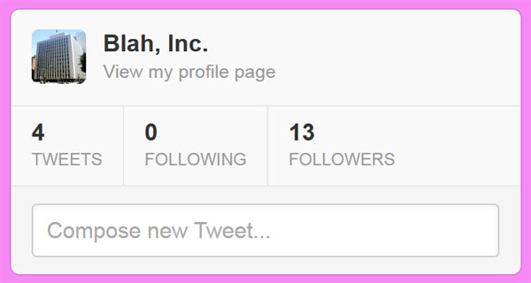
Does this look like the sort of Twitter page you’d want people to see?
Chances are, you have one social media account that tops the rest—one that has the most social followers, the most interactions and the most authority. This should be the profile that you most prominently promote in your print marketing collateral.
Again, it’s not about quantity, it’s about quality. Giving the audience too many options is annoying, but it’s even worse when half of the pages you link to are basically dead. Most brands have one social media page that they filter everything through. Do you tweet all your Instagram pictures and Youtube videos? Then just promote your Twitter page and skip the extraneous details.
5. What do I do with your nonsensical QR code?
This example QR code is much too small to be easily scanned, and there’s little indication of what it even links to.
QR codes are a great way to link from your print media to your social media—when they actually work, that is. There’s nothing more frustrating than trying to scan an unintelligible QR code that’s too small, too big, or absolutely refuses to be picked up by the camera.
If you’re going to integrate QR codes, you have to spend the time testing to make sure they work. And that doesn’t mean taking a picture off your computer screen and calling it good enough—you need to see if the print options you’ve chosen will allow the QR code to be scanned.
Does it blend too much into the background? Will that glossy reflective coating you added make it hard to scan? You won’t know if you’ve made some of the most dire QR code mistakes until you get off your butt and test it out.
And much like any other successful social media element, you need to give the audience a reason to pull out their phone or tablet in the first place. Nobody likes to gamble with QR codes; they want to know what scanning the code will do and why it will benefit them to do so. Otherwise, it’s just a shot in the dark.
6. What kind of Luddite completely ignores social media?
The gravest design sin you could ever commit would be omitting social media from your print designs altogether—unless part of your brand’s identity is being tragically stuck in the past.
Keeping your print media entirely separate from your social media? That’s a major missed opportunity.
If customers were fish, would you rather use two separate fishing poles to reel them in one at a time, or a giant net that can grab them all? When you keep print and social media entirely separate from one another, you limit the amount of reach your brand can have. In some cases, this might be a necessity—the brand, product or even the message you’re trying to convey might not lend itself to promoting social accounts.
But nine times out of ten, if you’re going out of your way to not promote your social presence in a print ad, then you’re shooting yourself in the foot. How can you grow your social media presence if nobody knows about it? And how can you show your print audience you have authority if your brand looks like it isn’t even big enough for its own Facebook page?
Final Thoughts
Amateur hour is over. When it comes to the social effects of print media, it’s time to get with the program or get left in the dust. Integrated social media should be treated like any other print design element, not a digital element you copied and pasted into your print file.
Are there any faux pas we missed regarding social media and print marketing? Are you guilty of one of these transgressions and want to confess your sins to the world? Leave us a comment below!



Thanks Vlad! Great points! I recently switched to sending a postcard with a QR code instead of mailing out my studio newsletter. (Saves $ on postage, printing and no envelopes to stuff!) And made the point of checking the print proof for code/link legibility (works! …phew!). I’d also recommend creating a ‘family look’ between the print piece and the online link – whether it’s a logo a headshot, or more sophisticated branding – so there’s a visual reward discovering the destination. -S
Really like your post. I also get asked, which one of my social accounts should I list on my pages My recommendation: Let your customer decide where they want to connect with you, but instead of an endless list of social icons on a web page or on biz cards or print ads just have one link with your entire !!active!! social networks available. And if you are now new on i.e. Pinterest or one of your social networks are not very active anymore – just update the digital business card.
Thanks again for a great post
Marita
#1 & #6 should be the same thing… not separate. I disagree with wasting ad space by putting the address on there… If you do Social Media Optimization (SMO) correctly (hashtags etc.), they should easily be able to find your business without spelling it out for them & wasting overpriced print space by doing so. The only exception would be if your business has a difficult handle that wouldn’t easily come up. But then again if you do SMO correctly the business should easily come up anyways.