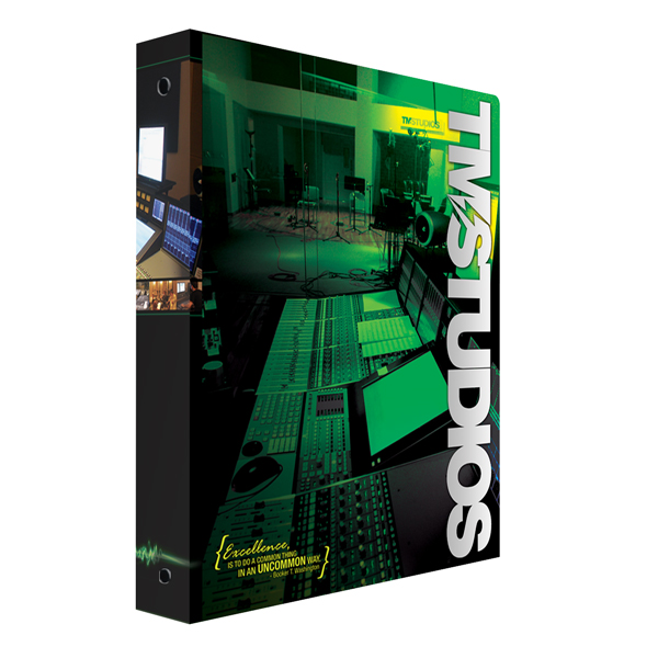
Presentation binders can help your company stand out above the crowd — however, don’t assume you’re the only fish in the business pond that uses them. Unique binders with eye-catching designs are the best way to ensure that your company is breaking away from the competition and forging a distinctive identity. Here are just a few design choices to consider if you want to create unique presentation binders that are truly one of a kind.
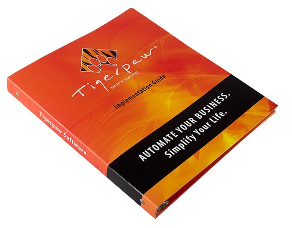
Stand out from the crowd using fun, colorful, exciting imagery in your custom binder design (SKU: 88-01).
Using Visual Imagery
The easiest way to stand out in a crowd is through creative visuals. Unique binders grab the eye’s attention through powerful imagery, use of color and clean design principles. Your binder doesn’t need to be loaded up with images and pictures — it just needs to represent the purpose and personality of your company in an exciting way. Just don’t go too simple, or you’ll run the risk of losing your audience.
Add Color to Negative Space
A graphically complex design doesn’t work for every company, so in cases where you only want a company logo on your binder, you need to find other ways to stay unique. Be aware of your negative space and add a splash of color whenever you can. A logo on a white background is boring, but put it on a yellow background and it’s suddenly bright and cheery. Textured effects are also great background filler, just as long as they don’t draw attention away from your brand.
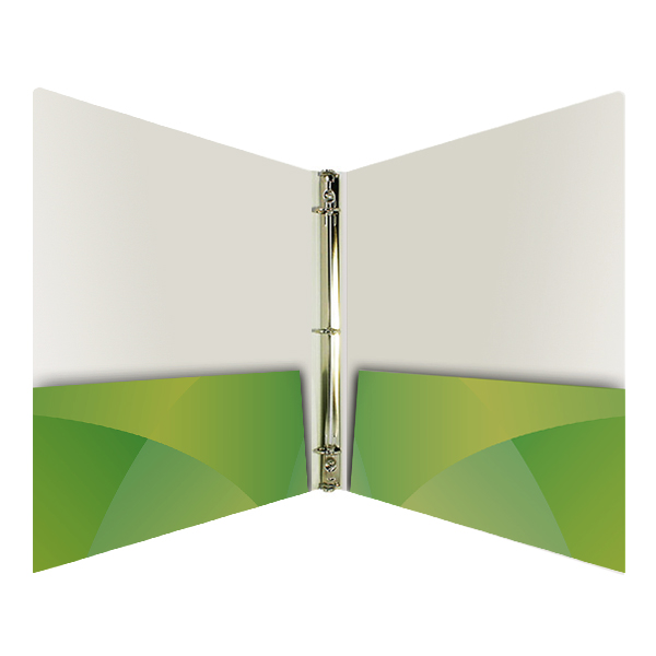
Continue your design inside your binder by customizing the interior, including the pockets (SKU: 88-01).
Decorate the Interior
Unique presentation binder design doesn’t stop on the outside; it also carries over into the interior. You have plenty of space inside your binder for more design elements such as color, textures, pictures and logos. Your audience will see the outside first, but most of the time they spend using your binder will involve having it open.
Write Creative Copy
Text can be just as powerful a design tool as images, especially when you have a clear message that is clever and to the point. You can also alter text to turn it into a visual element by adding size, color and texture. If you have a strong enough mission statement, company slogan or sales hook, you can let it stand alone and still make a big splash.
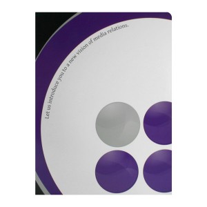
Use a design that creates mystery, such as this binder which invites the reader to open it and discover the company's vision.
Create Mystery
As much as binder design is important, the real star of the show is the information that’s inside of the binder. Use mystery in text and images of your binder design to focus the audience’s attention on the materials within. Add a die cut binder window to give a clue as to what’s in store for the audience, then follow up with a dynamic visual on the first page of your binder. Use a wrap-around design to create a look similar to a locked diary, enticing the audience to open the clasp and see what’s inside.
Add Flourishes
Experiment with distinctive printing options to create a truly unique presentation binder. Add a touch of foil stamping for a shiny, glitzy effect or emboss your binder’s design to make them stand out. Consider spot printing to add textural variety.
Customize to Your Liking
The most unique binder designs are the ones that you have custom suited to your needs. Don’t be afraid to ask for custom options such as die cut index tabs or unique pocket shapes that will best show off the concept you have in mind. If you can think it up, it’s possible that you can make it a reality.
This post is a part of our Binders 101 product guide.


