Forget everything you know about those brown, boring, store-bought document portfolios — they do nothing to promote your work, your brand or yourself as an individual. Custom portfolios can be designed to give recipients a sense of who you are before they even look at examples of your work. It’s time to show the world what you can do, and that starts with a smartly designed portfolio.

You have a lot of space to work with in a horizontal portfolio design -- so utilize as much as you can.
Go for Big Designs
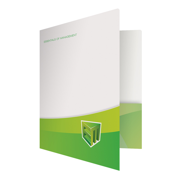
Since a portfolio is printed in a horizontal position, you have a very wide canvas to work with. If you refuse to fully utilize this space, your design will come out looking boring and plain. Instead, fill your design from corner to corner with a big full color picture, or add a repeating pattern to the background of your design to fill in any negative space. You don’t have to use all of the space afforded to you, but you do have to think in widescreen mode. Consider a smaller design, but with a mission statement running all the way across the folder to make better use of the space.
Show Off Your Personality
Your portfolio shows off your personality through your past work so that recipients get a sense of who you are and what you can do for them. In that regard, the design of your portfolio should be an extension of your brand personality. Is your work business oriented, or is it for a more creative field? Do you want to present yourself as an authority and expert, or are you an up-and-comer with fresh ideas? The answer to these questions will dictate how you design — from the type of images you use to the color and type of font. A professional looking portfolio might go with dark color schemes and fewer visuals, while a creative portfolio might feature bold designs and lighter colors.

Incorporate contact information like your website address into the design of your portfolio.
Make Contact Easy
A portfolio is about more than just showing off your work, it’s about promoting yourself – which is why it’s crucial that you include contact information. If you have a website or online portfolio with additional pieces or examples of digital media, be sure to include the web address or even a QR barcode so that recipients can see more of your work. A good place for this is on the back flap, where recipients will open the portfolio. Many portfolio folders can be outfitted with business card slots so that recipients can always get in touch with you if they like your body of work.
Folder in a Folder
Portfolio folders are great for carrying around smaller folder types, like presentation folders. This makes it easier for you to distribute your portfolio, as the outside folder is turned into a mailing envelope and the inside folder becomes your portfolio. This gives you twice the opportunity to create visual interest and put your work in the spotlight. The folder within a folder method is useful when you have vertically aligned documents but you want to display them with that horizontal portfolio look. When recipients remove the second folder from the inside, they will know to turn the folder vertically and to open it like a book.
Expand as Necessary
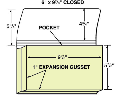
You want your portfolio to contain as much of your best work as possible, but if that includes a lot of pieces then you’ll need a folder that can contain all of these materials. An expanding pocket folder has the extra space required to hold a large volume, while still retaining that portfolio look and shape. The expansion gusset usually gives you an extra inch or two of room so you can store entire booklets, pamphlets, albums or magazines that might have featured your past work.
Put Your Best Foot Forward
The way you organize your document portfolio can make it a more effective promotional tool by ensuring that recipients see your best work above everything else. Your best pieces should be at the very front and very back of the portfolio, since these are the two areas that get the most attention. Your portfolio tells the story of your career, but unlike most stories, you want to give away the best parts first. In some cases, you may have only minutes to make an impression, so get to the point quickly.
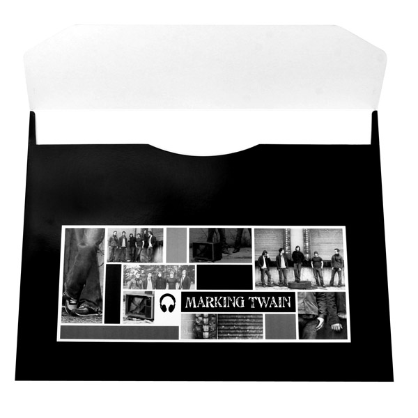
Don't forget to add a design to the back flap of your portfolio, since your recipients are sure to see it (SKU: 16-02).
Consider Both Sides
When designing a folder that is vertical or portrait style, the front cover should be your first priority since it will be the most visible area. However, with a horizontally printed portfolio, both the back and front are equally as important. You still need to make a strong visual statement at the front of your portfolio to entice and attract readers, but you also have to pay attention to the back flap because this is where the portfolio is opened from.
Designing two sides requires special considerations. You don’t want to have two large designs on both sides because it tends to confuse your audience as to which side is which, as well as which design is more important. Come out big and bold on one side and stay subtle and reserved on the other. This way, your audience knows what to focus on.
Document portfolios are like an ice cream cone – your past work is the ice cream, which is the real focus, but that doesn’t mean that the cone itself should be tasteless and dry. When you customize your portfolio folder, it’s like dipping that cone in chocolate and covering it in sprinkles. Ensuring that your portfolio looks fantastic is a surefire way to get people to notice its contents.

