Looks matter in a creative field like photography because potential clients gauge worth by how good previous work looks. This means the design of a photographer’s custom portfolio folder envelope also has to look as good as the pictures inside, especially when considering that the cover is a client’s first look at the work. To make the best impression possible, there are a number of factors to consider in a design.
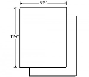
A two-piece report cover allows you to hold more in your portfolio, but you have to bind the contents yourself (SKU: 75-01).
Select Your Portfolio Type
The design process starts with selecting the type of report cover you want to use: one-piece or two-piece. Both serve different functions and require different design considerations.
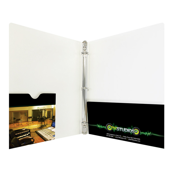
A one-piece cover folds in half like a makeshift folder, letting you store loose photographs without having to worry about ruining the quality of your photos with 3-hole punching or stapling.
A two-piece report cover must be bound together, so if you use one you’ll have to mount your photos onto a separate sheet of paper. However, a two-piece report cover can allow you to make portfolio packages as big as you like.
Compile Your Portfolio Packet
Before you can really design the cover for your portfolio, you have to know what is going inside so that you can plan accordingly. You can select as many pictures as you like to put into your portfolio as long as they represent your best work.
However, most people will not look at every photo in great detail, so to make the most efficient impact, you should put your best image at the front and your second best image at the back. These two areas get the most attention when potential clients thumb through your work. Be sure to group together pictures that belong to the same series so that recipients aren’t left flipping through to find the other parts of a set. You can use expandable envelopes if your portfolio is too thick for a standard envelope.

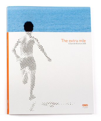
Use your own art or photography as the cover to your portfolio.
Create Your Design
The way your portfolio looks will have as much impact as the photos inside, so your design should be a bold declaration of your artistic vision. Print in 4-color ink so you can use one of your best color photos as the cover, giving recipients their first taste of your work. Select PMS spot printing if your design features black and white photography because it is better at reproducing gray tones.
Your design elements should work to represent the pictures inside. If you do primarily wedding photos, you want a light, floral design, while sports photography would need a colorful, energetic design.
Add Functional Accessories
There are a number of add-ons and special features that will help your custom photography portfolio to be a more effective marketing machine. For example, attach a folder-like business card slot so that potential clients can easily get in touch with you if they like what they see. Design a custom business envelope to send out your work to potential clients who are far away. Use a spine attachment to turn a one-piece cover into a bound photo album. Function is just as important as aesthetic when it comes to designing an effective portfolio.
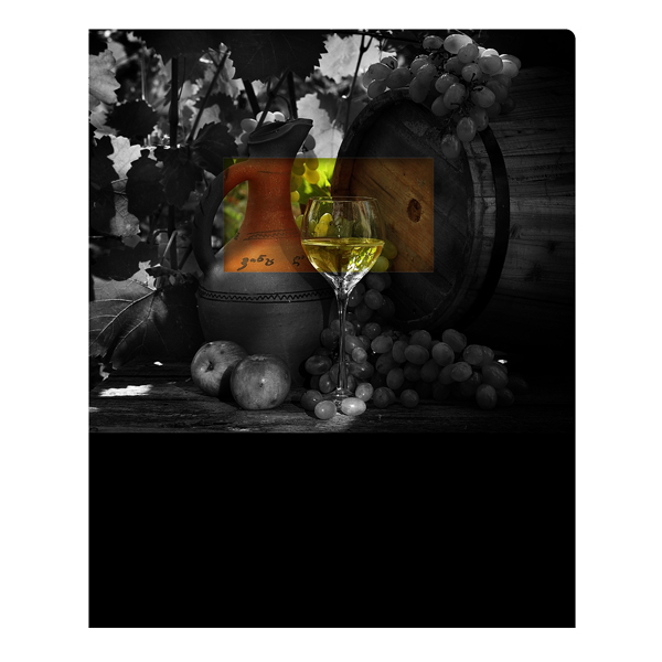
Die cut windows allow you to create artistic effects such as a burst of color inside a black-and-white photo within a presentation folder (SKU: 08-09).
Windows Bring Attention to your Work
Your portfolio is about showing off your work, so consider giving recipients a sneak preview of what’s in store using a die cut window. A window allows the first piece in your portfolio to be viewed from the outside cover, which can be designed around this function. Your design might have the subject of a photo peeking out from behind a window, enticing the reader open up and see more. You could also reproduce the photo in black-and-white on the cover, but have a color copy behind the window so that only one portion of the picture has color. Windows give you more creative options to consider while designing your portfolio.
Your clients expect to see your artistic talent and creativity when they look at your portfolio-including the cover design. However, if you’re not as comfortable with designing documents as you are with snapping pictures, there’s no shame in hiring an outside designer to create something for you–as long as your personality and imagery are front and center.


