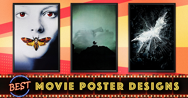
We recently rounded up some of the worst movie posters of all time to show you what not to do when you tackle a design project. With many designers already questioning whether the future of movie posters is in jeopardy, our blog seemed like further proof that this art form is on its last legs.
But movie posters are just like any other print design. Where some do less than impress, others shine brightly like a homing beacon, calling designers to a higher standard. These are the kind of designs that will last for generations (in fact, some already have). And in twenty years, they’ll probably still be hanging on our walls. So what makes the best movie posters so iconic? And how do you apply their positive traits to your own designs? The only way to find out is to study the greatest movie posters ever made.
Want to see how these designs have contributed to the evolution of movie posters over the years? Take a look at this easy-to-download summary graphic.
Metropolis (1927)
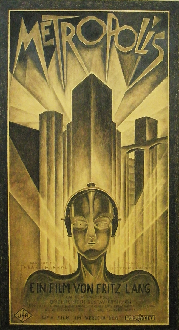
Fritz Lang’s Metropolis is the oldest film in our countdown and a great example of classic cinema—and we think this movie poster had something to do with that longevity. In fact, the poster is even more valuable than the silent movie it advertises. Only four surviving originals are known to exist, one of which was reportedly valued at over $1 million in 2012.
Not only is it an art deco masterpiece, the poster blends the style of the ’20s with a taste of what’s to come in the future. Take the font, for example—even though it’s nearly 90 years old, it looks like the kind of logo you might see on a hair metal band’s album in the ’80s or even one of today’s graphic novels. As a designer, you can never be certain if your ideas are strong enough to stay popular for a century, but those that do are typically the ones that are ahead of their time.
Vertigo (1958)
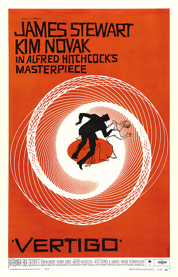
Director Alfred Hitchcock was exceptionally skilled at working in a visual medium; any designer could learn a thing or two from watching his movies. So it only makes sense that the marketing for this film would be created by someone who was equally adept at using visual effects to manipulate the audience’s emotions.
Legendary Hollywood designer Saul Bass created this movie poster for the psychological thriller Vertigo to be both complex and hypnotically simple, immediately drawing in and disorienting the audience. Not a single element is wasted—even the hand-drawn typography, which is a throwback to 1920s era German expressionist films, gives you a sense of vertigo.
The poster is also a bit prophetic: it refers to the film as “Alfred Hitchcock’s masterpiece,” an extremely unconventional thing for an original poster to say at a film’s first release. Bass must have expected the film to survive for the long haul, and we’re sure his movie poster helped it do just that.
Anatomy of a Murder (1959)
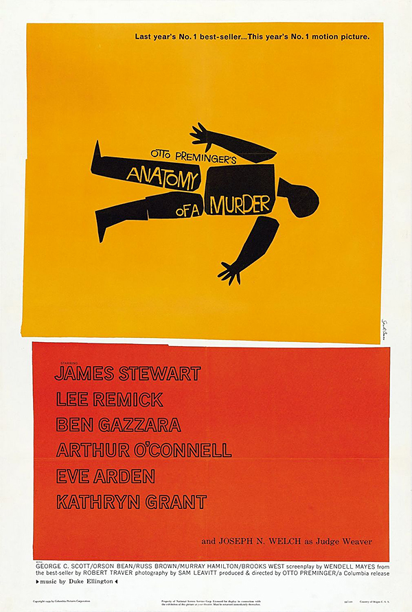
Another example from Saul Bass, this poster for Anatomy of a Murder is as simple as it gets, yet it speaks volumes. The title is spelled out within the clever imagery. Viewers see the outline of a body, reminiscent of the chalk outline at a murder scene, but the body is comprised of different individual parts to indicate “anatomy.”
This minimal imagery stands in stark contrast to the dark subject matter of the film, easing the viewer in before scaring them. We can tell that the more gruesome details are being held back, which only heightens our desire to see the movie and find out what the big secret is.
The poster design is so clever that Spike Lee used it as inspiration for the 1995 film Clockers—or stole it, if you asked Bass. The design legend said of the redone version, “The convention is when anyone steals something, they call it an homage.”
The Graduate (1967)
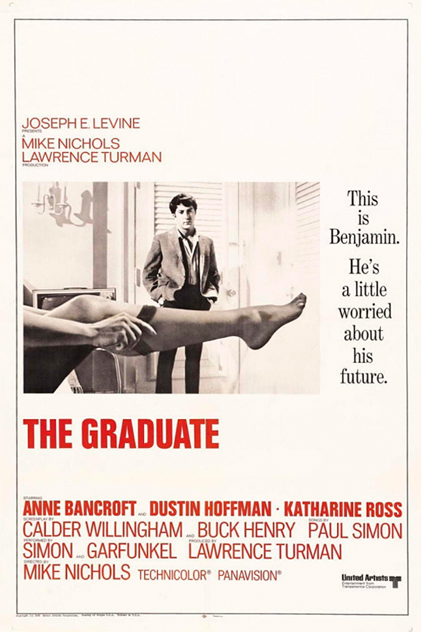
Let’s face it—sex sells. But designers often take it overboard, thinking that a bunch of scantily clad models or tacky innuendos will grab the audience’s attention. The problem is that when you use sex to sell a film with deeper themes requiring actual thought, you’re going to attract an audience who only cares about the sex and not the thought. Instead, designers should take a page from this poster for The Graduate.
Rather than plastering the design with nudity, its creator took a much more subtle route. Dustin Hoffman’s crotch is suggestively covered by a seductive leg (which belongs to actress Linda Gray and not to the film’s starlet Anne Bancroft). The sexual hints pique the audience’s interest in the movie—and their desire to meet the woman who owns the leg.
Even Hoffman’s pose, with his hands in his pockets as he awkwardly stares at the woman the audience can’t see, perfectly matches the poster’s tagline. We know his character can see more than we can, and it makes us want to watch the movie to find out what’s got him so worried.
Rosemary’s Baby (1968)
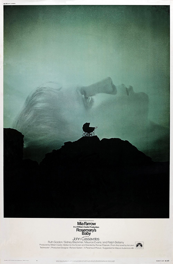
Even if you’ve never seen the supernatural classic Rosemary’s Baby, you’re bound to be a little spooked by this moody movie poster. You’d usually expect a scary poster like this to have a big title at the top, taking up all that negative space. Instead, the tiny title at the bottom leaves an unsettling blank space above Mia Farrow’s head—implying that something unseen exists in that space.
The juxtaposition between giant, ghostly Mia Farrow and the tiny shadow of the baby carriage further carries that uneasy feeling. The idea of a baby carriage left alone on top of a cliff conjures up the idea of danger, but the poster asks you to question who’s really in danger here—the baby, or the mother?
Gone With the Wind (1968)
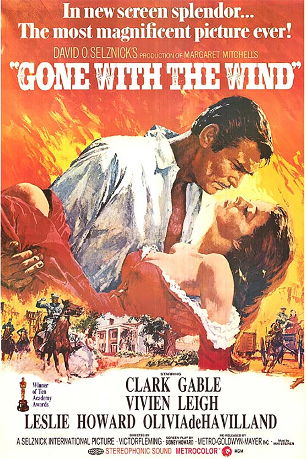
The passion, fire, and sheer drama of this Gone With The Wind poster has actually given it a reputation it may not deserve: many people think this is the original movie poster.
But they’re wrong. The real original, which debuted with the film’s first release in 1939, was just a simple portrait of Clark Gable and Vivian Leigh locked in a kiss against a white background. The one we know and love today is actually a poster from the film’s thirtieth anniversary re-release.
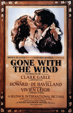
It just goes to show that there’s always room to bring new ideas to old projects. Gone With The Wind did perfectly fine at the box office with the old poster (it was one of the first Hollywood blockbusters), but the re-release poster is the one that captured audience’s imaginations.
It would be easy to credit the poster’s success to the fame that comes along with a best selling movie. But when comparing the two designs side by side, our eyes automatically go to the 1968 version. The bright colors create motion, Vivian Leigh is far more provocative, and the tiny paintings at the bottom show that the film has action as well as romance.
A Clockwork Orange (1971)
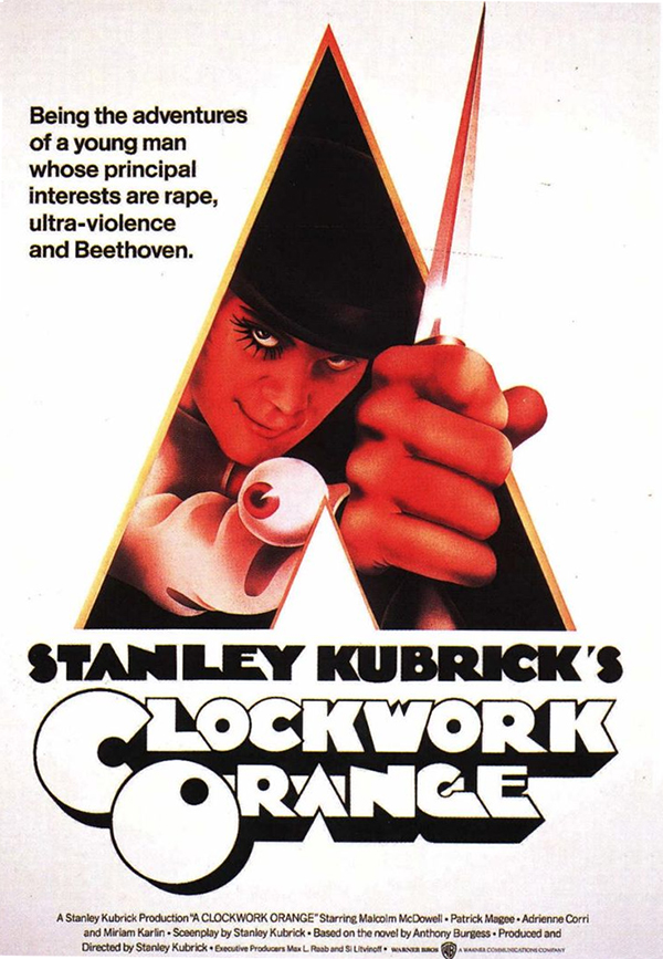
Just looking at the poster for Stanley Kubrick’s A Clockwork Orange makes the viewer feel a little uneasy, seeing as how there’s a guy popping out at you with a knife. The poster does a great job of creating different depths of field. Its layers make it more multi-dimensional and imposing—the only thing keeping you from becoming part of this world is the negative space barrier, and even that’s being breached by a blade.
This poster gets a lot of love from other designers, but one thing that doesn’t get enough credit is the unique typeface in the logo. Though it was clearly designed in the 1970s, it’s also got a great futuristic vibe. And best of all, the “A’s” in the font match the shape that Malcolm McDowell is popping out of.
Mean Streets (1973)
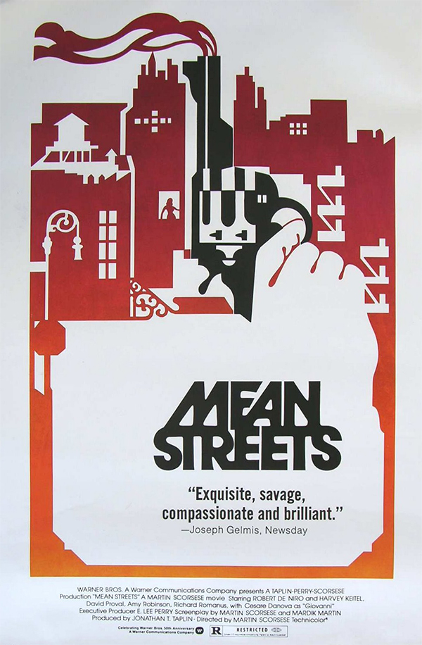
The gritty Martin Scorsese film Mean Streets—and the imagery in its poster—are based on Scorcese’s own childhood growing up in New York’s Little Italy in the ’40s and ’50s. The designer captures the feel of New York through an image collage similar to modern vector artwork; the few details in the negative space give it structure.
Piercing straight through the city is a cold, black pistol held by an invisible hand that bleeds into the negative space. The pistol is still smoking, having recently been fired, and its barrel merging into the city skyline looks like a factory’s smokestack. It’s a clever design that was a bit ahead of its time—this is the kind of artwork you’d expect to see on a video game box today.
Jaws (1975)
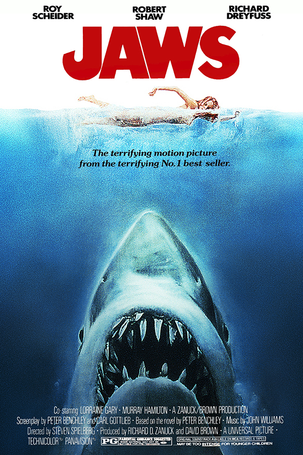
The reason the Jaws movie poster works so well is that it gives the audience their first scare—before they even see the horror film. You can’t help but put yourself in the swimmer’s position and imagine a shark lurking beneath you, waiting to strike.
The shark’s size is exaggerated for dramatic effect—it’s large enough to be some prehistoric beast, with a mouth big enough to swallow the woman whole. It’s so enormous, you might have missed some of the other great details included in this poster design, like how the “J” in Jaws resembles a fish hook.
Another thing that’s missing: the original poster. Designer Roger Kastel—who actually created the book cover for the novel Jaws prior to its transformation into film—last saw the poster at the Society of Illustrators near the time of the film’s release. It’s undetermined whether the poster is stolen. “Either someone has it, or it’s lost in storage at Universal [Studios],” Kastel says.
Star Wars: A New Hope (1977)
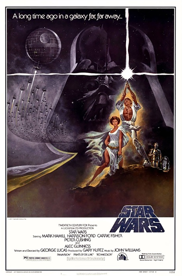
By now, we know that the original poster for Star Wars: A New Hope was a bit of false advertising. Luke Skywalker isn’t some muscly barbarian warrior, Princess Leia isn’t a scantily clad supermodel, and that’s not how light sabers work. But this movie poster has stood the test of time and countless franchise sequels because it does one thing really well—it opens up your imagination.
When audiences first saw this poster back in the ’70s, they didn’t know what to expect from Star Wars. The poster gave them just enough details to get their imaginations working. There are clear cut heroes, villains, and the promise of some epic conflict. By the time audiences found out Luke was actually a skinny twerp and Leia was tougher than her male counterparts, it didn’t matter that the poster had lied—they were already hooked.
E.T. (1982)

There are two well-known versions of the E.T. movie poster—this one and the other depicting the famous shot of the bike flying in front of the moon. We chose this version, not only because it’s the original movie poster, but because the idea came from Steven Spielberg himself.
Spielberg wanted to feature E.T. and Elliot’s fingers touching in homage to Michelangelo’s painting The Creation of Adam. Given that E.T. is often considered an allegorical stand-in for Jesus, it’s only fitting that the poster would give the little guy as much awe and reverence as Michelangelo gave to his depiction of God. And to add a personal touch, Hollywood illustrator John Alvin’s daughter posed as Elliot’s hand.
The E.T. poster was so successful at capturing the film’s emotions that it won multiple awards and, according to Alvin, was his most satisfying work. Dreamworks CEO Jeffrey Katzenberg sums it up best: “Somehow, John was able to capture the emotion of an entire movie in a single image.”
Blade Runner (1982)
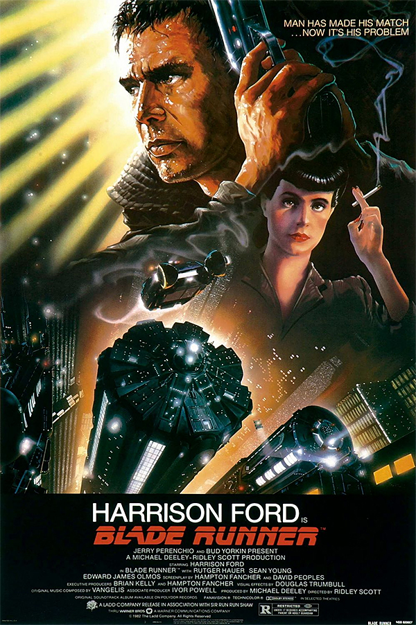
Hand-painted illustration has always been a popular element in movie posters, especially for movies with a lot of fantastical elements that would be hard to show with regular photography. Another piece from John Alvin’s prolific career, we chose this movie poster for Blade Runner as one of his crowning achievements.
Its combines the movie’s film noir feeling with impressive sci-fi imagery. Looking down on the futuristic city, the viewer is drawn into this new world in a way that’s almost a bit thrilling—like you’re free falling.
Alvin’s use of light contributes to the falling effect. The lines of light create motion, while the light hitting both sides of Harrison Ford’s and Sean Young’s faces disorients the viewer. According to fellow designer Frederico Tio, this is an Alvin trademark. “John always brought this magical, almost romantic quality to his work. His sense of light … was spectacular,” Tio told the LA Times.
The Thing (1982)
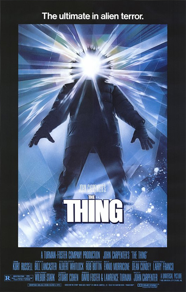
There’s a reason Drew Struzan is a movie art legend. He created this poster for The Thing literally overnight—and he did it without any guidelines. The “Thing” hadn’t even been designed yet, so Struzan did what any good designer with a mystery monster would do. He let the audience imagine a creature more horrifying than anything he could come up with.
The otherworldly energy pouring out of the Thing’s face is like a mirror reflecting the audience’s worst fear—whether that’s a tentacle-faced creature or a monster with dripping fangs. Leaving The Thing a mystery compels the audience to watch the film and find out what it really is.
We won’t tell you what the Thing is in the movie, in case you’re one of the two people who haven’t seen it. But the Thing in the poster is Drew Struzan in a snowsuit.
Scarface (1983)
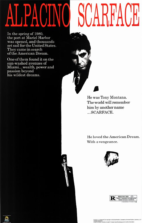
Okay, we admit this one often hangs in dorm rooms and frat houses. But consider this: there’s a reason the Scarface movie poster is so entrenched in pop culture. Its simple, clean design uses negative space and shadows to create a sense of power.
Al Pacino blends in and out of both the shadows and the light, creating an optical illusion that alludes to his character’s unpredictable nature. Adding to the poster’s sense of menace is the blood-red font, which has narrowly kerned letters to create tension in the design.
The actor who played Manny Ribera, Steve Bauer, told reporters the movie has stayed a part of pop culture because “it has a very specific tone. It’s brutal, but there is a weird sense of humor.” The poster perfectly matches that tone, from Al Pacino’s angry expression and ready revolver to the oddly amusing way his left hand floats in empty space. An ’80s movie poster that captures all the emotion of a film in one hit—it could only be the work of John Alvin.
Silence of the Lambs (1991)
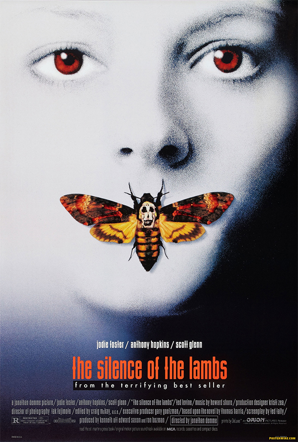
When you first look at designer Dawn Baillie’s Silence of the Lambs movie poster, you see Jodie Foster with her mouth covered up by a Death’s Head Hawkmoth, a species known for the markings on its back that look like a skull. You might think that’s all there is to the poster, just a girl’s face and a bug—but there’s actually a hidden image in the skull.

It’s made up of seven women’s bodies. Director Jonathan Demme suggested using the image, which is actually an old photograph taken by surrealist artist Salvador Dali. Rumor has it that the seven bodies are a reference to the women victims in the movie. This makes the moth covering Foster’s mouth even more chilling, implying the “silence” of the movie’s title.
Even without the hidden imagery, the poster is still haunting. So to keep you from getting completely creeped out, here’s another fun fact you probably didn’t know about the film: since the movie used live Death’s Head Hawkmoths, the studio brought in not one but two “moth wranglers” to make sure the moths were properly taken care of.
Jurassic Park (1993)
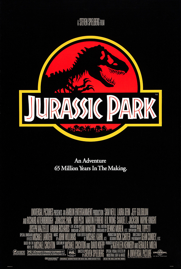
When you think about it, the poster for Jurassic Park showed quite a bit of restraint. More than twenty years after its release, the movie is still considered a special effects marvel for the way it made dinosaurs on film look and seem real for the first time. And yet, not a single CGI or animatronic dinosaur appears on the movie poster—just a logo.
Surprisingly, it completely works, because the branding for the movie is identical to the branding seen in the film’s fictional park. But while John Alvin designed the poster, the park’s logo wasn’t his doing. That credit goes to Sandy Collora, who in turn based the logo on the cover art that designer Chip Kidd created for the 1990 novel Jurassic Park.
The T-rex skeleton—which Kidd chose because all that’s left of real dinosaurs are bones—has been part of pop culture ever since. He once joked, “It became one of the most recognizable icons of the 1990s. My obituary will probably lead off with this and not go much further.” That icon is what makes the poster a perfect representation of the film’s deeper themes and one of the first successful uses of meta branding elements in marketing.
Pulp Fiction (1994)
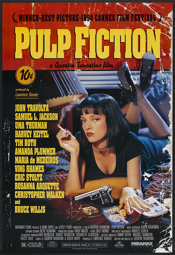
Quentin Tarantino’s Pulp Fiction was inspired by the gritty, steamy stories found in pulp magazines. The movie poster captures that essence—it’s a throwback to a pulp magazine cover, complete with retro fonts and a ten cent price tag. It even looks weathered and wrinkled, like somebody left it in a gutter.
But if the poster looks like a pulp fiction magazine cover, it does so with a twist. Designer James Verdesoto notes that Uma Thurman’s character is stronger and more modern than the femme fatales typical of the mag covers—something he portrayed through her pose, long dress, and insolent stare. Verdesoto’s goal was as simple as it was challenging: “You make a tribute to the past, yes, but you have to catch contemporary audiences with it.”
The proof of Verdesoto’s success is in the poster’s popularity. The last of more than 200 posters that he created for Miramax Films before starting his own business, the award-winning Pulp Fiction design is still hanging on our walls.
The Usual Suspects (1995)
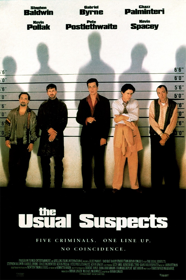
Usually, designers make posters from movies—not the other way around. When director Bryan Singer read a magazine column called “The Usual Suspects,” he decided it sounded like a good movie title. From there, it was a short hop to the movie poster design—a police line-up featuring a bunch of different characters the audience would get to know over the course of the movie.
So naturally, this design is a spot-on representation of what the film is all about. The shadows are the first part of the poster to catch our eye, which works perfectly since the audience starts out knowing only hazy details. The tagline draws you in and makes you want to know more about these characters, while the actors stand in ways that show their character’s personality. It’s almost like you’ve already started watching the movie.
Showgirls (1995)
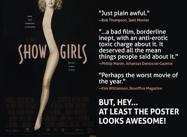
Showgirls was one of the worst movies of the ’90s. It had thirteen nominations for the 1995 Golden Raspberry awards (it won 7 of them) and maintains a less-than 20% rating on Rotten Tomatoes. Though it’s notorious for being a cinematic disaster, Showgirls did come with one silver lining: an iconic and distinctively stylized poster.
While it would have been easy to throw together a corny image of Elizabeth Berkeley in a skimpy outfit, the designer instead used empty space to turn her body into a slinky ribbon (a strip, if you will) for a seductive, mysterious quality. The classic poster is still inspiring artists—Tyler Perry’s Temptation: Confessions of a Marriage Counselor closely mimics the design.
So, who created the design that outshines the movie it was made for? Well, the graphic designer didn’t have as much to do with it as you might think. The poster is pretty much a spot-on representation of a 1992 photo by Tono Stano, which later became the cover art for a book on photography. MGM took out a license to adapt the photo, putting star actress Elizabeth Berkeley in the model’s place and adding the text.
Fargo (1996)
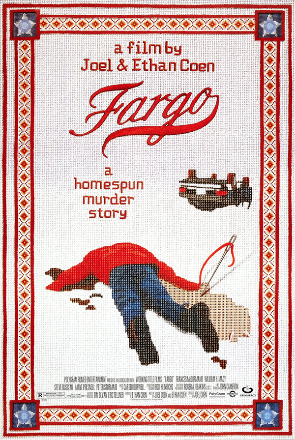
The movie poster for Fargo might just be the first instance where needlepoint was used to advertise a movie. Of course, it’s not actual needlepoint, but the textural quality still makes you believe you could reach out and touch the stitches. It even sparked a trend among fans who created their own cross stitch versions of the poster, like this one.
The stark disparity between the kitschy cross stitch and the bloody dead body perfectly defines the film’s gruesome-yet-homey atmosphere. The two contrasting elements are tied together seamlessly with the use of the needle and red thread, which doubles as a stand-in for a murder weapon and blood.
While we have you here, we’d like to clear something up: contrary to popular belief, Fargo is not a true story. The film does have similarities with two murder cases in Minnesota, the setting of the movie and the Coen brothers’ home state. It’s this mingling of small town hominess and the exoticism of murder that makes the movie—and the poster—so effective. But it’s still false. Sorry, kids.
Little Miss Sunshine (2006)
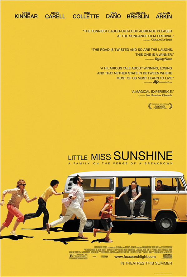
This poster for indie dramedy Little Miss Sunshine is a great example of how to fit a bunch of characters onto one poster without making it a busy nightmare. The entire cast is featured without just standing around posing for the camera—they’re creating a story through movement. Even with the minimalistic style, it’s clear that this chaotic family is pulling together in a pinch.
The yellow background also makes perfect sense—what other color would you use for a movie with “sunshine” in the title? And although the color scheme is bright and cheery, it’s subdued enough that it doesn’t hurt your eyes to look at. The use of shadow further suggests sunshine and underscores the actors’ movement. Even the title suggests action, with each word becoming progressively larger to match the forward motion of the bus—one of five modified VW microbuses used during filming.
Moon (2009)
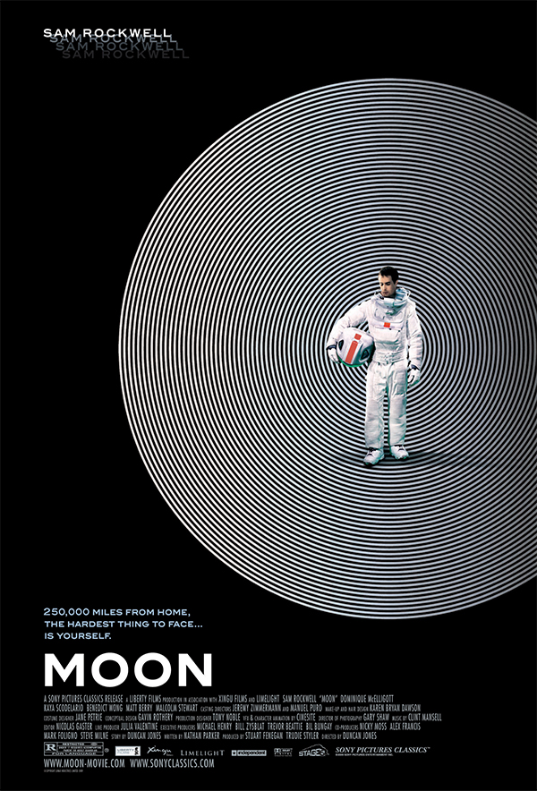
This poster for Moon perfectly encapsulates the movie’s trippy atmosphere and feeling of isolation. In a movie where the protagonist is constantly being cloned, it would have been easy to put multiple Sam Rockwells on the poster—or at least do some sort of mirror image. The single image of the actor makes the original Sam’s sadness all the more real. The only hint at his fate as a clone is the tagline.
But the poster’s strongest suit is the way it stirs up memories of older, more cerebral sci-fi movies from the ’70s, like 2001: A Space Odysessy. It was a clever way for the designer to indicate that Moon was more of a thinking man’s sci-fi movie than your typical space opera fare. Staring at this poster for too long is bound to make you a little dizzy, which works perfectly with the film’s atmosphere. (Not to mention it’s a bit of a throwback to the dizzying spiral on the Vertigo poster.)
The Dark Knight Rises (2012)
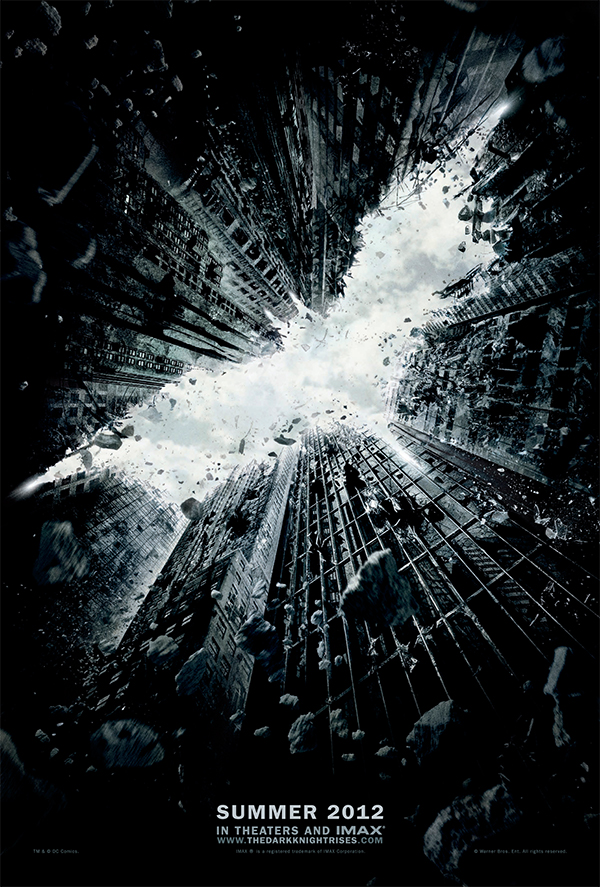
The teaser poster for The Dark Knight Rises uses negative space to create the Batman logo that we know and love, as seen through the rubble of a collapsing cityscape (presumably, Gotham City.) There are no characters, no tagline, not even a title—and yet, everybody knows exactly what it is based on the amazing visual cues worked into the design.
The viewer appears to be at street level, looking skyward towards the Batman logo and symbolizing the idea of the Dark Knight literally “rising.” The poster is dark and moody—some would even say apocalyptic, what with the viewer trapped underneath the falling debris of Gotham City. But angling the camera up to the sky brings in a sense of hope. By the time you finish looking at the poster, you’ll be holding your head up high.
X-Men: Days of Future Past (2014)
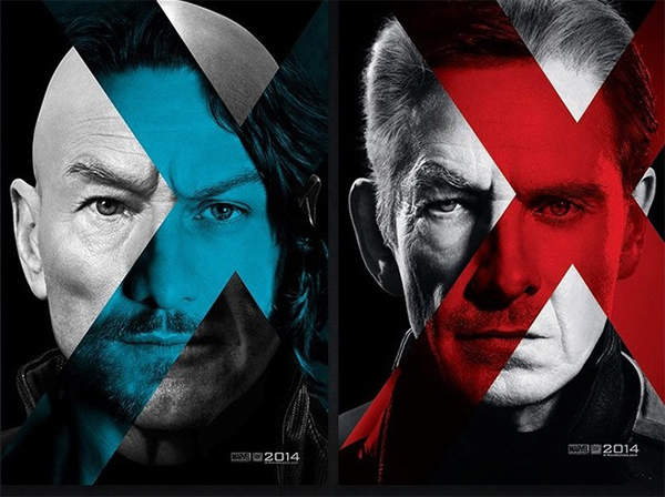
In our previous roundup, we were kind of tough on a character poster for X-Men: First Class, so we thought we’d make it up to Marvel’s mutants by including these landscape character posters for the film’s sequel, X-Men: Days of Future Past.
The images resemble the wanted posters featured in the original comic. And thanks to the film’s time travel plot, both the younger and older versions of Professor X and Magneto appear onscreen. These character posters visualize that by overlaying the younger actors’ faces over their older counterparts. It’s uncanny how close these two sets of actors look to one another—and the use of the “X” branding just brings it all together.
The placement of the X over the characters’ eyes draws the viewer’s attention to the perfect spot. And instead of bothering with unnecessary text, the designer just put the movie’s release date in the lower righthand corner. The minimalist style works because it highlights characters the audience already knows and loves.
Download and share this history of movie poster evolution with your friends!

This work by Company Folders, Inc. is licensed under a Creative Commons Attribution 4.0 International License.
Embed this graphic on your site
Lessons the best movie posters teach us
There’s no one right way to tackle a design project, but movie posters consistently prove two points. One is that art is always evolving. While filmmakers are contracting far fewer designs out to individual artists these days, there are countless alternative interpretations that designers and fans are sharing on social media or giving away at IMAX screenings. That’s pretty cool, in our opinion!
The second thing that good posters do—whether they’re one of these classic designs or a new alt style design—is to tell a story. The cleanest, simplest posters are the most enticing because they leave so much up to the audience’s imagination, letting them become part of that story, too.
Now we want to hear about your imagination. New films come out all the time, and we had to leave out quite a few of the old classics (so many movies, so little time). So let us know which classic posters you think deserve a spot on our list—or tell us which new posters will stand the test of time. We’d love to hear your comments below!




Christopher Nolan is so successful because he keeps the same team around him that are all experts at what they do – expert cinematographer, expert sound editor, and expert marketing and graphics people as well. That poster was pure genius, and just got fanboys everywhere very excited.
WOW! I like the Gone With the Wind (1968). How creative people was at that time, really eye catching, awesome art work.
What a great topic! It really outlines what speaks to an audience; the subtle and/or subconscious messages and imagery that leave a last impression. Working at a graphic design and creative agency we are constantly honing in on what it is that reaches out grabs the prospective clients and drives them to connect. I personally feel Rosemary’s Baby is especially impactful. Thanks for sharing!
X-Men poster is my favorite. The design of the poster should not be too fancy and rigid. The visual effect is comfortable. This can be in line with people’s normal aesthetic psychology.
Hi Kris, it’s always great to see these posters given their due, although I would argue you left some off, but that’s just someone else’s opinion.
I do have one critique, you should have added the artist’s name who created these incredible works. People like, Saul Bass, Drew Struzan and others created excitement that a lot of those movies didn’t actually convey themselves. So, if anyone loves movie posters they should go see what those great artist’s have also done. They’ll happily find themselves going down a rabbit hole of great art that usually doesn’t get attributed enough (I like to think that even though you don’t know the artist’s name, you definitely know their work). I can say that as someone who runs a website for artwork of the great Bob Peak who is considered to be the Father of the Modern Movie Poster. Pretty much everyone knows his work, but nobody outside of the Illustration or Movie industry has ever heard of him.
Keep putting out these lists, I personally love them.
Thank you!
i think The Godfather poster is a MUST on this list.
others that i find quite good:
the thin red line
Schindler’s List
Batman 1989 teaser poster
Iron Man teaser poster
L.A. Confidential
28 days later
saturday night fever
Pan’s labyrinth
No frills here but then none were needed. The park’s logo against a simple black background and signed off with the inspired “An Adventure 65 Million Years In The Making.” Instantly identifiable and conveys all the information with simple elegance. Testament to the fact that sometimes less is more.
Sometimes, one sheet is all it takes to pique your interest in a film: a dazzling color scheme, a clever concept, an arresting image. Film posters are more than just marketing materials – they’re undeniably an artform in themselves, with the world’s greatest illustrators and designers (including the likes of Drew Struzan, Saul Bass, and Bill Gold who passed away earlier in 2018 ) producing works that have sometimes become as iconic as the movies they’re promoting.