 You’ve already posted all of your graphic design work online, so who really needs a print portfolio, anyway? As a matter of fact, investing the time to create an outstanding printed portfolio can pay off in a big way—even if your work is strictly digital.
Unlike online portfolios, physical portfolios cannot be clicked away. Since they’re physical objects that take up space, clients can rediscover them even after putting them in storage (long after they’ve deleted your web portfolio from their bookmarks). The more care and effort you put into making your graphic design print portfolio look good, the harder it will be for clients to part with.
Consider the following printed portfolio examples from graphic designers across the globe—would you find them easy to throw away? The artists who created them went above and beyond to show the world not only their ability to design, but also their ability to think outside the box.
1. Present yourself as a brand
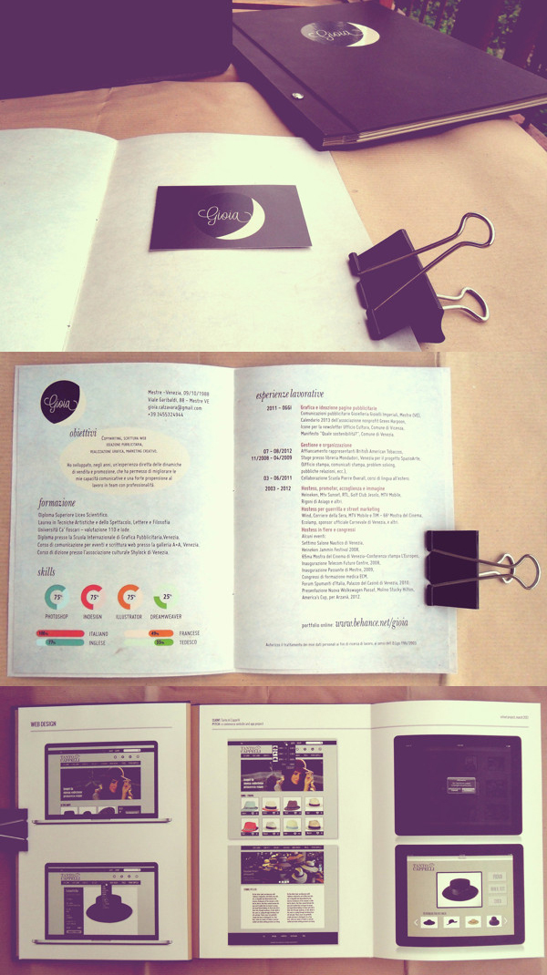
Photo Credit: Gioia Calzavara
The focus of your portfolio should always be your work and the results you create, not necessarily you as a person—but you still need to have some sort of presence throughout your portfolio’s layout. The best strategy is to present yourself as a brand. This doesn’t mean you need to develop a new “brand name”—your own name can do just fine.
In this creative example, we see the artist has turned her name into a logo, which allows it to be repeated throughout the portfolio to help build brand awareness. A symbol can represent much more to a potential client than just your name and contact information. It presents both you and your work as a grand concept.
Branding yourself also demonstrates to a client that you are capable of building and maintaining a brand identity, which means you can do the same for them.
2. Don’t be afraid to show off
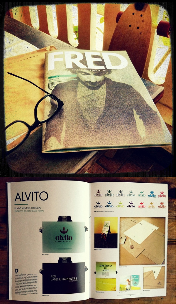
Photo Credit: Frederico Cardoso
Printed graphic design portfolios are all about making an impression, but you’re not going to do that by holding back. Don’t be afraid to trust your gut, because if you create something that excites you, it’s ultimately going to excite your clients.
In this example, the artist transformed his portfolio into a magazine, something that people often browse, read and even keep on their coffee table. By presenting his work in this format, the graphic designer is communicating a positive message to the audience about his work. A magazine usually features professional quality design and photography, so by presenting his portfolio as a magazine, he’s telling the audience that his work is of a comparable quality. And what client could argue with that claim when they have the proof right in front of them?
3. Be surprising
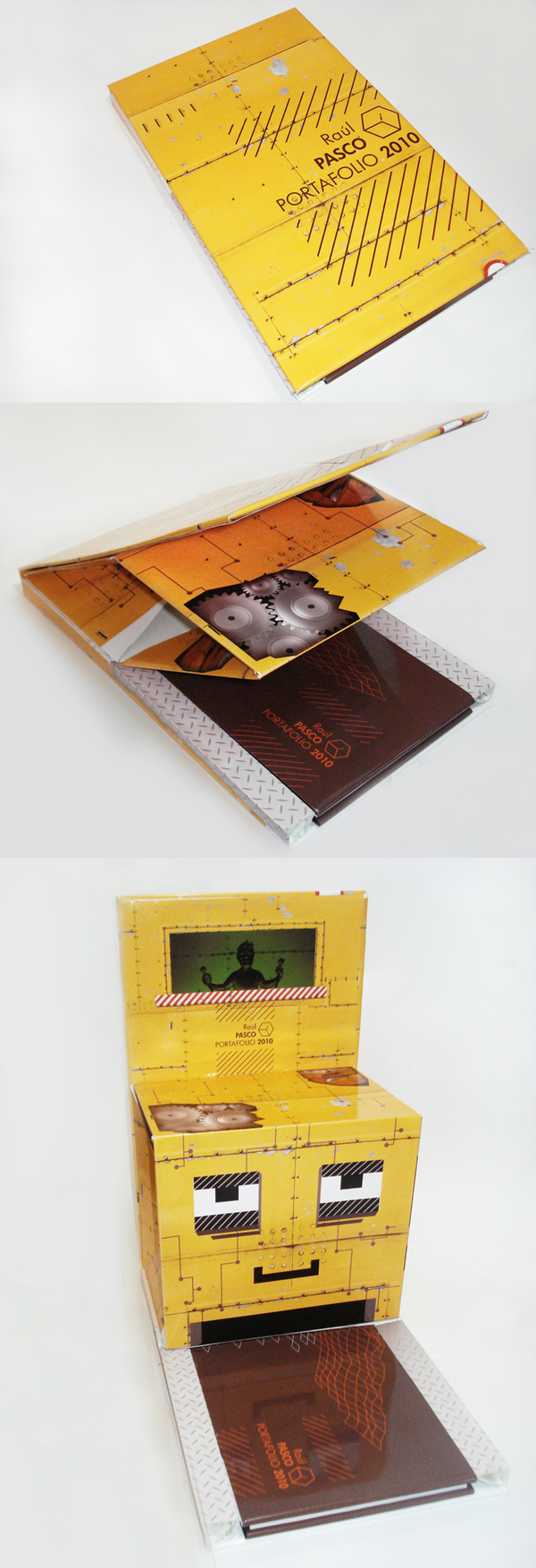
Photo Credit – Raul Pasco
Everybody always talks about the importance of first impressions, but nobody ever mentions how important second impressions can be. Nothing beats that moment when you completely dazzle and delight your audience by surprising them with a brand new element. Pretend your portfolio is telling the audience a story about the work you do—hook them in with an unexpected twist.
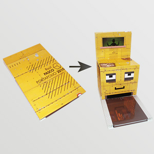
This print portfolio may look unassuming from the outside, but when the audience opens it up, a 3-D robot pops out at them. It’s this kind of spontaneity that potential clients really remember.
Best of all, the surprise comes from an interactive element, which means the audience will develop a stronger connection to it since they had a hand in bringing it to life.
4. Redefine what a portfolio can be

Photo Credit: Alper Yildirim
Arguably, a portfolio can be anything so long as it is able to show off your work in a positive light. Since the form of the portfolio itself is malleable, it should change to fit your work, not the other way around. Your printed portfolio should take on a form that will help enhance your ideas and identity as an artist.
In this example, the artist shows off his architectural designs on one large sheet of paper, which uses stylish folding to create a neat package. This kind of presentation makes sense for an architectural designer, because their clients are used to looking at blueprints, floor plans and other large format print media. A portfolio like this would resonate to that type of client because it feels familiar and therefore, more appealing.
5. Tell the story behind your work
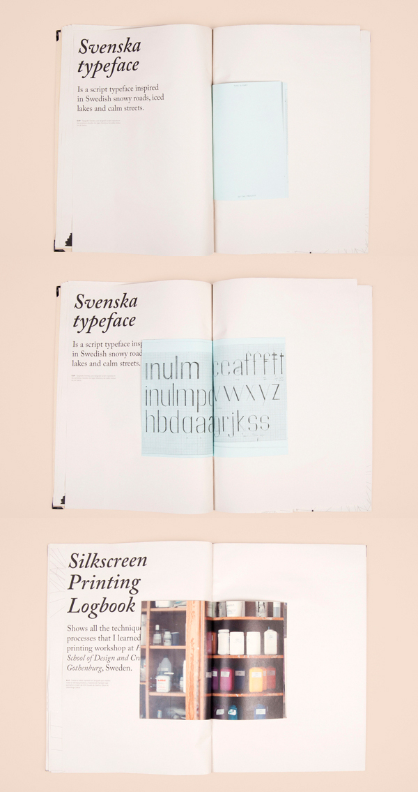
Photo Credit: Marta Vargas
Remember that the people looking at your portfolio will be much less familiar with your work than you. Just because something looks good doesn’t mean your clients will know what they are looking at or how it came to be. Include these details in your portfolio so that your client has some insight into your process get a better idea of what to expect from you.
This printed portfolio uses a layout with stitched inserts that first presents the story behind each work, then invites the audience to look inside and see the work for themselves. This sort of picture book quality allows the audience to become invested as they follow the story of how the work came to be, in a format that is easy-to-follow and not excessively wordy.
Remember how your teachers in school always told you to “show your work?” Knowing how something was made and learning about the process that the artist undertook can help the audience to become more personally invested in it. It’s not just about the end result but also the work that went into it.
6. Don’t neglect digital media
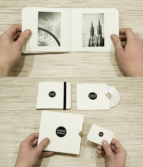
Photo Credit: Michal Kulesza
Just because your portfolio is printed doesn’t mean you should neglect all of the digital work you’ve created. You won’t be committing some taboo if you print screenshots of your digital work in your portfolio. But at the same time, digital media should ideally be viewed on a digital device; at the very least, you should have a URL or QR code linking to your online portfolio.
Your best bet is to just include your digital work alongside your printed work. This portfolio contains a small sample of printed work with a CD containing more examples of digital artwork. Since the CD and portfolio are designed to bundle together, it means that one is never far from the other.
And there is something to be said about the physicality of digital media. An online bookmark is easily forgotten, but it’s easy to hold on to a CD that you can actually “hold” in your hands.
7. Make your work sharable
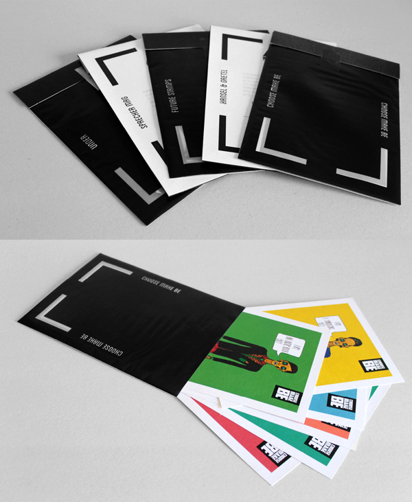
Photo Credit: Raquel Boavista
One of the perceived benefits of an online portfolio is that each piece of work you share online can stand on its own; it can easily be shared through social media or displayed on other sites. But the works from your printed portfolio can also be shared, so long as you design your portfolio in such a way that allows for it.
Take the example portfolio, which contains several different loose prints of the graphic designer’s work divided into different envelopes. The prints double as postcards, allowing the client to send the artist’s work to others or even display it as décor. When the samples in a print portfolio are as sharable as possible, they’re that much more likely to be exposed to others.
8. Give a reason for keeping the portfolio
The physicality of a printed portfolio makes it hard for a client to part with it, even if their initial impression of you is chilly. The only way for clients to get rid of a physical portfolio is to throw it away; to many people, that can seem like a waste. You can exploit this Achilles’ heel in your clients by giving your portfolio a secondary function so that they will want to hold onto it for longer.
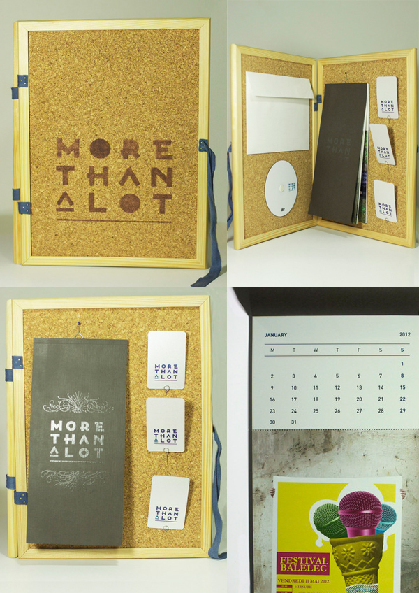
Photo Credit: Randall Barriga
In the first of our examples, the artist has not only used a corkboard carrying case to make a good first impression, he’s printed each work in his portfolio as a page on a calendar. This gives the recipient a reason to hold onto the portfolio for at least the rest of the year, and each month when the calendar changes, the client is given a reason to think of the graphic designer once again.
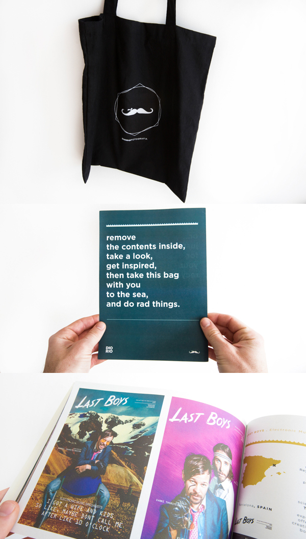
Photo Credit: Kyle Diorio
This design portfolio comes in a canvas tote bag with explicit instructions for the recipient: take it with them when they’re out doing “rad things.” Not only does this encourage the client to hold onto a part of the portfolio for a long time, but also to think of the artist during recreational activities, when they’re in a cheerful mood and more likely to react positively.
9. Show off more than one talent at once
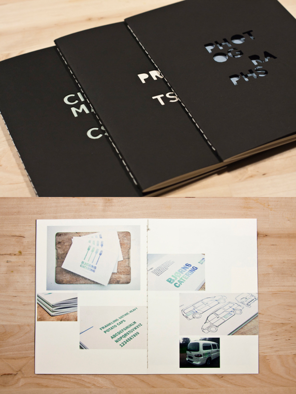
Photo Credit: Katrin Kreiner
If you are a designer of many talents, it behooves you to show them off. Do you sew? Can you bind a book? Do you know how to create your own custom die cuts? Incorporate these skills into your portfolio—you probably won’t find a client who wants to utilize all of them, but you will be demonstrating that you can go above and beyond.
Here’s a print portfolio that doesn’t shy away from showing off the fact that it was handmade. Each of the artist’s three portfolio booklets were bound and die cut by hand, a fact that the graphic designer chose to display proudly with a custom-made label. This kind of thoughtfulness and attention to detail shows clients that you’re willing to learn new things and unafraid to get your hands dirty.
10. Give the audience something to interact with
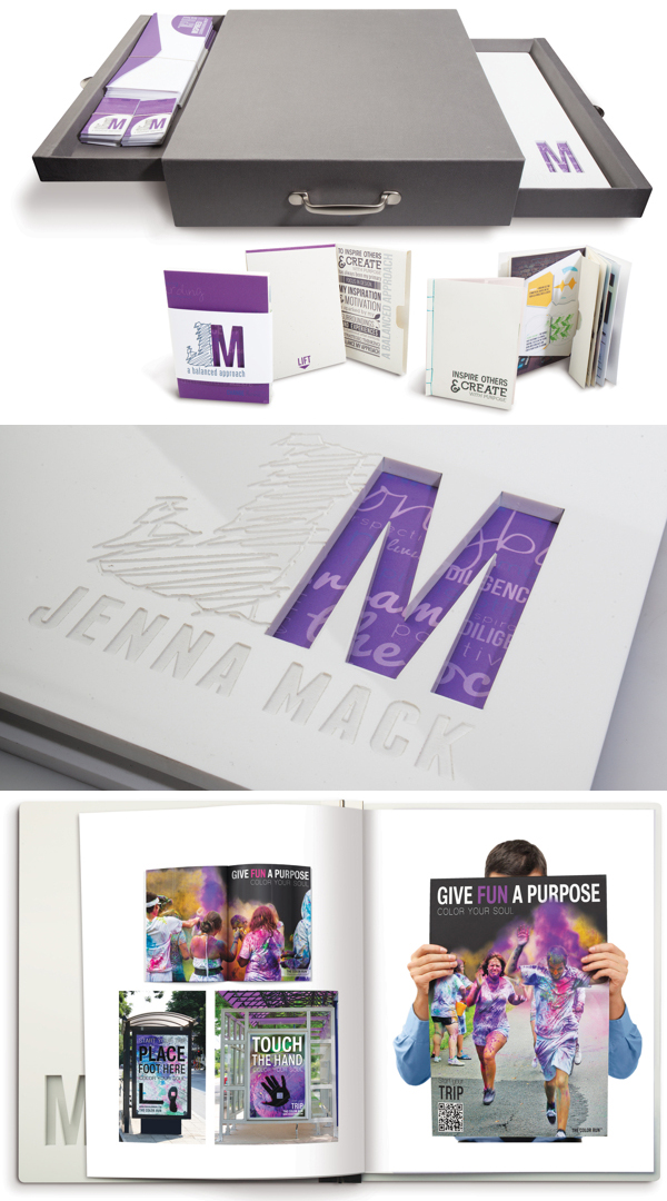
Photo Credit: Jenna Mack
When we discover something for the first time, we use all five of our senses in unison to create a sense memory. The more senses affected, the stronger the memory becomes. Since printed portfolios are physical objects, they offer an advantage over digital portfolios by stimulating the sense of touch.
In this example portfolio, the artist uses a series of different techniques to provide interaction—from creative die cutting and embossed effects, to the uniquely built carrying case that opens both drawers at the same time. Providing the audience a chance to experience the portfolio with their hands as well as their eyes makes the work much more appealing and memorable.
Final Thoughts
Although you will need to break the mold if you want to craft a truly creative printed portfolio, remember not to sacrifice functionality. It’s not enough to just be creative if that creativity makes it difficult to understand or utilize your portfolio. Your clients want a graphic designer that can help them get their message to the audience. Why would they think you can do that if your portfolio fails to deliver your message to them?
Do you have a print portfolio you’d like to show the world? Have any tips for creating an imaginative portfolio layout? Share your pics, tips and ideas in the comments below!



After designing these non-traditional kinds of portfolios, how do you get materials like these printed/made? Most typical printing services don’t seem to cater to these forms…
Many local printers do offer custom printing services, though it can get expensive. If you only need a few portfolios, you could ask your printer to print your design on a flat sheet and then cut and fold it into a unique shape yourself to save money.
Have you ever had any examples of success/client interest with printed portfolios that you just wouldn’t have got with an online portfolio? In theory this seems like an amazing idea (I’m experienced with printed media and would love to see my more elaborate designs printed) but is it worth the inevitable investment into costly custom print jobs?
It’s not always the best choice for everyone (especially designers that focus more on web work), but at least one of our designers has been enthusiastically offered a job because the client was impressed with their printed portfolio. In situations where it makes sense (particularly for designers with a wide range of print work), we highly recommend it.
For interviewing purposes, do you think it’s best to have a portfolio the company can keep (like most examples above) or a book the designer shows but takes with? I can imagine I will have to tailor each book to each company depending on what they are looking for.
Generally, potential employers won’t expect you to leave your portfolio with them. A portfolio that you can take home after the interview should suffice.
On my latest interview I presented my work from within a brushed aluminum case. Of the 8 pieces that were clearly labeled I was able to speak about my work and focus on leaving a strong impression. At the end, I gave to each person in attendance a handmade magnet with my own cow photograph with the caption, Be Outstanding In Your Field. With that personal touch of humor I aced the interview and I got the job.
Very useful tips! We had the pleasure of completing Jenna Mack’s custom portfolio so it’s great to see it featured in your article 🙂
I feel like a lot of these are terribly pretentious. A company wants to know that you can do the work, be on time, be precise AND have great ideas. Folding my resume into a robot is cute but I want to impress them with my work ethic as well.
Is it seen as too pushy to mail unsolicited a printed portfolio / personal promo piece (e.g. a postcard) like the examples above to companies one would like to work for? I’m considering making putting together a more advanced print portfolio for my work, but I’m hesitant to start without figuring out how it’s going to be used and given out. Maybe a set of postcards would be a good start, to just mail out to companies?
It depends on the company, but many design firms welcome unsolicited portfolios.
Check out this article for more info:
https://www.core77.com/posts/26319/how-to-land-your-dream-design-job-eight-tips-for-getting-hired-at-a-top-id-firm-26319
Vladimir; A very good summary of how to assemble and use a printed portfolio. I would like to use your 10 points in a portfolio prep class at Dunwoody College, in Minneapolis. My only suggestion would be to add at least one example of the hand drawn thumbnails to roughs to comps process. This will illustrate your thinking and can spark a conversation.
Love this collection of inspiring examples – thanks! For number 9, what kind of binding is that? Would most printers be able to accomodate that?
Thank you.
I’m not positive about the specific type of binding but it was definitely done by hand, which some printers would be able to do. You may want to contact the designer directly for more information.
I’m not a graphic designer, but work in creative and would love to know where these were printed? Any online printers doing this kind of custom work?
You’d have to contact the designers directly to find out where they were printed (check the link under each photo), but searching “custom portfolio printing” seems to turn up some promising results.