Creating a personal logo is the easiest task you’ll ever undertake as a graphic designer—and the hardest. The good news is, you can be as free and expressive as you like. After all, you are the brand in this scenario, which means you know more about it than any other client that you’ll design for.
But that means expectations are high, and the pressure is on. As a graphic designer, your logo isn’t just the centerpiece of your brand identity; it also doubles as a sort of portfolio piece that gives the audiences their first taste of your design work.
We want to make sure you’re up to the task. Whether you’re just starting to create your brand or you think it’s time for an upgrade, these tips will help you design a personalized logo that is professional, creative and an accurate representation of who you are—both as an individual and a brand.
For a quick and easy rundown of these tips, be sure to download and share this helpful summary graphic. Or, if you’re feeling a little too close to the project, take a step back and let our logo services team help you create your personal logo.
Write a creative brief

You wouldn’t jump into any other design project without first outlining a creative brief with your client to find out what they want and what kind of message they want to portray. The same principle applies to your personal branding—you have to act as if you are your own client. You need to figure out who your audience is, what you want them to know, and how you want them to perceive your brand.
It can be easy to get off track because the process is so, well, personal that you forget the logo is part of your corporate identity and not just another creative expression of your self. Not only can a creative brief help inspire you with potential ideas, it also gives you a metric by which to gauge whether or not your design works for your brand’s needs.
Keep in mind that a good brief will cover more about the project than just the creative parameters. It’s also a handy tool for keeping track of due dates and budgets. Even when you’re acting as your own client, it’s still a good idea to set these boundaries for yourself so that you don’t spend all your time and money on this one logo.
Specify which variation of your name you want to use

There’s a common misconception that to be professional, you have to use your full, given name in your personal branding. But like an author who uses a pen name, you get to choose what you want to go by. That might actually be your full given name, but if you prefer to be called by a shorter version or a nickname, there’s no harm in making that a part of your design instead. If you’d rather keep your personal and professional lives separate, you can use a different name than the one you use with your family and friends.
Then, try out various ways of displaying it. Write the whole thing out, middle name and all. Try shortening it to just your first two initials and a last name. Evoke your inner diva and use just one name, like Cher does. Seeing different versions can help trigger your creativity and guide your design decisions.
Exploring all of the different ways that you can express your identity can also help to smooth out the weird disassociation that comes from thinking of your name as a brand instead of just the thing you’ve been called your entire life. Choosing your own name is an empowering experience and allows you to control the level of personal investment you have in your brand identity.
Make sure you include your name in some way
We hate to break it to you, but you’re not Apple or Nike or any other big name brand that can get away with a logo that features only a symbol and nothing more. And chances are that unless you’re music legend Prince, there isn’t some artistic symbol out there that can sufficiently describe who you are as a professional and a person. That means that your marketing materials pretty much have to feature your name in some way, so audiences can draw the connection between you and your business.
Once again, the name you decide to use is up to you, and you can even control how much of that moniker actually makes it into the logo. You can use as much or as little of your name as you like—just so long as there’s enough of it so that the audience can make a clear connection between you and your logo. Even a two-letter logo made from your initials can do the trick.
Don’t worry if you think your logo looks best without any accompanying text, as you can always utilize multiple variations of it for different purposes. A nameless version won’t ever really work as the primary representation of your brand, but it may work as a watermark, social media icon, or for other situations where you might not want your full logo displayed.
Find inspiration
Nailing down that one perfect idea that forms the basis of your design is often the hardest part of creating a logo. General brainstorming techniques such as creating a mood board or word cloud can help, but a few tricks are especially useful when it comes to self-made logos.
Look at what other designers are doing

A great way to start is by looking at what your fellow graphic designers have created. Search galleries such as Behance or DeviantArt and take note of the personal logos that grab your attention … and the attention of the design community.
Obviously, you should never rip off someone else’s entire concept. It’s fine if you’re inspired by a certain shape or a font that catches your fancy, but if your logo looks like you just swapped out the letters in someone else’s design, then it’s hardly “personal” anymore, is it?
In fact, you may get the most benefit from looking at other logos if you’re mainly looking for what not to do. Scoping out the competition gives you a chance to recognize common tropes and clichés, which better enables you to go against the grain and set yourself apart.
Draw inspiration directly from your name

Sometimes the best place to look for personal logo inspiration is in your own name. If you’re lucky enough to have a name that’s a homophone or a homonym, you can easily work that to your advantage. For example, Jane Doe might incorporate a female deer, but so could Jane Dier.
If your name doesn’t have any pun appeal, you could try looking into the meaning behind it. For example, Regina Zimmerman might add a crown to her personal logo design, because Regina means queen.
Be careful about going too far off target when drawing inspiration from your name. Just because your name is Mike Smith doesn’t mean you should have a microphone or a hammer and anvil in your logo; you might confuse your audience into thinking you’re a DJ or a blacksmith.
Focus on what you do

If your name isn’t exactly a wellspring of inspiration, try digging up ideas by focusing on what you do instead of who you are. Take a look at our roundup of the best personal design logos, and you might notice that a lot of designers incorporated imagery of a pen or pencil to identify themselves as designers.
But representing your craft in logo form can be a challenge because designers mainly work in concepts and creative ideas. If everyone added an art tool like a pen or pencil to their graphic designer logo, it’d be a pretty boring world. Fortunately, you don’t always have to hit the nail so directly on the head.
What you do extends beyond just the act of creating—it’s also about what you make. For example, if you specialize in print design, your logo could use images of paper or ink. If your talent is flat design with a quirky sense of humor, then your personal logo should match. Or maybe you’re the kind of designer who never misses a deadline—you could incorporate a clock or calendar.
You don’t even need to pull directly from your professional life; the idea of “what you do” can reach into your personal passions or hobbies. Just be careful that you don’t draw focus away from your message so much that it confuses the audience. For example, a designer who also dances ballet wouldn’t necessarily want to use a pair of ballet slippers for her personal logo because the audience might think she runs a dance studio or teaches ballet. But she might add a ribbon to reference her life as a dancer without letting it overshadow her message.
Ask others what they think of you
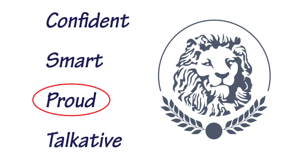
It’s not always easy to hold up the mirror and analyze yourself, so take a step back and ask some people you trust for their input. When trying to come up with a visual representation of who you are, the ability to see yourself the way that others see you is a valuable asset.
Ask your friends and family to make a list of words that they think best describe you, then compare the results and find out which traits pop up the most. Chances are that when you meet with potential clients, these are the qualities that they too will see in you, so your personal logo design should bring those to the forefront.
When in doubt, make it look like you

A great way to create a personalized visual identity is to take ideas from your physical appearance. We don’t mean using a photograph like a realtor or anything, but an illustration or cartoon of yourself can be an easy way to reinforce your identity.
If you’re not keen on putting your pretty face front and center, then try isolating your look to just one or two stand-out features. For example, we saw a lot of faces and glasses incorporated into the designs in our roundup of the top personal logos.
What kind of personal look you are known for? Your lucky tie, your favorite pair of shoes, even the tattoo you got in college can all become sources of inspiration. Take some time to consider the reasons why you like to dress the way you dress. Do you gravitate toward a certain color scheme? Do you have a thing for polka-dots? What is the best feature of your favorite t-shirt? The answers to these questions can inform your personal logo design.
Give it that handmade touch
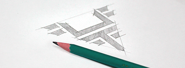
Even though graphic design is primarily done on computers these days, it’s sometimes good to get back to your roots and draw out your ideas by hand with a good old-fashioned pencil and paper. Not only does this free up your creative process and allow you to let your ideas flow, it gives you the opportunity to put a little personal touch on the project.
Sure, you’ll eventually have to convert your sketch into a vector image so you can actually use it in your collateral, but you may find that the handcrafted look suits your particular style of branding. For example, many designers like to incorporate hand-drawn illustrations or their own penmanship to give their logo that unique touch.
Just keep in mind that there is such a thing as being too personal. You may want to avoid using your actual signature, as that could lead to security troubles for you in the future.
Refine your concept
Once you’ve got a basic idea that you’re happy with, it’s time to start polishing that concept . This is never quite as fun as letting your brain run wild with ideas, but it’s the only way to bring your personal logo to life.
Remember the basics
The rules of design don’t go out the window just because you don’t have to worry about someone else rejecting your work. The same principles that apply when you’re designing the ideal business logo still apply when you’re creating one for yourself. Remember to:
- Consider your target audience
- Keep it relatively simple
- Focus on just one or two specific ideas
- Maintain proper balance
- Set trends instead of following them
- Be mindful of shape, font, and color psychology
- Use negative space to your advantage
Try to be evergreen

This is one of those essentials you should keep in mind for any logo, but it’s especially important to remember when creating your own. Just because you have the luxury of changing your design every time you see a new trend pop up doesn’t mean you should. Your brand identity is not some outfit you can just slip into every time you feel like having a new look.
For one, it’s costly to rebrand all the time. Each time you change your logo, that’s more unused print collateral with your old look that you’ll have to toss in the recycling bin (or the garbage can, if you’re a Captain Planet villain). That’s a cost you don’t want to eat as a professional designer. Not only that, it can damage your brand awareness if you’re constantly changing the idea of what your brand stands for.
Think toward the future of your brand and how you’ll want to be represented in ten years. Because even though you’ll certainly evolve your branding over the course of a decade, the seeds you plant now will inform your future designs. Even the best logo redesigns ever keep the strongest elements from their brand’s past, so take the time to find the kind of design that you’ll want to build upon in the years to come.
Don’t be afraid to make it as weird as you are

Your personal logo design should be just that—personal—so don’t waste your time trying to stuff yourself into a brand identity that’s an inaccurate portrayal of you and your talent. Being professional doesn’t mean you have to strip the fun out of your personality. It just means you have to show your audience that you have what it takes to get the job done.
Your personal logo can be just as creative or funny or weird as you are. After all, your future clients are going to meet you eventually, so if your logo is conservative and classic but you’re loud and eccentric, it’s going to throw them for a loop. Not only that, but you’ll be missing out on the kinds of clients that get your particular quirkiness.
Don’t hide behind a design that you think your future clients would want to see. Instead, step into your own brand identity and let your personality shine through.
Plan on having several rough drafts
Nobody ever expects to get a logo completely right on the first try, but you might find yourself creating more rough drafts than usual for a personal design, especially if you tend to be your own worst critic. You may not have a client looking over your shoulder, but you’re technically the client… and you can’t escape yourself.
When you work for a client, you typically have a branding book or a style guide to work from. When you work on a personal project, you’re often creating the branding at the same time, which means you’ll need more room for experimentation.
Just embrace the fact that you’re going to have several rough drafts—which, again, is why it’s a good idea to work with pencil and paper first. Work through all of your ideas, the good and the bad, until you start to get a feel for what direction you want to go.
Select your color branding
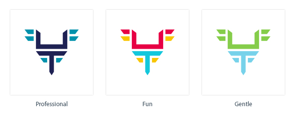
Every brand, no matter how big or small, can benefit from solid color branding. You’ll need to figure out what color best suits you, which is easy if you’re one of those people whose wardrobe, home décor, and automobile are all in one signature color. But for the rest of us who aren’t Power Rangers, it can be a little harder to find what works.
Your favorite color is a good place to start, but inspiration can come from anywhere. You could match your logo color to your eyes, your birthstone or even your favorite food. Your choice could also come from the kind of emotion you want to evoke from your audience or the type of image you want your brand to project.
Keep in mind that for printing reasons, you’ll want to pick a Pantone color to ensure color consistency across print jobs.
Your logo also has to look good when printed in all black ink, for the occasions when you won’t be able to print in color. For that reason, make sure you work in black-and-white first, before you start experimenting with hues.
Evaluate at the end
Evaluating your finished product can be tricky when you’re your own client. You can’t exactly hold a meeting to present your logo to yourself. No one else can give you the final thumbs up or thumbs down.
You can, however, fabricate the conditions of a design presentation by giving it a little time before you make any final decisions. At the very least, you’ll want to sleep on it. But if you can, give yourself a full week.
Try to evaluate your logo objectively—it doesn’t matter how much you love a design if it won’t work with your brand. Refer back to your creative brief and hold yourself accountable to the goals you set for the project. And it never hurts to ask a trusted friend or colleague for some feedback before you finalize your design.
Download and share this guide to personal logo design

This work by Company Folders, Inc. is licensed under a Creative Commons Attribution 4.0 International License.
Embed this graphic on your site
Do you have any lingering questions about creating a personal logo? Have a hot tip or interesting anecdote that you think will help your fellow designers? Leave a comment below and let’s get personal about our logos.


This was an awesome read. I decided to go with my initials (JH) to create a 1 color logo/icon in black. I used a paint spatter (because of my love of graffiti) with JH as a knock-out. It’s been getting me a lot of complements.
Hey John,
It would be awesome if you could post your logo along with your comment so that we can see where you went with it! Always love looking at designer’s inspirations and end products.
Hi Vladimir,
Thank you for the post, Its detailed and you have mentioned some really good point on logo designing. I prefer doing some sketches before taking final steps on converting a logo into vector. As custom logo always work best for the company.
Hello Vladimir
Very useful tips. We too also follow the same while designing corporate logos. Indeed a great post. Lots of logo designers will be getting leverage out of this post. Thanks for the writeup.
Thanks
Regards Martin
It is a nice article but unfortunately it cannot help a person who is not a designer but want to create their logo by themselves…Maybe you can write something about how to create a logo if you are not a designer. thanks!
That is exactly what I was thinking also excellent comment.
The blog is detailed and you have mentioned some really good point on logo designing. I prefer doing some sketches before taking the final steps on converting a logo into the vector.
I appreciate that you explained selecting a color for the brand logo based on your favorite color or the emotion you want to evoke. My startup cookie delivery business idea is about to come to fruition this year and I’m having a hard time selecting a good logo for my business. I want a good logo that evokes a warm feeling and emotion and is easily recognizable. I should hire a professional to draft some good ideas so I can make a final decision.
Taylor, congratulations on your cookie delivery business taking off this year!
A logo is the ultimate representation of your brand. Our expert team would love to help you with ideas and design of the perfect logo for your new business. You can learn more about our Logo Design Services and schedule a free consultation here: Custom Logo Design Services
Hii Vladimir,
I really liked reading this article, I have been thinking to design my website logo myself and found some great tips in your content. I like to work with a sketch before starting the work on my client’s project and loved how you mentioned that it should be the same for your personal project as well, That makes a lot of sense. Thanks a ton.
I love using your graphic for my students when they do self-branding but it always bothers me when I see the two p’s in bookkeeping and I have to tell them to proof read better than you did!
Thank you for pointing this out, DeAnn, and glad to hear you’re using the graphic!
Hi Vladimir, a well-written and thorough resource. I really appreciate your hard work behind it. The personal logo is always different. In the Real Estate industry, most agents and individuals want their names to be designed with a personal logo. They always want to market themselves with their name only. Your content is really helpful to me and, I will be forwarding it to my design team.