When big name brands redesign their logos, the world takes notice because it means that something about our shared culture has changed—it reminds us that the world is changing around us. That can be a scary thing for people, so when popular brands successfully create a great new logo, we sit up and take notice … and when they fail, we notice it even more.
We rounded up examples of the worst logo redesign failures and the best “wins” from the last couple years to show you the how to handle a logo redesign project with grace and skill (or, alternatively, how to completely run it into the ground).
10 Worst Logo Redesign FAILS
Giving a logo a makeover can go horribly wrong in any number of ways. Here are some recent ill-advised redesign disasters that totally missed the mark.
DeviantArt

If you’re going to change your logo and your target demographic is one of the largest online communities of designers and artists, you better be prepared to bring your “A” game.
The new DeviantArt logo does bring an “A” to the game, but the “D” is kind of hard to see, which has been a point of contention with the design community. Many users claim they can’t even see the “D”.
But the worst offense is that the new DeviantArt logo looks strikingly similar to the logo for Russian design studio platzkart.ru. Whether they plagiarized the logo or not is up to you to decide. Either way, it’s clear that the concept looks much better suited to platzkart.ru than DeviantArt.
Reebok

It’s not like the old Reebok logo was all that special—it always sort of looked like a weird combination of the Nike Swoosh and the three lines in the Adidas logo. So it makes sense that Reebok would want to redesign their logo to stand out from the competition.
But instead, they swapped out one generic-looking logo for another. The new Reebok logo would look more at home on a bank teller’s polo shirt than it does on a pair of tennis shoes. Somewhere along the way, Reebok forgot to ask themselves one crucial question: “Would anybody actually want to wear this on a t-shirt?”
The answers is a resounding, “Eh, not really.”
Black and Decker

That old familiar Black and Decker “bolt” logo has been with the company for decades and has always been a symbol of the brand’s dedication to quality—appearing on all of their power tools as a sort of stamp of approval. That is, until recently, when the business decided to modernize and threw out the baby with the bathwater.
It makes sense why Black and Decker would want to upgrade, now that the company is known for home and kitchen appliances in addition to power tools. But the new look is so generic that if you didn’t already know the company by name, you’d never know what they actually make or why you should care.
Not to mention trading in the ampersand for a plus sign is a bit awkward—it makes you want to read it as “Black plus Decker.”
JCPenney

Back in 2012 (under the helm of CEO Ron Johnson), JCPenney’s logo was changed to a simplified square design that rebranded the company as “jcp.” The response was lackluster, so when Johnson stepped down as CEO, the unsuccessful logo was redesigned once again and the name was once again changed back to JCPenney.
The old-new logo wasn’t all that bad—a bold change, but a bit refreshing. And this new-old logo does a good enough job of bringing the company’s established identity into the modern age. The problem here is the constant flip-flopping between different logos. The confusion left in the aftermath has damaged the brand’s identity, and it couldn’t have been cheap to rebrand so many times over such a short period.
AirBnB

Don’t worry if your initial reaction to this logo redesign for AirBnB was to giggle like a 13-year-old boy who just discovered he could write dirty words on a calculator. It doesn’t matter who you are, what your background is or where you come from, we can all agree on one thing—the new logo for AirBnB looks kinda dirty.
We don’t want to be rude, but if you look at it a certain way, it looks like a such-and-such. Look at it a different way, and it resembles a pair of you-knows-whats. To make matters worse, the logo actually has a name and origin story. It’s called the “Bélo” and it’s supposed to represent “the universal symbol of belonging.”
To us, this sounds like a coded message that says, “We wanted our logo to be provocative so that everyone will talk about it.” Well, mission accomplished. But when people stop talking about it (and they will stop talking about it), then AirBnB is going to be stuck with a logo that looks like a—you know.
WWE

The old, messy, scribbled logo has put in a lot of years at the helm of the WWE brand, so it was about time to put it into retirement. However, the updated look takes away the raw, rebellious energy that the old logo carried for something a bit more sleek and corporate—and a lot less fun.
What we really hate about this awful logo is that it looks so dated. The polished chrome look is so last decade that it’s more of a lateral move than an actual evolution of the brand.
Monster

When you think of Monster, you think of resumes, jobs, employment—or at the very least, from the name, you might think of an actual monster or creature of some kind. Is there any person out there who thinks “waving flag” when they think of Monster?
In a world of flat logo design, the new Monster logo is anything but. It’s practically unprintable and while it’s supposed to imply motion, it just looks kind of melted and warped.
There is an animated version of the logo, but if you’re not viewing it in motion, then you’re only viewing a single frame. There’s not even any consistency regarding which frame you’re going to be viewing, so there are multiple versions of this inferior logo floating around—and each one of them looks like a weird, distorted, crumpled piece of paper.
Oxford Dictionary

In an effort to be hip and modern, the Oxford Dictionary completely destroyed all of their credibility and prestige with this updated logo that completely misses the mark. Our main issue with the redesign is that it looks like a mix between the Beats by Dre and Target logos, with Twitter’s color branding thrown in for good measure.
It’s one thing to shamelessly pander to a younger demographic (and let’s be frank, targeting the youth market can only go so far for a dictionary company). But if you’re going to go for the younger audience, at least give them something new. Don’t just try to repackage the brands they’re already into.
Yahoo!

When Marissa Mayer took over as the new CEO of Yahoo, she made a big stink over changing the logo—going as far as to unveil 30 different logo designs over the course of 30 days, with the final design being released on the last day.
Unfortunately, the hype train crashed as soon it pulled into the station and the logo was met with yawns from the design community, who liked some of the scrapped logo designs better. Even worse, Mayer incised the design community even further by making a big deal about how the logo was put together in-house over the course of a weekend.
It shows. While the new logo isn’t terrible, it isn’t very exciting either—definitely not worth the hype it was given.
Cleveland Browns

The Cleveland Browns recently changed their logo design to—basically the exact same logo design, just a little more orange. We get the need to upgrade your brand colors, but the Browns missed a perfect opportunity to create a more exciting logo than the one they had before.
The team is represented by an orange football helmet—it is quite possibly the most boring logo design in the entire NFL, maybe even all of professional sports. Instead of injecting new life into the franchise, the team’s owners decided to go from an orange football helmet to a different colored orange football helmet.
Want to make sure your logo redesign doesn’t end up on this list of all-time worsts? Use our logo design services to make sure your new logo is a crowd pleaser, like the ones below.
10 Best Logo Redesign WINS
Now that you’ve seen what not to do when redesigning a logo, here are some famous companies that got it right.
Netflix

Remember when Netflix used to be primarily a mail subscription service? Those seem like such antiquated times now that Netflix is the reigning king of streaming media technology and original content. And so, a logo update was long overdue to match the company’s new high-tech direction.
The old drop shadow design evoked the feeling of movie theaters and was designed to pop out at the audience when placed over Netflix’s signature red envelopes. The new logo flattens things out and brings the red color branding to the forefront, injecting new life into the brand’s identity.
Pizza Hut

What makes the new Pizza Hut logo work is that it holds onto the past while still keeping with modern design trends. Pizza Hut has always been known for its signature slanted roof (both on their buildings and in their logo design), so it was a smart idea to hang onto that identity for this redesign.
It was also smart to cut down on the amount of colors while keeping the emphasis on red to evoke feelings of hunger. The logo maintains the flat design look that’s all the rage these days while still being fun and playful.
Olive Garden

The new Olive Garden logo is a bit controversial, with some camps hating it and others loving it. But we think it’s a good move for the brand for one big reason—their old logo wasn’t much of a logo at all. It was more of an elaborate outdoor sign that somehow became the restaurant chain’s go-to marketing image.
The new logo might have gotten off to a rocky start, but we think it’s fitting with the brand’s new direction towards healthier fare options; it’s not far away from any other brand you might find in your home kitchen these days. But what we like the most is that there’s an actual olive branch incorporated into the design, replacing the grapes as a more name-appropriate option.
MailChimp

At first glance, MailChimp’s logo redesign might not appear to be a redesign at all; the old and new logos look almost exactly alike. But on closer examination, designer Jessica Hische has made several subtle but effective improvements. The new logo is lighter and more legible, but keeps the same personable energy of the original.
This is a good example of how redesigning a logo doesn’t have to mean completely overhauling your business’s identity. It can also involve making minor changes that maximize the potential of what you’ve already built.
Bacardi

We can admit that a few of us around the Company Folders office were shocked to discover that the Bacardi logo had actually been a bat the entire time. The old logo didn’t make that especially noticeable, but the new logo redesign is like the kind of sketches Darwin made in his journals.
There’s a reason it looks a little vintage—because it’s actually an older logo design brought back to life. It’s a bold move by Bacardi, but one that certainly pays off, especially when you consider the brand has to compete with craft beers and artisan liquors these days. This new-old look makes Bacardi look a little more sophisticated and quirky, which is the right combination for selling alcohol in today’s market.
Marriott Hotels

It’s understandable why Marriott Hotels would want to redesign their logo to represent one unified image, since that’s commonplace in the hotel industry. Having a single signature symbol makes it easy for customers to find your hotel chain when they’re driving on the highway; plus, it looks good on a pillow or an ice bucket.
The redesigned logo cuts down everything from the old logo except for the letter “M,” which is much more effective on its own. As part of the word Marriott, you never really notice how fancy the “M” is, but when it’s isolated, it makes for a strong monogram.
TGI Fridays

If you’re one of those people who cringes at bad grammar, then the redesigned TGI Fridays logo will probably drive you insane; the company has dropped the apostrophe and periods from the logo entirely. It might be incorrect in terms of punctuation, but it does make for a cleaner design. It also complements a fun brand like TGI Fridays by showing that they don’t “play by the rules.”
Besides updating the logo’s shape to something a little more sleek and modern, this redesign has streamlined the font into something more cohesive and simple. The old font face was feeling a bit of date with its varying letter sizes. The new logo is still friendly and accessible, but also more modern and legible.
Tampa Bay Buccaneers

Now this is how you handle an NFL logo redesign. The Tampa Bay Buccaneers recently traded in their old illustrated logo for something a little more vectorized and polished. The skull is more realistic and menacing, the colors are noticeably brighter, and the sword that makes up the handle of the flag now matches the twin swords on the flag itself.
It’s essentially the same logo as before, just a better-looking version of itself—which honestly, sometimes makes for the best kind of redesign. It manages to evolve the brand while sticking to its roots and without alienating the fan base.
Morton Salt

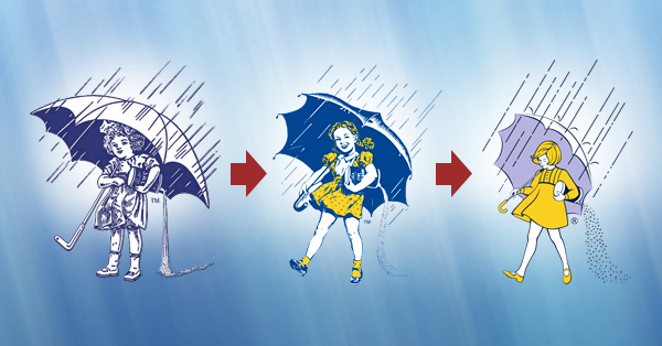
Morton Salt has the kind of logo that’s hard to redesign because it’s such an American classic. Throw out too much of what makes it special and you lose those feelings of nostalgia associated with the brand. Morton Salt’s branding has evolved over the years, and their newest logo is a perfect streamlining of their previous one, bringing the company into the 21st century while still keeping those nostalgic feelings of the past.
The designer of the new logo added a hint of modern flair while also cleaning up the image of the Morton Salt Girl ever so slightly. The previous version had a lot of blue line detail, which darkened the illustration and gave it an old-timey feeling. This new version removes most of the lines, letting her pop out from the dark blue packaging like a ray of sunshine
Fandango

We love logos with hidden meanings and thanks to this redesign, the Fandango logo is now much more than meets the eye. The “F” for Fandango has always been a ticket stub, but now there’s a second letter “F” made from the negative space, creating two interlocking F’s.
Even apart from the hidden image, this new logo is a big improvement. Not only does it trade in the dated drop shadow look for a flat design, the wider font and tighter kerning make the typography look much better.
Your Turn
When you redesign a logo, look to these examples as object lessons. Learn to emulate the positives and avoid the horrible missteps that “redesigners” have already made.


This work by Company Folders, Inc. is licensed under a Creative Commons Attribution 4.0 International License.
Embed this graphic on your site
What’s your favorite logo redesign of all time? What would you consider the biggest logo redesign fail? Comment below and leave your answers—we want to hear from you.


DeviantArt AND Oxford Dictionaries copied existing logos. Please expose their creators. #ijs
What if I justify that Black & Decker’s logo really does have a worse redesign because + in Boolean logic stands for the OR operator, making it look more awkward?
I really like the old WWE logo. I think it is better if they retain it as it is.
The AirB&B logo might look a bit like a ball sack or something else, but if you take in to account all the uses of the symbol – from phones/apps (notifications on your android) etc then it’s actually a really smart redesign and certainly hasn’t harmed them at all.
deviantART doesn’t need a favicon logo badge emblem because it doesn’t work. Their logo should be a clean, simple, single-line wordmark that can also be initialized as dA for favicons as their shortened compact logo. Dailymotion was also a success, so deviantART should look into that, too. Why Need for Speed when you can Dailymotion?
The new WWE logo doesn’t look so bad when it’s flat & plain white on a dark background and vice versa.
If you want a classic, legible logo turned into a complete 180 trainwreck, look at WCW.
I see a lot of wwe fans on this post, me too. I agree I think the old wwe logo is the best but with the attitude era gone, they had to rebrand it for family entertainment. Shame.
TGI Fridays should have never had an apostrophe. It doesn’t belong to Friday. So the redesign actually fixed the punctuation error.