Photo Credit: Jeff Snell
If you’ve ever run your hand across a raised watermark on an official document, then you can understand why embossed binders are so effective. An embossed element encourages your audience to touch and interact with your marketing materials.
However, you can’t just start stamping embossed elements all over your printed binders and hope it attracts new customers. You have to be aware of all the different options available to you and create a strategy that sets your binders apart from the rest.
What is Embossing?
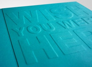
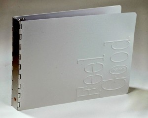
Embossing creates a ‘raised’ effect on the surface of your binder. Photo Credit: Anthony Armendariz
Embossing takes place after your binder has been printed with ink, but before any finishing effects like foil stamping or spot coating have taken place. This gives you a number of binder design ideas for incorporating embossed elements. You can make printed elements look three-dimensional or let the embossing itself take center stage.
Why Emboss?
Our brains compile information from all of our five senses whenever we discover something new or create a new memory. Embossing adds a touchable design element, giving a new sensory component to your binder and making your binder more effective as a marketing tool.
Technically any binder can be touched, but since it’s a common object, there’s nothing new to be discovered or remembered. Similar to pop-up books or uniquely embossed folders made from velvet, binder embossing offers a new and unexpected tactile experience for the recipient. They can literally reach out and touch your audience, allowing them to connect with your brand in a whole new way.
Embossed Text
Embossed binders work best when the effect is subtle. Adding embossing to only the text on your binder cover will draw just enough attention without compromising the design qualities.
You may want to emboss only a single textual element, such as the name of your company or a short company slogan. If you emboss all the text, it takes away the impact and muddles your message. You also want to pick a clear, bold font so that it can be easily read; fancy script fonts are harder to read when embossed.
Embossed Pictures
An embossed picture creates a sort of 3-D effect where it looks like the image is jumping off the page. When utilized creatively, this can really grab the attention of your audience. Embossed pictures typically look better when the picture itself is a bit simpler, such as a logo design.
Photographs and complex imagery can also look good with embossing, so long as you don’t go overboard and try to emboss every line. Instead, try embossing only part of a picture to create the illusion of depth. For example, you could emboss just a person’s hand to make it look like they’re reaching out to the audience.
Debossing
Debossing is the reverse of embossing—creating a concave effect that goes into the stock instead of popping out. It creates a visual guideline for the eye that makes the reader think they can jump right into the design. When applied to a binder, debossing compels the reader to open the cover because it makes them feel like they’re being pulled in.
Since debossing is the flip-side of embossing, the same rules for text and pictures apply–only deboss the most important text and simpler pictures look better. You can also use the process’s unique concave effect to your advantage; for example, a real estate binder with a debossed front door design makes it look like you’re stepping into a house.
Embossing with Foil Stamping
Embossing and foil stamping go hand in hand to create a striking visual effect that’s all glitz and glamor. Metallic foil is shiny and reflective and these effects are only heightened when added to an embossed element. In fact, metallic embossed designs create the illusion of actual metal, which makes your binder both visually striking and professional looking.
Non-metallic foil creates a glossy, vinyl effect for a more subtle look. Although not as reflective as metallic, a non-metallic foil will catch the light on the raised areas of your embossed design.
When adding foil stamping to embossing, you have to be careful not to create too complex of a design. Foil stamping isn’t suitable for images with small details such as very small text or intricately thin lines; it works best on simple designs like large letters and logos.
Blind Embossing
Even though embossing makes a great add-on to an existing visual element, it can also be used on its own. This process is called blind embossing; it’s a subtle look that emphasizes the qualities of the stock itself.
Embossing on its own forgoes the need for ink, which means it’s a more eco-friendly option. By choosing embossing by itself, you’re avoiding adding any harsh chemicals to your binders, which makes them more easily recycled. Less energy is also consumed to create a binder with blind embossing, since inks don’t have to be mixed or printed more than once.
Tips for Choosing Stocks to Emboss
- Textured stocks work well with blind embossing, but the embossing effect can be muddled or lost when used on stock that is too textured. It’s generally best to use long fiber sheets.
- You want a stock that has a 14pt thickness or less. Thicker stocks might be sturdier, but that thickness makes it harder to imprint an embossed design.
- If you’ve decided to use blind embossing, it’s best to stick to a lighter colored stock. Dark colored stocks will still imprint just fine, but it will be harder to see your design on the dark stock as the raised areas won’t catch the light as well. If you absolutely need a dark stock, add a foil stamped effect to your embossed elements to make them stand out.
Tips for Selecting Coatings for Embossing
- If you’re using only blind embossing, you may not need a coating for your binder at all; coatings are typically used to protect printed ink from smearing or rubbing off, so a binder with no ink doesn’t necessarily require a coating.
- However, you may want to use a coating with a unique texture (such as soft-touch or suede) for an additional sensory effect. This makes your binders extra-touchable, further encouraging audiences to interact them.
Conclusion
Embossed binders give you a more diverse set of design tools to work with, letting your creativity run wild. When people are given an embossed presentation material, they immediately want to make a tactile connection with it, which helps you to create a memorable brand experience.
This post is a part of our Binders 101 product guide.

