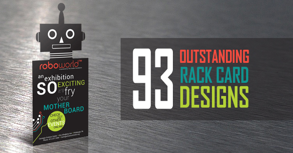
If a business card and a brochure had a baby, that baby would look exactly like a rack card. Rack cards are the best of both worlds, displaying an array of information through a medium that’s portable and fits neatly into the racks found in hotels, travel centers, rest stops, convenience stores, waiting rooms, reception desks–basically any place that gets a lot of foot traffic.
This poses a unique design challenge you won’t find in any other print media. Rack cards are usually found amongst other rack cards, each of which is trying to compete for attention. Your rack card design has to have something about it that will make your audience take notice.
If you’re having a hard time coming up with ideas or finding that X-factor that’s going to make your card stand out, then check out what other professional graphic artists have accomplished with these eye-popping rack card design samples. Be sure to tell us which are your favorites in the comments below!
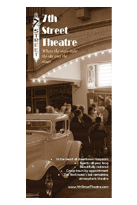
Entertainment and Theater
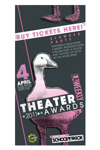
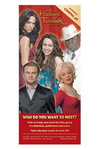
You’ll find plenty of rack cards in the entertainment and theater industries because they make a great, inexpensive way to promote a show or event. These rack cards usually draw in the audience by offering a preview of what’s to come through photography. But it’s not just enough to slap on a cast photo and call it finished-a good entertainment rack card also creates a bit of atmosphere to stir up the audience’s emotions.
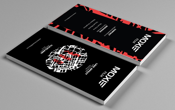
Moxie Film Brand Identity
Les Misérables
Opera in the Ozarks
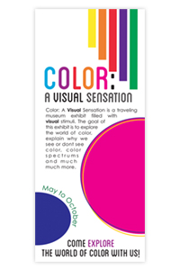
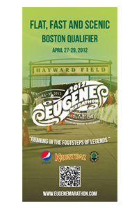
Event
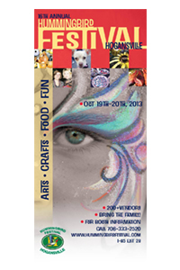
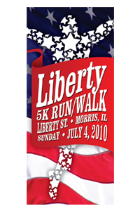
Rack cards are often used to promote one-time events because they tend to be cheaper and easier to print than brochures. A well-designed rack card for a special event will also act as a sort of memento, making perfect scrapbook material. Therefore, your design should match the event’s tone and be memorable enough that someone would want to hold onto it as a keepsake.
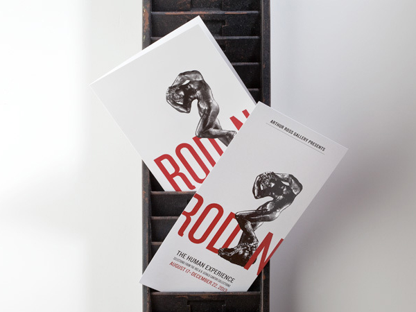
Rodin Exhibit Materials
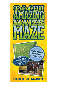
2013 Amazing Maize Maze
Food
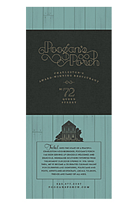
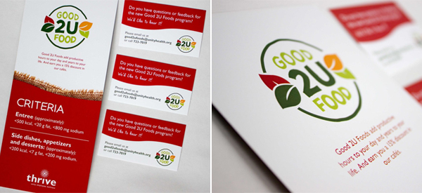
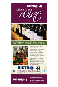
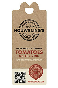
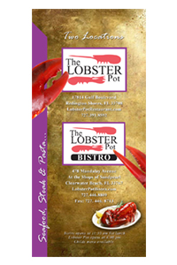
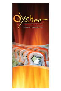
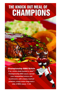
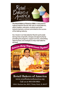
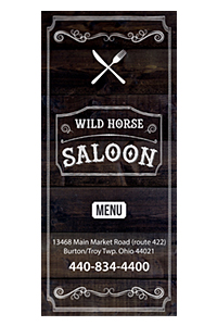
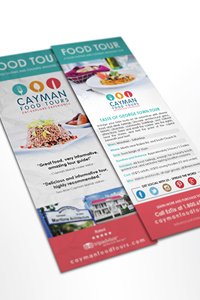
Food rack cards have hungry audiences, so your designs have to appeal to both their eyes and their stomachs. You’ll see a lot of instances of red and green in food rack card designs because red is a color known to stir up feelings of hunger, while the color green feels fresh and healthy. Food rack cards usually double as take-out menus, so your design has to be good enough that when someone sticks it on their fridge, it makes them want to eat out more often.
Good 2 You Food
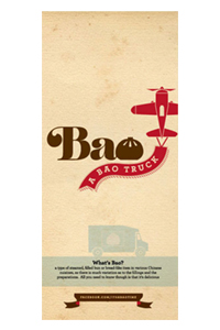
Bao: A Bao Truck
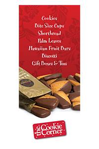
The Cookie Corner
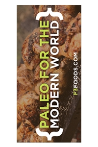
Paleo Rack Card
Poogan’s Porch
Marketing and Graphic Design
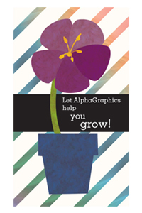
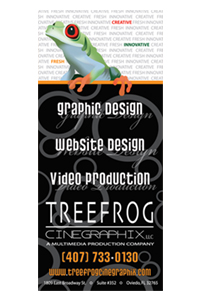
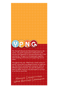
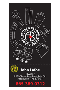
Marketers and designers who have worked with rack cards before know just how powerful they can be when it comes to building up brand awareness. That’s why many of them use rack cards to promote their own services—after all, if you can’t design a rack card that will attract new business, how can you do the same for your clients?
Pixel Turbine Rack Card
![]()
Evil Lizard

Party Planning
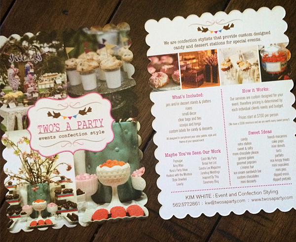
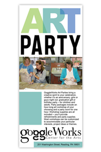
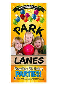
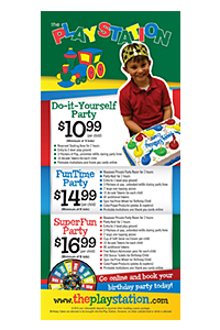
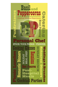
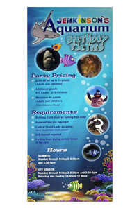
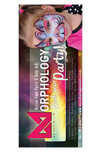
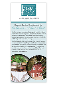
Party planning companies often utilize rack cards to drum up brand awareness, while businesses that offer party venues frequently use rack cards to let patrons know of these additional services. These rack card designs need to pop and give the audience the feeling of excitement and fun. A boring rack card indicates a boring party, and nobody wants that.
Two’s a Party Marketing Info Sheet
Art Party
Park Lanes
The Playstation
Religious and Nonprofit
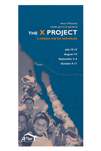
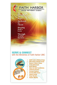
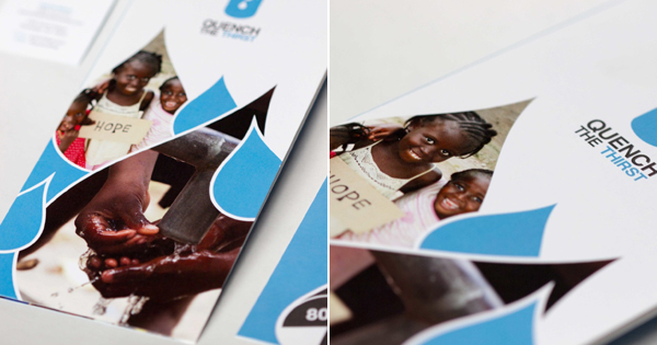
Religious and nonprofit groups often turn to rack cards to get people interested in lending a hand or donating to their cause. These designs should impact the audience emotionally and get them to care about the issue at hand. They also tend to communicate a sense of empowerment by helping recipients believe they can make a difference.
Quench the Thirst
Amor Ministries (1)
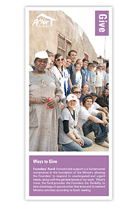
Amor Ministries (2)
Faith Harbor
Spa and Salon
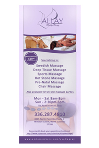
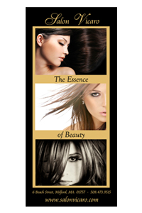
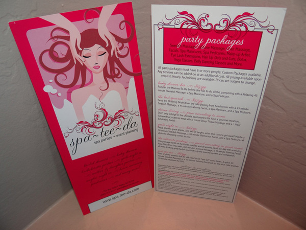
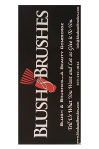
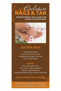
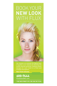
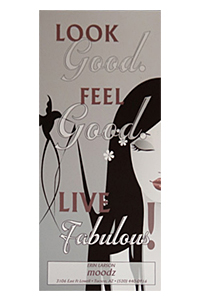
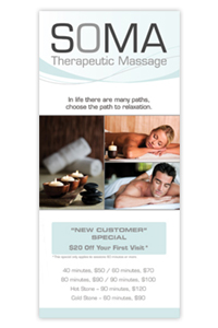
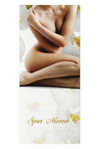
Spas and salons sell beauty and tranquility, so rack cards for the spa and salon industry usually look lovely and serene. Women make up the primary audience for spa and salon rack cards, so the designs are typically feminine, but that doesn’t mean they’re necessarily “girly.” Instead, these types of rack cards focus on being stylish, chic and modern to express to the audience that they’re up to date with all the latest trends in health and beauty.
Spa-Tee-Dah
Allay Massage Therapy
Salon Vicaro
Travel and Recreation
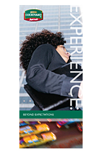
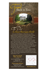
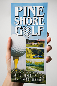
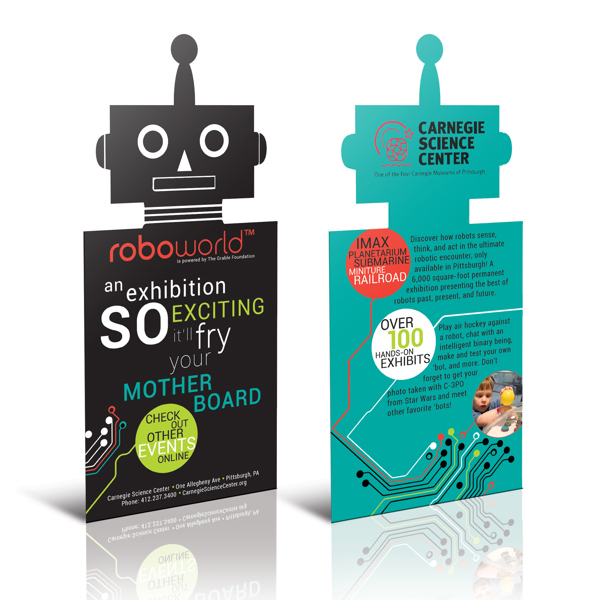
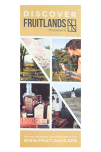
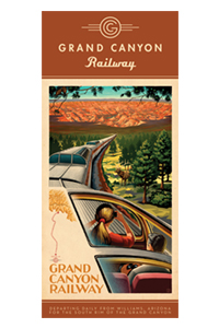
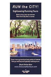
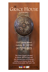
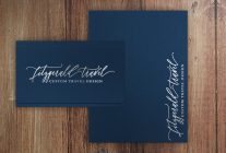
Rack cards are a godsend when you’re in a new place and you don’t know what there is to experience around you. We’ve all seen those giant racks of cards in gift shops, tourist attractions and visitor centers that let you know what local shops, activities, landmarks and attractions are in the area. Travel rack card give the audience a sense of what to expect if they come and visit, so their designs can range from exciting to traditional, depending on the locale.
Carnegie Science Center
Courtyard Marriott Collateral
Historic Salisbury Foundation
Pine Shores Golf
Tsaina Lodge

Wedding
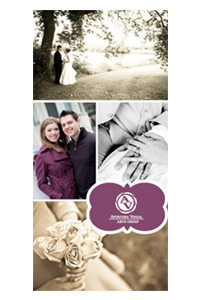
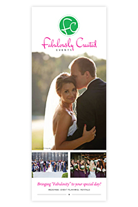
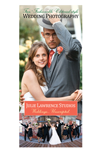
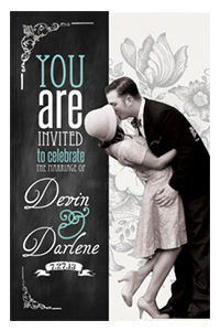
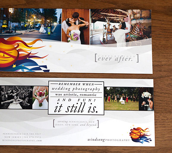
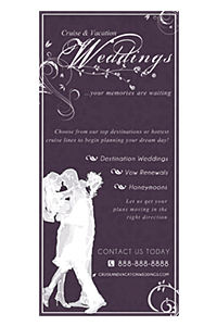
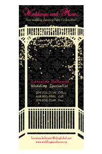
The entire wedding industry uses rack cards, from cake makers and caterers to wedding locations and photographers. Some have even used rack cards as an affordable alternative to traditional wedding invitations. Weddings rack cards have a lot of competition, and the designs have to attract an audience who can be downright picky. Couples want to work with brands that are going to make their special day perfect, so they will quickly overlook a wedding rack card if the design isn’t up to snuff.
Windsong Photography
AV Arts Group
Fabulously Created Events
Julie Lawrence, Photographer
Wedding Invitations
Miscellaneous
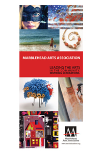
There are plenty of brands and services that benefit from rack card marketing and thousands of great examples of rack card designs to boot. The one thing all great rack card designs have in common is that they faithfully represent the brand and are creative enough to look good on a rack next to other designs. Here are just a few more examples of what designers have done with the medium for a variety of different industries.
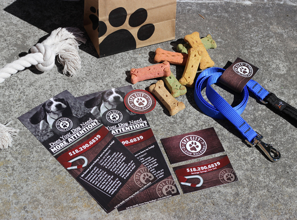
Spa City Dog Walkers Identity Design
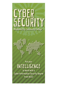
Cyber Security
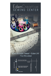
Freelance Sewing
Jessco Construction, Inc.

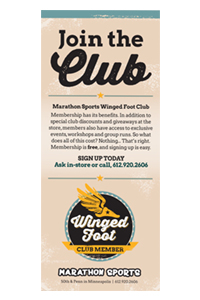
Winged Food Collateral
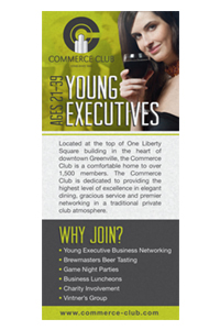
Commerce Club
Your Turn
If you like these cool rack card designs, why not create one of your own? Our print design services can help you create an amazing custom rack card for your brand.
And as always, we want to know what you think about the design inspiration we’ve shared. Leave a comment letting us know which ones you like most or sharing your best tips for designing great rack cards!

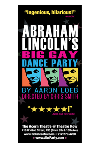
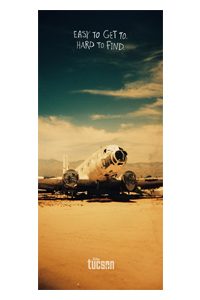

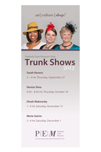
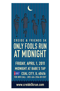
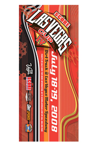
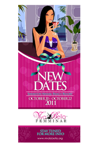




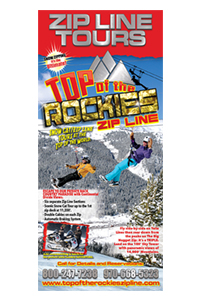




One thing I noticed staring at a huge rack display today was that once the cards are stacked up, only the top quarter of the card is visible beyond the front row. You’ve got to make the top part eye-catching so people will actually remove it from the rack.