They say that you should dress for the job you want, not the job you have – in that case, your presentation binders should be dressed up for the company you want to become, while still representing the company you currently are. Designer binders can make even the smallest of businesses look big and important, projecting the image of luxury and success to your clients.
Fortunately, you can design affordable binders that only look like a million bucks by using a few inexpensive techniques and accessories. Here are just a few of the ways to add a touch of class when you print custom binders.
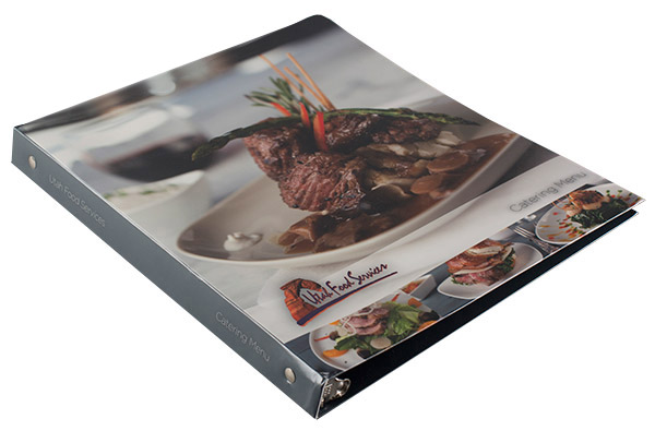
Add high-quality images and photography to your binder design to display your company's personality (SKU: 88-01).
High-Definition Photography
Some of the most gorgeous images are the ones that are true to life. Printing a binder in four-colors costs the same whether you print a small logo or a large photo, so get the biggest bang for your buck by using expansive, high-definition photography in your design. Luxury binders with photographs (like the example from Utah Food Services) give your customers a look at what you’re selling in the most flattering way possible.
Reverse Printing
With reverse printing, certain areas of your binder are left unprinted, allowing the natural tone of the stock to come through. This creates an effect much like an etched drawing, where ink becomes the negative space for the picture that is formed from the stock. This feature comes at no additional cost and can make your binders look truly dramatic and unique.
Embossing and Debossing
Embossing and debossing are popular choices for designer binders because they create a tangible, textured effect. The embossing process stamps an image or text directly into the stock of your binders without using ink, similar to an embossed pocket folder. This make the design appear raised (or sunken in, in the case of debossing). These techniques can be added to binder designs or used on their own for a subtle, stylish look. A “blind embossed” design with no ink may look expensive, but it’s actually a cheaper option than using ink at all.
Foil
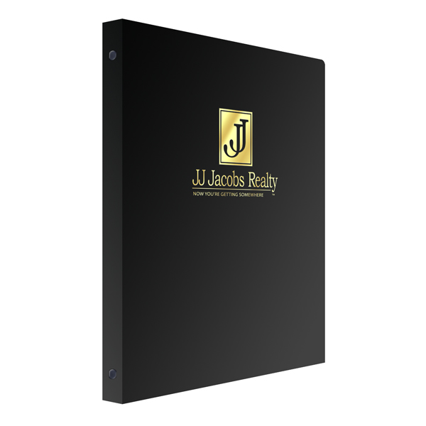
Foil stamping often goes hand in hand with embossing; you can also use it on its own to add elegance to your binder design. Foils are special coatings that are added onto the binder to make it look shiny, metallic or even holographic, depending on your selection. The foil effect is reminiscent of luxury items like expensive jewelry and sleek sports cars.
Add Patterns for Texture
Stock patterns aren’t the only way to add a touch of class to your designer binders. Try a repeating pattern design such as houndstooth or argyle. Make your binder look like designer wallpaper or artisan tiles to invoke a luxurious feeling.
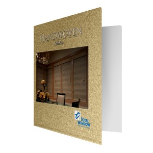
Use four-color printing techniques to simulate the look of textured paper stock.
Choose a Classy Stock
Creating a luxurious look also mean picking a luxurious binder material. Binders have fewer choices than folders when it comes to paper and linen stocks. However, you can still have the luxurious look of a certain paper stock by using ink and four-color printing techniques. For example, add a marbleized effect to your binder to simulate marble stock.
Faux leather binders are the very definition of luxurious, but they also come at a higher price. However, if you’re willing to make the investment, leather will project an image of the utmost sophistication.
Slip Into a Slip Case
If you really want to make an impression, use a slip case with your binder for an extra touch of elegance. These go over your binder to provide protection, storage and portability – but they look nice, too. Slip cases can transform a binder into something worth putting on your bookshelf by making it look like a leather bound book.
Luxury is more a state of mind than a state of being, so even the smallest company can use simple design techniques to create a sense of elegance and class. This goes a long way towards helping to attract clients and business relations by building up a sense of authority, trust and establishment for your company.
This post is a part of our Binders 101 product guide.

