Sometimes it’s the little things that can make you successful in a business presentation–the way you carry yourself, the clothing you wear and even the design of your display binders. One look at your binder can tell the audience a wealth of information about you and the message you’re selling. When designing your custom presentation binders, consider these tips to maximize your odds of making a connection with your audience.
Select Simple Design Choices
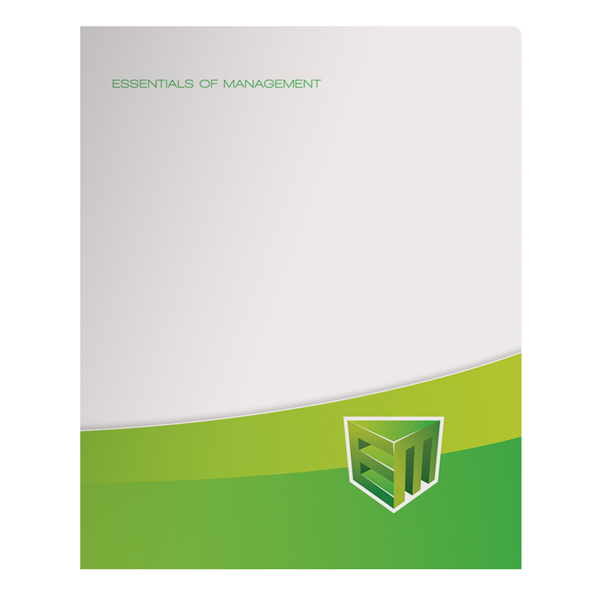
You don’t want your binder to overshadow what you have to say, so keep your display binders on the simple side to make the biggest impact. You want the design to be eye-catching enough to capture the audience’s attention, while not making it so distracting that they’re not paying attention to you. Your logo and company colors are enough to build up your brand awareness. If you want something a little more visually appealing, consider one bold picture over a collage of different images.
Expand Your Message
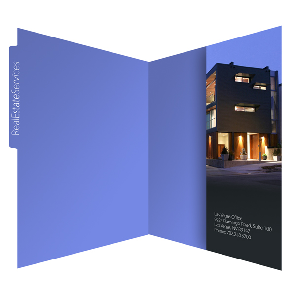
Custom binders for presentations are tools to help you get across your message. Boil down your presentation material to one or two major points and reiterate them within the design of the binder through slogans, mission statements or acronyms. Your message can also be printed on the interior pockets of the binder. Use a vertical pocket to create an entire presentation agenda, so that your audience can follow along from point to point.
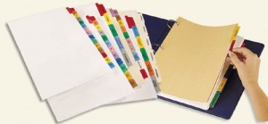
Break up your information into manageable chunks using binder dividers.
Organize with Tab Dividers
If you have a great wealth of information to present, adding binder tab dividers will keep everything clear. The dividers themselves can be customized for more opportunities to sell your message or your brand. You can mark sections with tabs that say “Do Not Read Until After Presentation,” so that audience members know what info to follow along with and what is intended to be read later.
Include Only Important Info
Try to be succinct with your display binder design and make sure you’re not overloading the audience with information. The binder should include a highlight of your presentation, with additional information only when necessary to build upon a point. You don’t want your audience to be distracted by the contents of the binder; you want them paying attention to your presentation.
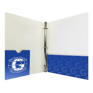
Add a CD pocket to store digital files in your binder (SKU: 88-05).
Add a CD/DVD Holder
If your presentation utilizes any media, you may want the option to include them in your display binders. CD and DVD disc holders provide a place for your digital media so that audience members can view your slideshow, watch promotional videos or listen to pre-recorded versions of your speech at a later date.
Using Die Cut Windows
Adding a die cut window to the front of your binder gives audience members a peek at what’s inside. Use this feature to customize each binder by placing a sheet of paper with an audience member’s name behind the window. This can be used to assign seats for everyone or make sure nobody goes home with someone else’s binder.
This post is a part of our Binders 101 product guide.




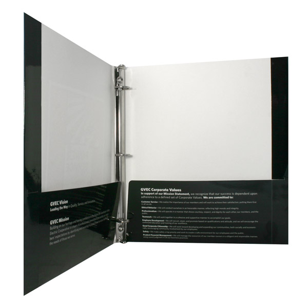
I appreciate you providing some tips on how to design custom business binders such as selecting simple design choices. It is recommended to choose a simple design that should not be a source of distraction especially when you are doing a presentation. You may want to go for something that has the simple logo of the company in front and the organization’s mission and vision. This way, your custom binder would not take the spotlight away from you. If I were to choose my own customized binder, I would definitely keep this in mind. Thanks.
I really like the tip about not letting your binder’s design overshadow what you have to say. After all, while it is great to spend some time designing the custom look for your binder it should not be your only priority. Instead, you need to focus on the actual look of the binder and what goes into it when you’re designing it.