When people look for a high-quality product, they don’t just want something that is well made and long lasting; they also want something that will look good. Custom binders portray a positive message about the caliber of your business – but only if they actually look professional. Consider the factors that go into making a high quality binder and design yours accordingly.
High Quality Pictures
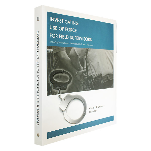
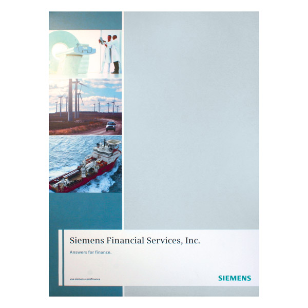
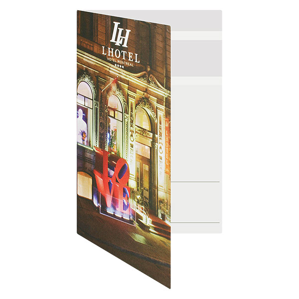
The eye is naturally drawn to pictures and images before any text or other design elements. High quality binders often feature imagery in the form of photos or professionally designed logos. On the other hand, unclear photos and poorly designed images can have a negative effect on your binder design. Consider the message you want to portray through your binder – do your images help to heighten that message, or do they distract from it?
Appropriate Color Choices
Color is one of the many ways your company can brand itself – but if used improperly, it may ruin the design of your binder. Bright colors are playful and project a tone of youthfulness, while dark colors project experience, professionalism and luxury. Four-color printing allows you to have access to a wide range of printing colors, but you can often make a powerful statement with only one or two colors using PMS printing. If you do go the colorful route, be sure to pick a color scheme using complimentary tones with a contrasting tone thrown in for visual variety.
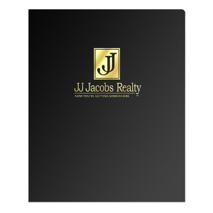
Add foil stamping to your binder design for a tasteful and elegant flourish.
Tasteful Embossing and Foil Stamping
For an added touch of elegance, many opt for an embossed or foil stamped effect on their binder. Embossing an area of your binder creates a raised texture that you can feel with your fingers. Foil stamping adds a metallic effect to a portion of your binder making it shiny and noticeable. Many high quality binders utilize these effects to emphasize certain areas of the design. However, these effects are best used sparingly and only when you want a certain aesthetic aspect to pop off the page.
Avoiding Overcrowded Designs
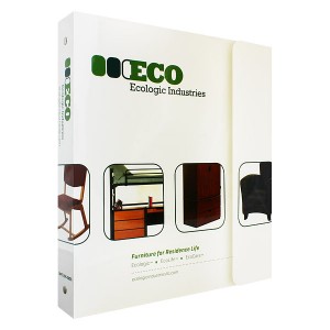
Ever noticed how high end shops and boutiques use small, simple signs instead of giant, flashing neon lights to attract customers? High end binders utilize the same principal. If you have a strong enough brand identity or an aesthetically pleasing logo, you don’t need much more to make an impact. Boil down your mission statement to an easy-to-read tagline or slogan, which makes it easier to incorporate your message into your binder design. A high quality design can be distinguished by a simple glance.
Customization Features
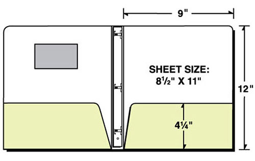
We associate quality with greater functionality and unique aesthetics, so utilize customization features to make your binder look more sophisticated. For example, a die cut window adds an interesting visual component by showing a portion of what’s inside. A front flap binder has a clasp that goes over the cover to keep it from opening. This not only keeps the contents secure inside, it makes a visual statement on the quality of the binder itself. Install a business card slot in folders to display your personal information in a classy, stylish way. Consider other special options such as vertical pockets and CD sleeves.
Add-ons and Accessories
Sometimes it’s the little things that help improve the quality of a binder’s design. Add custom printed tab dividers on the inside or a custom binder slipcase on the outside for an added touch of class. Binder sleeves make it possible to put documents inside your binder without punching holes in them first. These extra accessories convey the message that you’re not afraid to go the extra mile to ensure quality.
This post is a part of our Binders 101 product guide.



I think that the article raises a very good point about avoiding overcrowded designs when choosing a business binder. After all, you’d ideally want to choose a business binder that looks professional and can be carried into meeting. In order to ensure this you should make sure that you avoid those with crazy fancy designs.