Under normal circumstances, having a hole in something would ruin the product. However, a report cover window is the kind of hole that people go out of their way to include. Die-cut windows draw in readers by creating a sense of intrigue and by visually pulling the reader’s attention directly to the first page of your report. They also provide you with a number of different design options to consider.
Utilize Different Windows
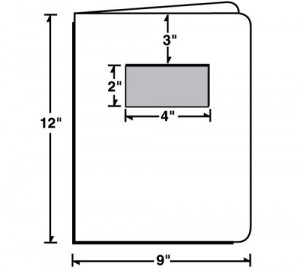
There are a variety of different window sizes and locations that you can utilize in your cover design. Your standard 2×4 window report cover is big enough to display most pictures, text and logos and its position 3″ down the page is just the right spot to get the best part of your design. If you only want to highlight a logo, try something smaller like a 1 3/8″ x 4 13/16″ window. A small 1″ x 5 5/16″ window is best if you just want to highlight a small portion of text (like your company name) without any visual elements.
Highlight Your Message
Every report has an overall message it wants to convey, so incorporate this message into your design using die-cut windows. Use a slogan or mission statement to sum up the scope of your information and boil it down into an easy-to-remember point. Put this message behind a die-cut window to bring the reader’s attention to it and to highlight it as the most important aspect of your design. You can even use a window to break a long statement down into a shorter one. For example, your message might be “We care about the needs of our community and strive to bring value to our neighbors,” but the window might only display the words “We care” in order to drive home the message of a business that cares.
Focus on a Picture
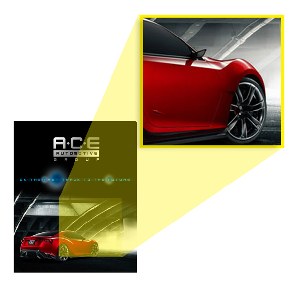
Presentation covers with a window can also be used to highlight visual components such as pictures and graphics. When you put a picture behind a window, you create a look of peeking in on something or having something peeking out at you. If your report cover uses a full color photograph, you can still use the entire image by reproducing the missing piece behind the window. This creates an inviting look that draws readers in and allows you to create a surprise by changing the quality of the picture when you open up the report.
Creating Mystery
Since a report cover with a window can only show a small portion of what’s inside, you can utilize this limitation to build suspense. For example, a clothing store might show a picture of a model’s head behind the window with copy on the cover that entices the reader into opening the report to see what this year’s hottest trends will be. If you want to create mystery with text, ask a question and place it behind the window so that readers know they have to read the report to find out the answer. A bold cover design is important– but never forget that the cover is only there to highlight the information you have inside.

Die-cut windows allow you to customize your cover by changing what's behind the window for different circumstances.
Customization
The best aspect of using window report covers is the fact that a portion of the design is dependent on what’s behind the window, so you can easily swap out different elements for easy customization. Utilize the same covers for multiple reports by putting the name and year of the report behind a window. Customize the design of your report to the person who will receive it by placing their name behind the window. The window becomes a free-zone for your design ideas, so get creative and think of different ways you can alter your design. Sometimes a different picture or design element can completely transform a report cover into something brand new.
Of course, if you can’t find the kind of die cut window you want for your design, talk to your printer about the possibility of custom die-cut options. From multiple small windows to one giant window, the design possibilities are endless.
This post is a part of our Report Covers 101 product guide.

