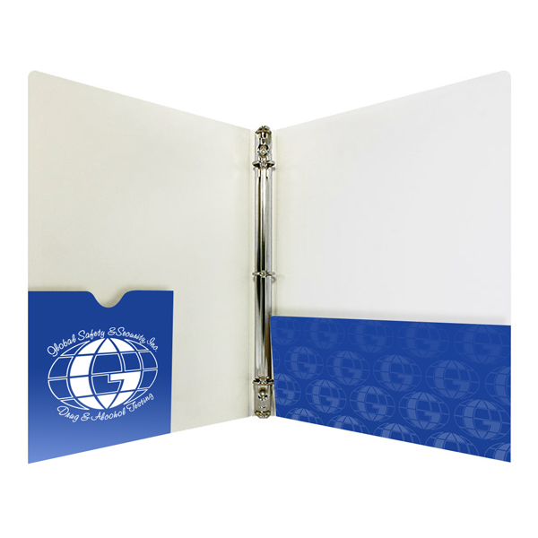
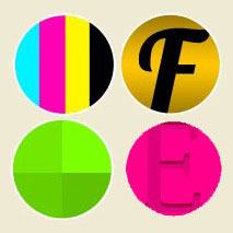
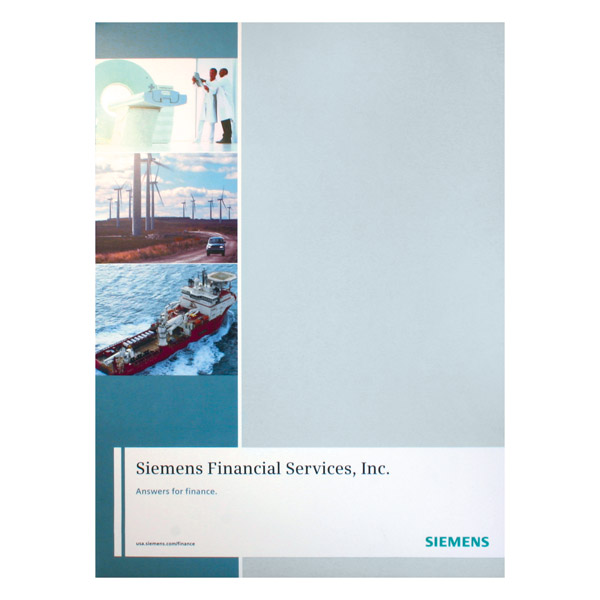
Four-color custom binders are the best choice if you want to portray your business as modern, professional, and attractive. There are literally dozens of styles to choose from; you can shop more than seventy custom binders on our site to select the die-cut and manufacturing material that are best for you.
Cool die-cuts and unique materials are a great start. But let’s face it: even the coolest, best made binder won’t magically fix a bad design. If you want to make the best impression on your clients, you need to know how to properly design for 4-color printing.
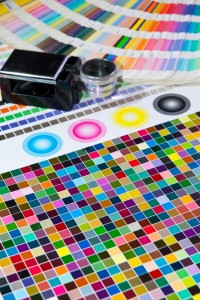
4-color printing uses a combination of the colors cyan, magenta, yellow and black to create a wide range of ink hues.
Design in CMYK Mode
The 4-color printing process uses a combination of four different colored inks — cyan, magenta, yellow and black — to create a multitude of other tones and hues. This is much like your computer monitor or TV, which uses red, green and blue to create color. However, if you design your binder on a computer screen using RGB color and then print it using CMYK colors, there can be a noticeable difference in the color quality.
Make sure to design and save your files as CMYK so that there is as little loss of color quality as possible. Ink printed on paper will always look slightly different from a design on a computer screen, so be sure to ask for proofs before completing your final order to make sure you end up with what you wanted.
Use Color Pictures for Full Effect
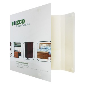
Four-color printing allows this catalog binder to display pictures that are true to the color of the product.
To get the most out of full color printing, your binder design should contain dynamic visuals. Add pictures of your product or a bold design element that represents your brand.
Your visuals should say something about your company and invoke an emotional response that is on par with your mission statement. It pays to have a graphic designer or photographer come up with something that is truly unique to your brand instead of using stock photos or clip art.
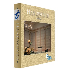
Create faux-stock effects using the four-color printing process.
Liven Up Negative Space
Printing on colored stock can alter the look of your design, making it look darker or distorted; with full color printing, you can use white stock to achieve rich hues that are true to life. There’s no need for your binder to have large areas of boring white space. Inject some color into your negative space or add a basic repeating pattern.
Not every stock option will work for a three-ring binder, but if you really want the visual aesthetic of an unavailable stock, you can cheat using 4-color printing techniques. Add a design that looks like marble coat or linen stock but is actually standard white glossy paper. A leather bound binder can look classy, but it comes with a high cost. Using 4-color printing, you can mimic the effects of leather without spending the extra money.
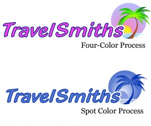
The difference between 4-color and PMS spot color. Both can be used in tandem to create dynamic visual effects.
Apply Spot Printing for Color Accuracy
The one major drawback of using 4-color printing is the inability to accurately reproduce some colors. This process is not good for printing metallic ink or certain colors like navy blue. Likewise, if your company has a specific color it uses for branding opportunities, it may not be faithfully reproduced in your print job.
Fortunately, full color printing gets along with all other printing processes, so you can easily spot print any additional colors you may need to complete your image. This could include foil stamping or the PMS ink of your choice on top of a 4-color design.
This post is a part of our Binders 101 product guide.

