When it comes to binders, it’s easy to get stuck in a rut. There are a lot of unoriginal designs out there, making it tough to get inspired. And nobody can open up your head and put creative binder ideas directly into your brain — you must draw from your own experiences and imagination.
Luckily, you can get started by shopping our 70 styles of custom presentation binders — and then using these four creative ideas to get your artistic juices flowing and your binders looking truly amazing.

Creativity comes from designs that show a message instead of outright telling one, like the healthy message of this binder design.
Show, Don’t Tell
To start thinking creatively, find ways to show something without saying it outright. Take a look at the example to the right. This binder for a medical center communicates a message of staying in good health through both images and words. However, the message doesn’t have the same impact through the text as it does with the strong visual of two people in good health.
Your first instinct might be to incorporate pictures such as a prescription bottle or a doctor treating a patient, but this could convey the wrong message. These images would tell you what a medical center does, but they wouldn’t show you the results. Think of the different ways that we communicate with one another without words, and you will begin to find creative ways design your binder.

Sometimes the idea you need is right in front of you, like this binder which borrows textures from real life.
Draw Inspiration From Around You
To be creative, you have to be original — but you can still borrow inspiration from around you. Focus on your company and your product to find new visual elements to bring to your design. In the example to the right, a construction company that builds athletic facilities borrowed textures directly from their own product to create a background for their binder design. The bright green grass and the neutral grey metal flooring designs bring color and texture to the design in a creative way.
When you draw inspiration from what’s around you, chances are you’ll not only end up with some great ideas for presentation binders, but ideas that help to build your brand identity. In this case, the company was not only able to create a stunning design, but also draw attention to their product in a clever way.
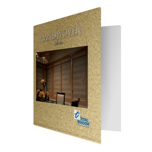
Creativity comes from working around limits, like this binder that uses ink to create a textured look when textured stock was unavailable.
Work Through Limitations
Sometimes your best ideas come from having to work around an unfortunate limitation. That’s because your brain works twice as hard to think of a creative way to still get what you want, despite the limits set before you. In this example, a window treatment company found a unique way to make their binder mimic the texture of their product. Although they were unable to print the binders on a textured stock, they were able to mimic the effects using ink.
Every project will hit one or two snags along the way, but it’s how you deal with these situations that will encourage your creativity. Sometimes you unfortunately have to lose exciting design components because they just won’t work – but before you throw in the towel, challenge yourself to think of a new solution.
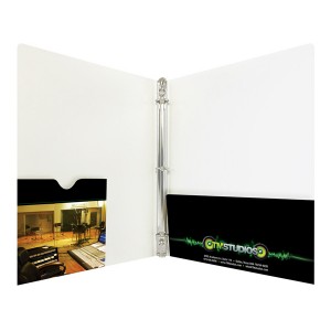
You have a large canvas with which to express your creativity, so don't forget areas like the interior pockets.
Utilize the Entire Canvas
Creativity comes from the freedom to express yourself, and when you consider the fact that every inch of your binder can be customized to your liking, that’s a great deal of free space to work with. Take, for example, this binder for a recording studio that incorporated design elements into the interior pockets. The binder’s CD pocket features a full color photograph of their studios, while the other pocket has a logo and contact information.
The possibilities are endless when you consider the different combinations of specialty folder types there are and the design elements that can be applied to them. Folders with die-cut windows, portfolio info flaps, vertical pockets and business card holders feature a bevy of different design opportunities. Even without any special features, you still have to consider a design for the spine, back, interior and cover of the binder.
Being creative comes naturally for some people, while others may find they struggle with it. In the end, your binder design should be about putting your company in the best possible light, by any means necessary.
This post is a part of our Binders 101 product guide.


