 Since visual elements are such a large part of print design, many designers make the mistake of focusing their attention on shape, line and color while neglecting the typography used in the design. However, text is one of the most crucial aspects of any print marketing collateral, as it provides the most information to the audience.
Without taking special consideration when printing fonts, you can end up with a final product that looks unrefined and is difficult to read. Keep these tips in mind before adding any text to your print design projects.
1. Printing fonts with 4-color process
When printing in 4-color process, the printer uses four different layers of ink to create the final image. Because of this, there can be an “aura” of color around your text if the font is 12 point size or smaller.
Small text printed with four-color process tends to leave behind a blurry aura of color.
At this size, it is difficult for the printing plates to line up exactly, so even a white font created using unprinted stock against a printed color background may end up with this effect.
When using black, however, you may be able to avoid this problem in Photoshop using the Color Picker tool (accessed by clicking the Foreground button in the Color window). Make sure to set cyan, magenta and yellow levels to 0% with black at 100%. This ensures that the text will only receive a single pass of black color rather than four individual passes of color.
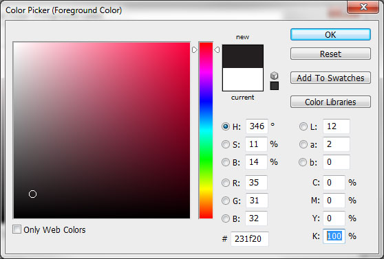
Set the 'K' value of your small black text to 100% and other colors to 0% to help prevent visual blurriness.
CMYK color typography will print correctly when larger in size, such as headlines and logos. However, to ensure your color font looks accurate, be sure to convert your files to CMYK mode before sending it to your printer. Otherwise, you could end up with color distortion and brand confusion.
2. Printing fonts with PMS ink
Since PMS printing uses pre-mixed ink, it is a safer bet for smaller font sizes and text in general. The color aura effect present in 4-color process will not be a problem when printing color typography in PMS ink. You may even want to consider utilizing PMS spot printing on your 4-color design to ensure crisp, clear text.
Since Pantone ink is added one color at a time, color economy is essential for any PMS print job. However, you should avoid trying to print color text on a similarly colored background. Even if there is a high contrast between light and dark values, this can make your font difficult to read.
3. Fonts for foil stamping and embossing
Due to the nature of foil stamping and embossing, you’ll want to avoid any line with less than a 1.5 point size thickness. This means that any font you use for either of these two methods should be on the thick or bold side.
Likewise, you’ll want to avoid serif fonts or decorative typography, as these often have elements that go below the 1.5 point size threshold.
4. When to use serif fonts
Serif fonts contain extra flourishes at the ends of the letters to create an embellished, unified look much like the typesetting found on an old-fashioned typewriter. Fonts with serifs are especially useful for print, as they are more readable and allow the eye to tell the difference between letters when they’re close together. This makes them especially helpful when you have to deliver a large amount of text.
Serif fonts create a visual guideline for the eye to follow, making large paragraphs easy to read and scan.
5. When to use sans-serif fonts
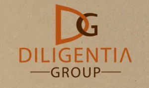 Sans-serif fonts forego the extra flourishes to create a simple, yet dynamic look. They’re typically used as headlines, since they catch the eye and create a natural contrast to any body text written in a serif font.
Sans serif typography can tire the eye more easily, so it’s not recommended for large bodies of text.
6. Use bold and italic fonts instead of bold and italic settings
Some fonts come bundled with bold and italic variations which are specially created by the font designer to give the most accurate representation of the font’s intended style. It is always a good idea to use the bold or italic version of a font whenever it is available instead of relying on your design software to create the bold or italic effect. This ensures the greatest degree of accuracy in the final printed product and helps to prevent any distortion that might occur when altering a font using bold or italic settings.
7. Limit the number of fonts you use
You don’t want to go overboard with the amount of fonts you use in one design, as it can lead to readability issues and poor design aesthetics. Not including your logo, you should only really use one to three fonts at a time: one for your body text, one for your headline and a third font only if necessary for call-outs, quotes or other special elements.
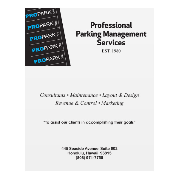
Notice how using too many different fonts makes this design sloppy and haphazard.
8. Printing fonts within your budget
If you have a strict budget for your print marketing collateral, you have to consider the price of the typography you use. The licensing fees for your favorite font may require a small sacrifice from your marketing budget. Fortunately, there are a ton of great free fonts for print available to download.
However, you have to be cautious when using some free fonts, as not all are intended for commercial use and may require you to pay a licensing fee to use them in your marketing collateral. Some font makers may ask you to make a small donation to use the font for commercial purposes.
9. Using colored text
Black fonts are the easiest to read, while colored typography is not recommended for body text because it can cause readability issues. Dark blue and dark green fonts are a little easier to read then others, but it’s generally best to stick to black for large paragraphs. Rather, color fonts should be used sparingly to create a sense of drama by highlighting certain words, drawing attention to your logo or creating eye-catching headlines.
10. Creating contrast
The difference in tones between your font and your stock should be like night and day–literally. If you have a light colored background, you should go for a dark font and vice versa. In fact, for people who have a hard time seeing (such as the elderly) it can actually be easier to read a light colored font on a dark background. Black and white tones are always the best combination for optimum contrast.
11. The ideal font size for readability
If you want your print design to be accessible by all audiences, then keep your font at 16 point size or higher. The ideal size is typically 18 point, but due to the size of your print template, this may not always be possible. 18 point may seem large, but this is to account for all vision types and to ensure that your media will appeal to as many people as possible.

18 pt is a good baseline for the font size used in your marketing materials.
12. Maintain a readable format
When you write in all capitalized letters online, it’s considered “shouting” by many and seen as a social faux paux. In fact, the all-caps format formerly standardized by the U.S. Navy was just recently eliminated.
This is due to the fact that it is easier to read text that uses both capital and lower case letters. When printing fonts, never use all caps or all lower case letters, or else your audience will have a hard time reading your copy.
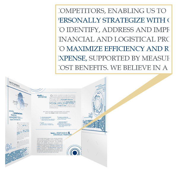
Writing body text in all capital letters makes it difficult and unpleasant to read.
Likewise, special font settings like italics or bold are best when used sparingly to highlight something important. Writing an entire block of text in bold or italics will lessen the impact and make it difficult to read.
Underlining is a particular problematic format because it interferes with the spacing between lines and can make your text difficult to read if overused. Only underline your typography in extremely rare cases, when you want a word or phrase to really stand out.
13. Be careful where you place your text
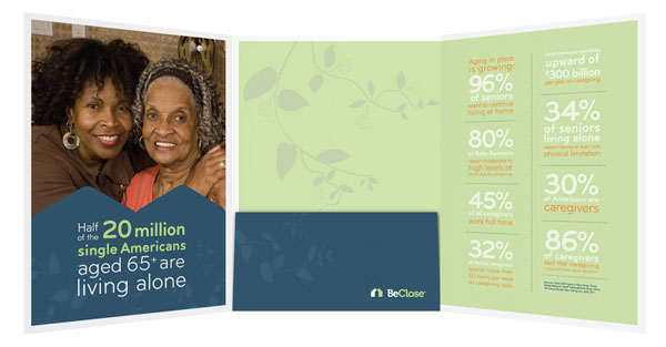
One big difference between printing fonts and designing for the web is that print items are meant to be held. Don’t put any important text near the areas where your audience will put their hands or manipulate the pages—primarily the left third of the front cover. You also want to keep any text at least 1/8″ away from the edges of your print design to ensure it is not accidentally cut off during the printing process.
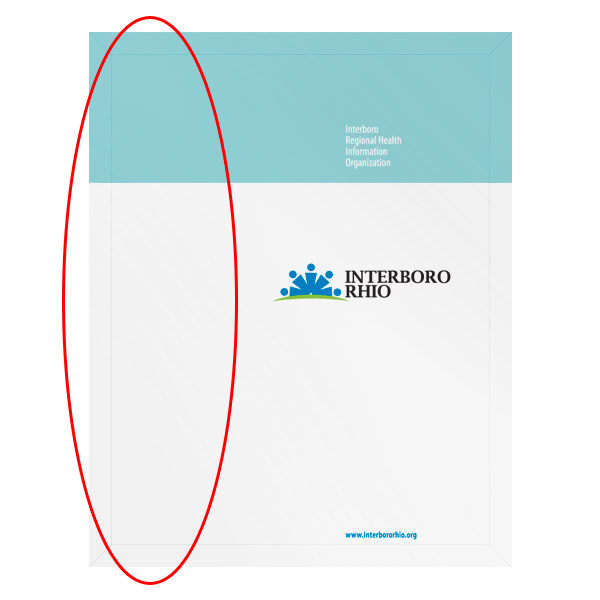
Make sure not to place any important text on the left third of your folder design, where a person's hand might cover it up.
14. Setting ideal tracking levels
When referring to typography, kerning is the space between two specific letters (for example, the distance between the W and the H in “when” at the beginning of this sentence). This is not to be confused with tracking, a measure of the space applied equally between all of the letters in a piece of text.
When letters in a line of text are too close together, it can be difficult to read. The best option is to use a font that has an equal amount of spacing between each letter, also called a mono-spaced font.
Notice how the example on the left is much more pleasing to the eye.
15. Setting ideal leading levels
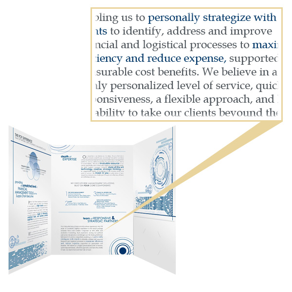
In typography, leading refers to the space between lines of written text. For maximum readability, you should set your leading level to 1.5 pt. This setting provides a greater level of clarity than single spaced leading, but doesn’t take up as much design area as double spacing does.
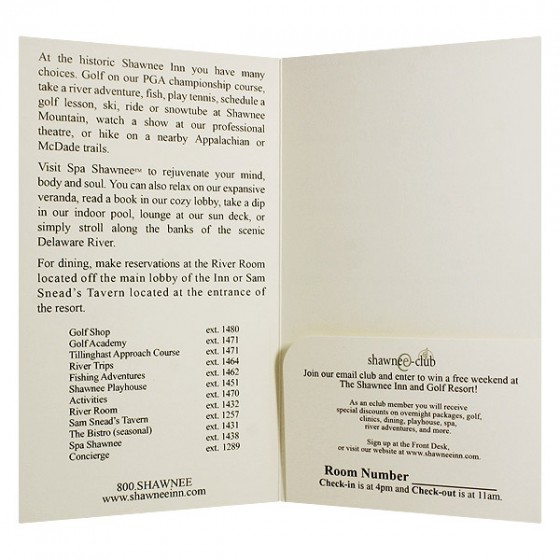
Setting proper leading levels (such as with this folder) helps ensure that your text will be easy to read and understand.
16. Gloss causes glare
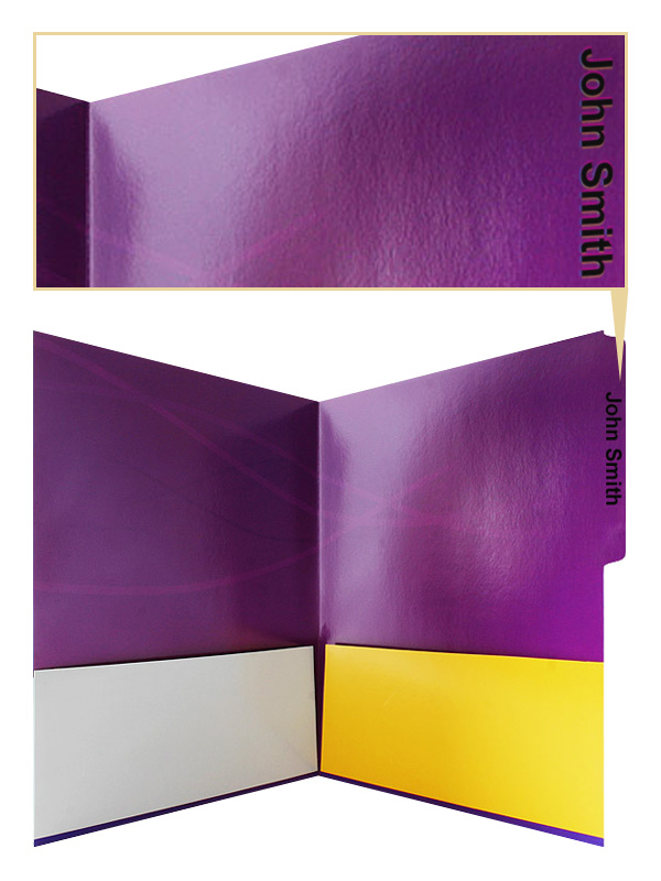
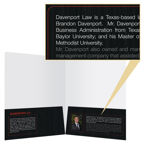
Avoid glossy stocks and coatings for any print design that features a heavy amount of text. The glare from the gloss can make it difficult to read and can also cause the eyes to become tired. If there are other design elements that you want to shine, you can always use spot gloss coating to leave your text gloss-free.
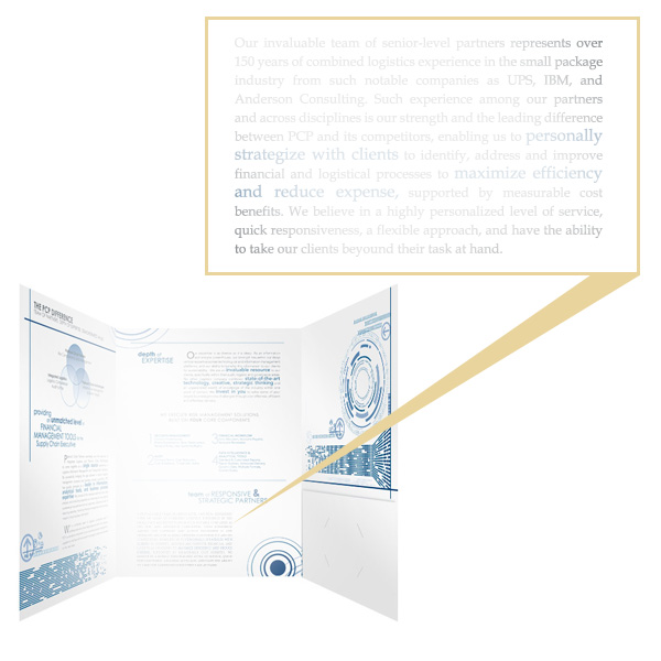
This folder's gloss coating makes the considerable amount of text (written in a fairly small font) a major pain to read.
17. Include fonts with your final design or convert fonts to outlines
If you use any special typography in your design, you will need to include these font files with your design files when you send your order to the printer.
Alternatively, for files created with Illustrator or InDesign, you can convert your fonts to outlines to ensure printing accuracy.
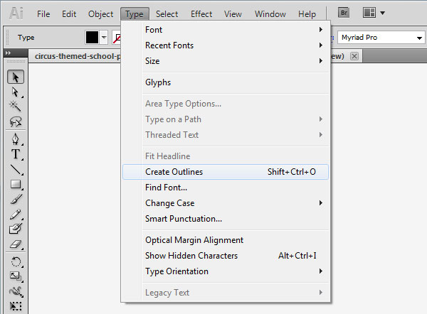
Use the 'Create Outlines' option in Illustrator or InDesign to ensure that your printer will be able to print your selected fonts.
Conclusion
When in doubt, your printer can help you determine whether the typography you’ve chosen will work well with your intended imprint method. It’s always a good idea to get a printed proof whenever possible so that you have a chance to see how a font will look on paper, as well as test its visibility and readability. Remember that printed marketing collateral should be designed to be easily scanned; your fonts should help, not hinder, this goal.
Do you have any questions about printing fonts? Any font-related printing horror stories to share? What do you feel are your ideal settings for readability? Leave your comments below, we’d love to hear from you!





I found your italic recommendation to be the most informational. I was unaware of any difference between the bold and italic fonts vs the settings. Thank you for sharing your tips on choosing and printing the best fonts!
I never knew that Serif fonts are more easily read! I need to print a few banners and need a clear font to attract customers. I think I will use a Serif font to keep things clear for anyone that reads them. Thanks for the great tips: I will definitely bookmark this article.