 Every industry has its own unique lingo that can sound like complete gibberish to the uninitiated. The print design industry is no exception to the rule.
You may have heard the terms RGB vs CMYK vs PMS in relation to color when designing for print, but you may not know what each acronym stands for—or, more importantly, why you should care.
However, if you want your final design to look the way you intend, it’s imperative that you educate yourself on each of these color profiles and the difference between them.
What is RGB?
The RGB color profile is used exclusively in digital design, as it represents the same colors used in computer screens, televisions and mobile devices. Rather than ink, colors in the RGB color wheel are created by blending light itself.
The letters RGB represent the different colors used to create different hues:
- Red
- Green
- Blue
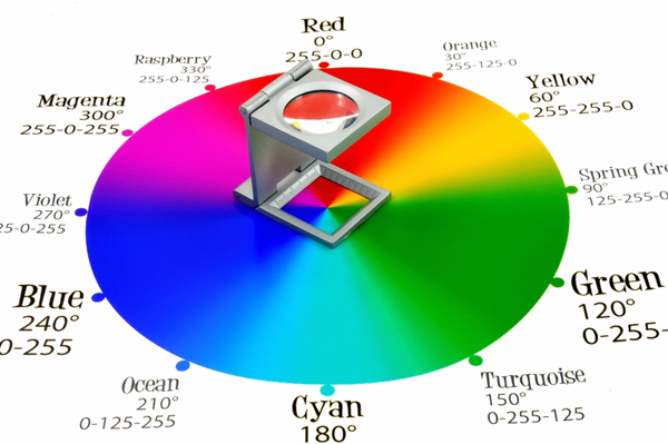
Each color in the RGB color model is created with some combination of red, green and blue, represented here as an R-G-B value, with each variable numbered between 0 and 255.
RGB has no actual canvas to be placed upon–it is projected against a screen using light. The use of all three colors together at higher intensities results in white and lighter tones, while black is produced with less light against the darkened screen. Note that the absence of RGB color results in black. This is different from our other two color models, where the absence of printed color usually represents white.
Keep in mind that no two monitors are calibrated in exactly the same way. This means that an RGB color on one screen might look slightly different on another.
What is CMYK?
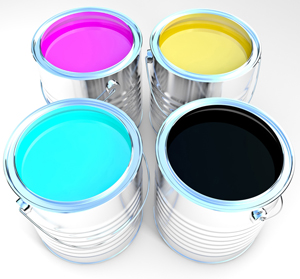 The CMYK color model is often referred to as four-color process due to the fact that it utilizes four different colored inks to create an array of different hues. The name CMYK comes from the four colors applied during the printing process:
- Cyan
- Magenta
- Yellow
- Key (Black)
The reason that black is referred to as “key” is because it is the color used in the key plate, which supplies the contrast and detail for the final image. In CMYK, the key color is always black, but with other printing methods (such as two-tone printing), the key tone could be something different.
There’s technically another unspoken “color” in the CMYK profile: the white from the paper stock that you print on. Layers of CMYK ink are laid in varying densities to create tonal differences—the less ink, the more white that shows through, creating a lighter tone. When designing CMYK printed folders, you should always do so on white stock or else you may end up with color discrepancies.
CMYK colors are mixed during the printing process itself, which can sometimes cause very slight inconsistencies in color throughout a printing run. It’s usually not a particularly perceptible change, but it’s something to keep in mind when using logos with specific color branding.
What is PMS?
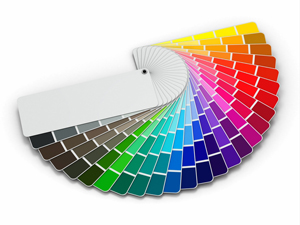 PMS stands for Pantone Matching System, which is a universal color matching system used primarily in printing.
Unlike RGB and CMYK, PMS colors are created with pre-mixed ink long before the image is actually produced, resulting in the most consistent color possible.
You can browse the Pantone Color Finder to identify the numbered code for the color you want. This ensures an accurate color match every time and eliminates discrepancies between your digital design and the final, printed product.
When to use CMYK vs RGB vs PMS
RGB is used only for digital designs. In fact, any design created with an RGB color profile must be converted to CMYK or PMS colors before printing. As a rule of thumb, you should only use RGB when designing for the web.

When you view a website on your computer, the images were likely designed using RGB colors.
CMYK can create a wide range of colors, so it’s used primarily for full color printing. It provides the greatest amount of accuracy when printing designs that contain color photography. In fact, CMYK should be your first choice of printing methods for any design that utilizes four or more colors.
Some tones may not accurately reproduce in four-color process, such as:
- Metallic colors
- Neon colors
- Navy blue
- Orange
- Grey
In these cases, it is recommended to use PMS spot printing to color correct the limitations of CMYK printing. PMS is also used to ensure accurate brand coloring in design elements such as logos. Black-and-white or monochromatic designs look their best in PMS, as the ink produces much richer variations in tones.

PMS colors are consistent and accurate, making them excellent for printed logos with pitch-perfect color branding.
However, since PMS ink is pre-mixed, it must be applied one color at a time. If you want to create a print design using only PMS colors, it is recommended to only use one to three colors at a time. Otherwise, you will greatly increase both the cost of your print media and the likelihood that the ink will crack.
How to convert RGB to CMYK in Photoshop, Illustrator and InDesign
Most design programs are set to RGB mode by default to optimize the image for digital formats. Before printing in CMYK or PMS, these RGB colors will have to be converted.
- To switch from RGB to CMYK in Photoshop, click Image > Mode > CMYK Color.
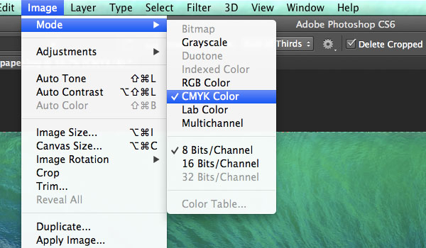
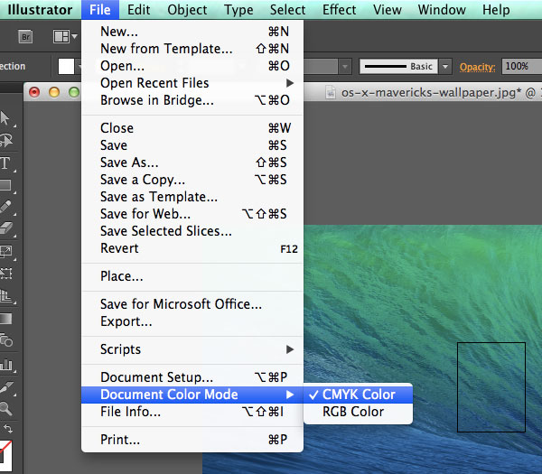
- To switch from RGB to CMYK in Illustrator, click File > Document Color Mode > CMYK Color.
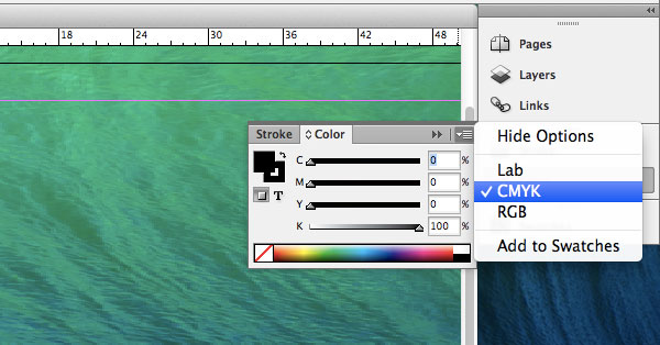
- To switch from RGB to CMYK in InDesign, click Window > Color > Dropdown button in the upper right corner > CMYK.
For other design programs, check the how-to files bundled with the software or at the publisher’s website to learn how to convert from RGB to CMYK. Note that not all design programs support CMYK conversion.
It’s recommended that you switch to CMYK mode before you begin designing. If you convert your artwork after the design is complete, you may have to go back and perform color corrections or fill in the gaps using PMS colors.
How to design with PMS colors in Photoshop, Illustrator and InDesign
When creating a PMS design, it’s a good idea to start with Pantone colors from the very beginning of the design process. RGB and CMYK both contain more colors than the PMS color model, so you won’t always be able to convert them directly.
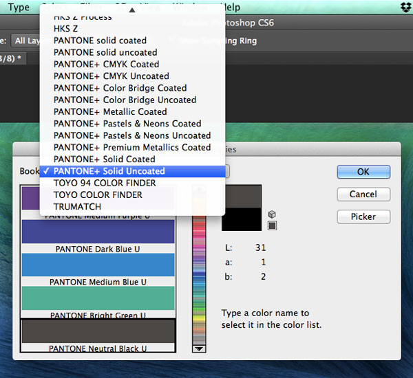
- To use PMS colors in Photoshop CS6, open the color picker, click Color Libraries and then click the Pantone library with the swatches you intend to work with.
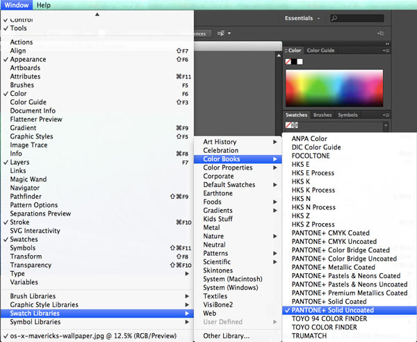
- To use PMS colors in Illustrator, click Window > Swatch Libraries > Color Books > and the Pantone library with the swatches you intend to work with.
- To use PMS colors in InDesign, click Window > Color > Swatches > New Color Swatch > set Color Type to Spot and then set Color Mode to the Pantone library of your choice.
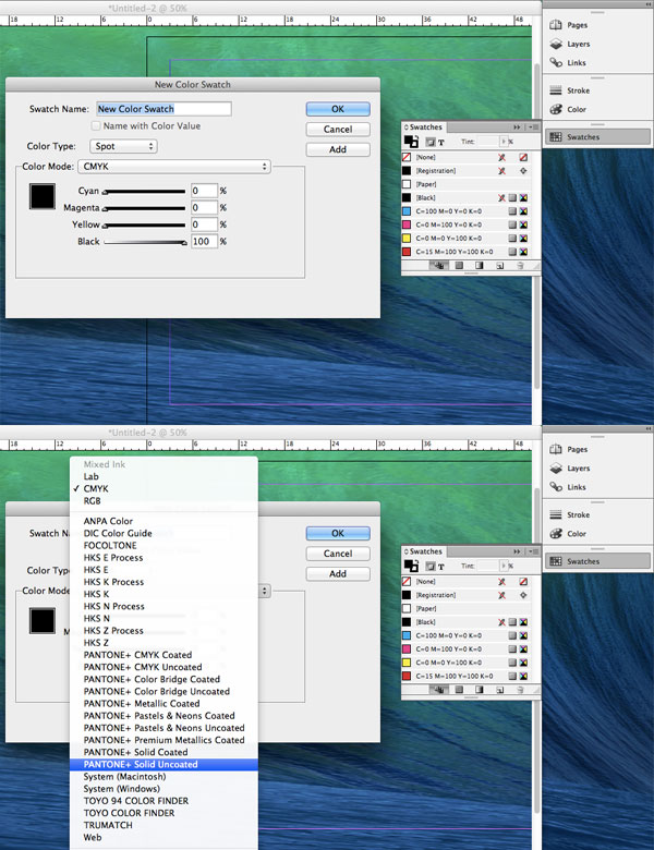
For other design programs, check the software’s how-to files or the manufacturer’s website for more information on using PMS colors.
Conclusion
Converting your files to the proper color mode before sending them to the printer not only saves time and money on your print job, it helps you to spot any color discrepancies before it’s too late to do anything about it. If you are having difficulties getting your design to look right with CMYK or PMS colors, consult with your printer. They will be able to help you to work out a solution and can offer advice on how to optimize your design for print.
Do you have any further questions about the differences between RGB vs CMYK vs PMS or how to utilize each color profile? Or better yet, do you have any tips or ideas for using these color profiles? If so, we’d love to hear from you, so leave a comment!


If your design is going to appear on digital formats (RGB) AND print formats (CMYK), which color mode is better to design in first and why?
I’d recommend designing in CMYK first and converting to RGB for the digital version. RGB has a wider color range, so if you create a design with bright RGB colors and then convert to CMYK, some of them may come out pale. Going from CMYK to RGB is more likely to give you a closer color match.
I am finding all your articles very helpful as well as the Infographic you have designed for each printing process !! Hats off to you ! Thank you very much ! 🙂
Thanks for your great description of the various color processes. I have a question about converting a color from RGB to a PMS color.
If someone says their website logo has the following color:
Adobe Caslon Pro Bold
Purple: 153-0-204
Hex: #9900CC
How can I convert that to a PMS color to be used on a promotional item like a pen or mug?
Joy
In Photoshop, you can double click the color swatch at the bottom of the tool bar to access the color picker. Type the color into the picker, and select “color libraries.” Photoshop will then open the default Pantone tool, “Pantone + Solid Coated,” with the suggested color selected. In this case, Photoshop suggested PMS #2592C. Keep in mind, the colors will not always be an exact match, so you may want to look at the color options immediately adjacent to the color suggested by Photoshop. For instance if Photoshop picked a slightly lighter PMS to represent your original color, you may have a reason to err on the side of a darker color.
Hi, I design my logos in Illustrator in CMYK format with proof working set up – FOGRA39 (ISO 12647-2:2004)
How do I ensure that the logos and designs I create will come out as close to on screen when printing in CMYK?
Thanks
Andy
Hi Andy,
Thank you for your question! There are several systems to choose from, depending on your needs. If you’re running on a tight budget, you can also print some proofs, visually adjust your monitor to match, and save the adjustments as a profile for that printer. Or, print a proof you are happy with, and send it along to the printer with a note explaining that they need to match the proof. Any reputable printer can come very close.
Hope this helps!
Hi, Thanks for your really useful article. It is really an eye opening and full of very beneficial information.
I would like to ask a question, I am a designer and my client asks me to design stuff to be printed on PVC rubber material as well as other materials like mugs and T-shirts. The first production of the materials went really off. The colors had major changes even I was working on CMYK mode. So I just learned about the Pantone colors. So my question is working on Pantone colors will solve this problem? and what Pantone color should I choose coated or uncoated?
The colors really went off especially with PVC rubber materials. But slight changes happened with textile materials and papers.
I would really appreciate your help in that matter.
Best,
That’s a great question. Since CMYK colors are mixed during printing, there can be color inconsistencies that are likely to be more noticeable when printing on rubber products, especially if the rubber isn’t white. PMS colors may help solve this problem for non-photographic designs; it’s hard to reproduce photos with PMS since its pre-mixed colors may not convey the full range of colors in the photo. You may also want to talk to your printer about the type of ink they’re using; some inks just are not well-suited to printing on certain materials. If this is the case, the type of ink could be creating the color changes. Hope this helps!
Thanks a lot for your quick response.
I will illustrate using PMS colors now. and will ask the printer about the type of ink they are using and hope it goes well.
I appreciate your answer so much and your help.
I use corel draw. I am going to order some promotional items. I know my RGB and CMYK colors however the promotional company is requiring me to convert it to PMS. What is the best way to do that in corel draw? The CMYK is C61 M20 Y0 K0, The RGB is R91 G168 B221
Hi Crystal,
You’ll want to check out CorelDRAW’s community advice forum. There are several threads about converting CMYK and RGB colors to PMS. YouTube is another great place to look for video tutorials that can show you how to make the conversion step by step. Hope this helps!
I am trying to design a slide in PowerPoint and I know the PMS color (Blue 281). However, I have no idea what the equivalent in RGB would be. How can I know what the match would be without auto-converting it using InDesign or something. Thank you for the help!