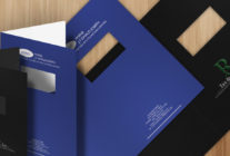
There’s sometimes an unfair association between report covers and boring, drab, stark designs. You can have creative report covers and still maintain your professionalism, as long as you stay true to the message you’re trying to deliver in your report. An interesting design will also allow you to stand out above the crowd and create a stronger brand identity.
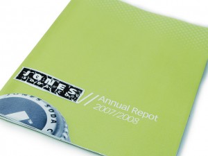
This colorful cover design uses green as a main hue, blue as the complementary and both white and black for neutral tones. Photo: Jesse Diehl
Use 4-Color Printing
The 4-color printing process uses a combination of cyan, magenta, yellow and black to create a bevy of different colors. This gives you a great amount of design flexibility as you can faithfully reproduce color photographs, images and graphics. Even covers without graphic components can add visual complexity using 4-color printing. Try filling in the empty space with a repeating pattern or solid color. Create a color scheme by selecting a neutral tone, a primary tone and a complementary tone. 4-color printing gives you a diverse palette of colors to choose from, so play and experiment with your designs to find the color qualities that pair well with your report.
Take Stock in Stocks
If your report cover design is a simple logo or title, consider adding a little extra flair with unique paper stock options. When you read a book, the cover usually has a different textural feeling than the rest of the pages. Textured stocks like linen, felt and vellum give your report cover a unique tangible quality that separates it from the report inside. Colored stocks can brighten up your design without the need for ink, but be careful when printing on colored stock as it will alter the color quality of any printed elements. If your company likes to be eco-friendly, there are a number of stocks made from recycled materials or stocks made with sustainable practices. If you want to project a very environmentally friendly image, try a stock like Eco Brown Kraft which is made from 100% recycled materials.

Sometimes all you need is a powerful image and an accompanying mission statement to make an impact. Photo: Tom Raftery
Make Visual Statements with Images
The old adage “show don’t tell” also applies to report covers. Draw in your readers with some powerful imagery that reflects your brand’s message or the tone of the report itself. Logos are okay in a pinch, but try some high-quality photography or a striking abstract design that captures the energy and vitality of your brand. Annual report cover designs are often given positive imagery to reflect the company’s goals for the upcoming year. Images and visual components also help people to differentiate between different reports. Your report cover sets the tone for your entire piece and the best way to create tone quickly is through graphical design elements.
Add Texture
The key to cool report covers are design components that can be both seen and felt. A textured stock is not always an option, but you can also add hints of tangibility using printing methods. The embossing process prints a design element directly into the stock of your cover, raising it up like Braille. Debossing is the same effect, but in reverse–the texture down goes into the stock. Spot printing allows you to add different coatings to your report cover to create textural dissonance that can be both seen and felt. For example, a gloss element on matte paper creates a shine that catches the light and feels smoother than the rest of the cover.
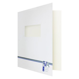
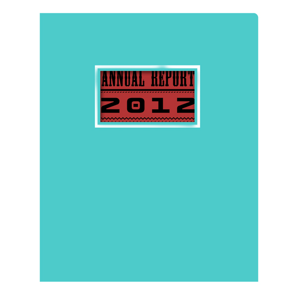
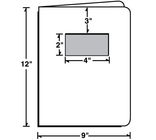
A die-cut window gives you design space to alter the look of your cover by changing what's displayed behind the window.
Draw Focus with a Window
Cutting a window into the front cover might take away some space, but it actually adds to the amount of canvas you have to work with. This is because anything you place behind the window will be seen from the cover, which means the first page of your report is essentially a second cover. This allows you to get as creative as you like–you can place a photo, title or even a mission statement behind the window to draw focus to the design aspects you really want to shine.
Go Horizontal
If the information you’re presenting is mostly horizontal, you should design your report cover to match. However, even with a vertical report, you can incorporate horizontal or landscape, visuals into your cover report. Printing horizontally gives you a wider amount of room to work with, which means you can reproduce widescreen images or write long lines of text without worrying about running out of space.

Foil stamping gives your report cover a classy, professional look.
Add a Touch of Metal
A metallic effect helps bring out certain design components and makes them appear shiny and luxurious. To add a metallic effect, you can choose between foil stamping or metallic PMS ink. Foil stamping creates a more vivid metallic effect and can be place upon embossed design elements to make them more visual. Metallic ink is a more subtle effect, which is more suitable for creating large metallic areas in your design. Either effect brings a bit of pizzazz to your cover without going overboard.
When designing creative report covers, it’s best to come up with multiple designs before finalizing your selection. This gives you more feedback on how your designs are working and allows you to flex your creative muscles. Any unused designs can always be tweaked for future use.
This post is a part of our Report Covers 101 product guide.

