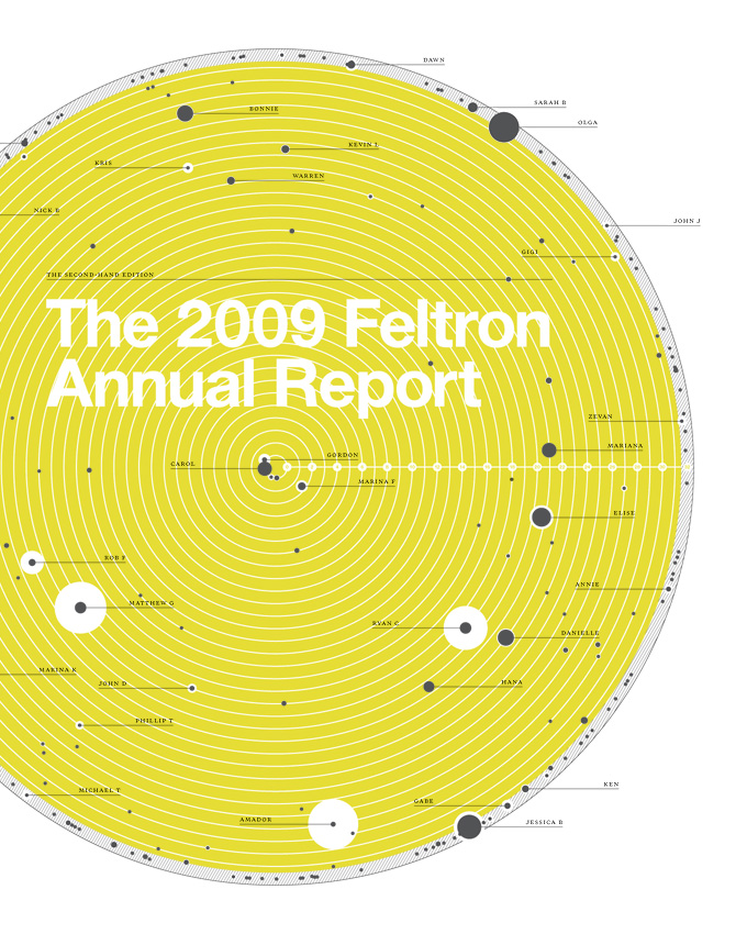
For many companies, an annual financial report is one of the few rare occasions where they get to show investors and partners how their business is developing. Your financial report cover should invigorate its readers and make them excited about the goals and accomplishments your business has achieved. Because of this fact, there are different design considerations to take in for a financial report as opposed to marketing materials that go out to clients and potential customers.

Choose a design that is optimistic towards your company's future. Photo: Tom Rafferty
Design with the Future in Mind
Your cover design should keep a positive outlook on the future, despite any losses your financial report might indicate. Excite your readers — don’t just tell them where your company is headed, show them through visual imagery. You want to make sure that all of your design elements share the same tone of voice and that they project an optimistic look into the future overall. In that respect, there are visual components you may want to avoid if they can be construed in a negative way. For example, a growing tree implies burgeoning progress, but a roller coaster projects an image of instability and constantly shifting business tactics.
Step Forward With Your Brand Identity
Your report cover should reflect more than just the contents inside; it should also reflect the unique elements that make up your company’s personality. From font and color choices to text and images, your report cover has to reinforce how strong your brand is and how it will continue to grow into the future. Having a strong brand identity in your cover will help to reflect your company in a positive light (even if you’re reporting a loss) because it shows your confidence in who you are and what you do.

Add color and visuals to your report cover to grab the attention of your audience. Photo: Arielle Weiler
Be Bold
Having a professional look does not automatically equal having a sterile look — you can bring bold design elements to your financial report cover page, so long as they stay on message and reflect your brand. Full color photos, dynamic graphics and stunning color schemes can get your reader excited — not only to read the report, but in the future of your company and its vision for moving forward.
Don’t Go Overboard
There’s a fine line between a bold design and an overdone design. As much as you want to excite readers into hearing about your company’s financial plans, you also want to promote an image of fiscal responsibility. Although an abundance of flashy special effects like foil stamping and spot printing can be a great way to grab the attention of an audience, the added cost may send an inappropriate message for a finance report. You want your cover design to look nice, but not so nice that it’s overly decadent.

This report cover uses the overall theme of peace and security to create a bold visual identity. Photo: Steve Rhodes
Design with a Theme
The easiest way to achieve a great report cover design is to pick out a central theme or mission statement and design around that. A memorable theme gives readers an idea or goal to focus on and sticks with them long after the report has concluded. Your cover design should reinforce this theme in any way possible, including visuals and text. In the example, the company focuses on the theme of peace and security by using three different pictures related to the topic, tied together with the yellow color scheme. Once you have a theme in place, the ideas will start to flow.
Because a financial report cover is meant for the eyes of investors, partners and employees, there is less pressure on building brand awareness, yet more pressure for keeping your audience’s attention. Present your audience with an exciting vision of what’s to come and you’ll have them hooked from the start.
This post is a part of our Report Covers 101 product guide.


Is there any software you could recommend for putting together these sorts of cover pages? Thanks in advance!
Photoshop or Illustrator (or one of their alternatives) would be a great place to start. This post may help: https://www.companyfolders.com/blog/the-16-best-free-adobe-photoshop-alternatives-for-mac-windows