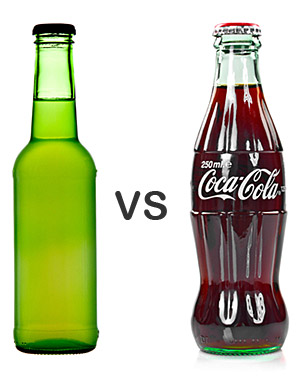
It’s easy to find inspiration in a unique color, font or logo when creating print marketing collateral–but the shape of your media is one aspect of design and branding that is often overlooked when brainstorming for ideas.
Need some examples? Consider the green soda bottle in the image to the right. Any idea what brand it is? You could certainly tell if it were labeled, but there’s nothing about the shape itself that tells us anything about the brand.
Meanwhile, the Coca-Cola bottle is instantly recognizable. Notice the distinctive indents, ridges and tapers; even without a label, you’d be able to tell this was a Coca-Cola bottle simply by touching it. It’s not just the color or font that gives this media an identifiable brand, it’s the shape.
Many designers make the mistake of putting so much emphasis on printed design, color and message that they forget all of the other ways a brand identity can be established. This same principle can be applied to print media: how many times has your audience seen the same old rectangular flyer, folder or business card?
You can use custom die cuts to make your print media recognizable by both sight and touch. When you consider that your print media could easily end up in a pile of junk mail and handbills, you’ll want every possible advantage you can take to make your brand stand out.
Where do die-cuts design ideas come from?
To design your own unique print media, you’ll first need to find that initial spark of inspiration. There are several different sources that that spark might come from.
- From your product – Custom die cuts can be used to highlight the unique shape of your product. This helps customers to become more familiar with your product (more so than just seeing a picture of it) because there is a tactile sense-memory associated with the way the shape feels. Ultimately, your recipient is more likely to form an emotional bond with your media.
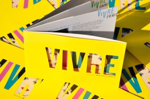
This promotional book uses die cut text in place of a normal imprint method. Photo Credit: Jodi Edwards
- From your imprint design – The best die cuts are the ones that enhance and build upon the printed design elements of your marketing materials. Most of the time, you’ll figure out the die-cut areas only after you’ve settled on an overall design. Your die cuts should support the most important elements from your design—they shouldn’t be the most important elements in and of themselves.
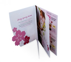
- From your logo – For many designs, the logo is the most essential branded design element, which is why it’s often used with die cuts. Cutting around the perimeter of your logo makes it stand out against the other design elements and also helps to create a sense-memory, only this time it’s associated with your brand instead of your product.
- From your brand identity – Certain shapes are often associated with your brand and tie into your brand identity, even if they’re not directly connected to your product. Say you’re creating promotional stickers for a veterinarian specializing in dogs. Rather than being on-the-nose and using a die-cut outline of a dog, you might use a bone shape instead. This shows off the brand’s personality in a clever, memorable and offbeat way.
- From your requirements – Die cuts may be decorative, but they also serve functional purposes as well. Some die cuts are born out of necessity because you need a place to stick additional marketing materials such as business cards or brochures.
Die cut shapes
There are two primary shape categories when dealing with die cut designs.
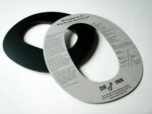
- Geometric shapes – These are the common shapes that you remember from geometry class, such as squares, ovals, triangles and arches. Geometric shapes can be either angular or rounded, but they are always have precise measurements. For example, a rectangle always has four sides, with parallel sides being equal in length. Rounded business card corners, slanted folder pockets or a window in a report cover would all consist of geometric die-cuts.
- Organic shapes – These are the shapes of naturally occurring objects; examples could include a leaf, a tree, an animal or a human being. In die-cutting, organic shapes are usually created when an outline is cut around a design element, such as a photograph of a person or a recognizable object. Therefore, organic shapes do not have precise measurements and instead follow an outline.
Types of die-cuts
- Edge – These cuts are made on the outer edge of your print material; they ultimately determine for the shape of the material itself. Altering the edge cut can create a completely different form altogether.
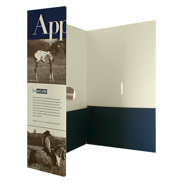
- Openings and closures – Printed media that has more than one page can be die-cut with a unique opening or given tabbed closures. Opening and closure cuts can also change how the media is manipulated—i.e. whether it opens like a book, like a gate or in a completely custom manner.
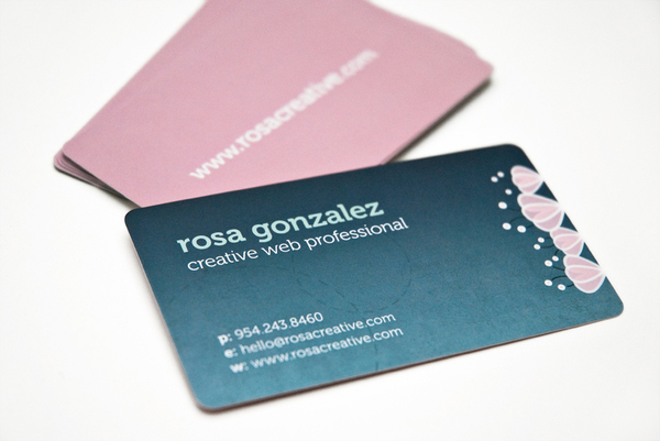
- Corners – To slightly alter the shape of your printed material, you can simply “cut corners.” Rounded corners give the media a subtly different look and have the practical effect of helping to prevent dog-earing.
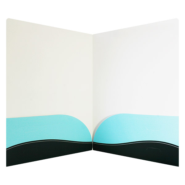
- Pockets – Folders, binders and some report covers often have internal pockets for storing additional materials. Internal pockets can be cut into a variety of different shapes or moved to different positions.
- Slits – These are small cuts made in the interior pockets to hold additional media. Business card slits and brochure slits can be cut into any shape, including tabs that grip the media or slots that the media slides into.
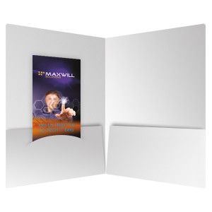
Pocket slits (including those for business cards or brochures) can be shaped or arranged in various ways.
- Window cuts – These are decorative shapes cut directly out of the central area of the paper stock. Die-cut windows are often used to show off an interior design, but in the case of one-sided print media (like a business card), the cut itself can be purely decorative.
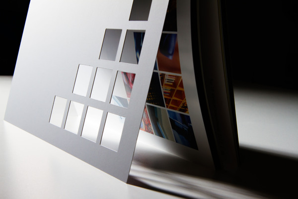
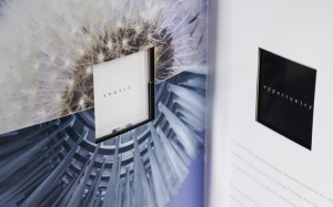
Die-cut windows give the viewer a unique perception of the media on the other side. Photo Credit: Meuller Design
Factors to consider
- Branding and message – Everything about the design of your printed media (including custom die cuts) should be working towards the goal of highlighting and promoting your brand identity and message. Your cuts should make the most important design factors stand out, not distract from them. Yes, die-cuts look nice and give your media a leg-up over the competition–but only when they help to direct audiences toward your brand. If they don’t, they’re drawing attention away from what’s important.
- Position – The location of your die cuts is important because they have to be visually harmonious with your design, but also located in an area where audiences will interact with them. Place the die cuts where people will put their hands when they’re holding it or manipulating the collateral. Any die cut windows have to line up with the media that they’re supposed to show off; otherwise, the design will look awkward.
- Functionality – Die cuts have to be technically accurate, not just so that they make an impression but to ensure that your media can actually be used. For example, a folder can be cut into any shape, but it has to be able to open, close, and hold all of the materials you want to put inside. Custom pockets and slits have to be the right size for whatever they’re holding and located in an area where they won’t prevent the folder from being utilized properly.
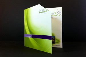
Be careful not to place sharp textures in areas where recipients are likely to hold your collateral with their hands. Photo Credit: Gulp Creative
- Texture – Die cuts add a textural component to your design, but you have to be aware of how your cuts will make your media feel when it’s being held. Does the cut offer a pleasant tactile sensation in the places where people will be putting their hands, or are there sharp edges and points?
- Budget and reusability – Using custom die cuts will increase the cost of your project, mostly from the cost of having custom die cut plates created. However, these custom plates can also be reused in future folder runs. You have to consider whether the investment in custom die cuts is worth the increase in cost for your project. You also have to figure out whether or not you’ll be able to recoup the price of your custom plates by reusing the same cuts on future projects.
Creating your cuts

- Working with your printer – It’s crucial to establish a good working relationship with your printer when utilizing custom die cuts because they’ll be able to tell you whether your cuts are possible and how much money it will cost you. A hands-on printer that does several spot-checks on your folder design during the printing process will be able to spot any die-cut issues before they become printing errors. Your printer might even have a few ideas or examples for how to tweak your design so that the cuts can be as effective as possible.
- Using a template – Before you can design your folder you need a template to work with. Since custom die-cuts alter your template, these need to be established before other design elements. Your printer will already have templates for their print products, which you can then alter to include any cuts you want. Ask your printer for instructions on how to indicate die cut areas on the template. Some printers want you to mark these areas in a specific color, others want you to add them on a separate layer, and some will require both.
- Creating your own template – Some die cut designs are so intricate that they may require completely custom specs and cannot be created by altering an existing template. Your only option in this case is to build the template completely from the ground up. However, before you can do so, you’ll have to figure out the physical dimensions of your end product to be able to create an accurate template.
 Working with designers – If you yourself are not a designer or your design team isn’t used to working with print materials and die cuts, your best bet is to utilize the designers that your printer recommends. These designers have experience working with printed designs and building custom die cut templates. You can choose to give them all of your design elements and have them create the folder for you, or you can just task them with the creation of a template which you or your designers can then build upon.
Conclusion
The biggest benefit for creating a custom die cut is that your media will look and feel completely different from anyone else’s. Just as no other brand will have your design, no other brand will have your unique shape either. And best of all, since custom plates are reusable, the unique shape of your media can be folded into your brand identity and carried over to new projects. Effective marketing media isn’t just about how your brand looks and sounds anymore—it’s also about how it feels.
Do you find yourself gravitating towards print media that has a unique shape? What are some cool die cuts that you’ve come into contact with? Share your comments below!




Thanks, we appreciate it!
Great ideas for inspiration! I consider a custom die cut for nearly every print project I work on and think most people would be surprised that creating a unique shape usually costs less expected. Thanks for the post! It’s just what I needed to get the creative juices flowing!
Thanks, glad to hear!