Some would say that finding the best fonts for your print media project is like looking for a needle in a haystack, but it's actually more like trying to find a needle in a stack of other needles. Just when you think you've conquered this herculean task and discovered the one font that seems to perfectly encapsulate your vision, you'll find that the font is outside your budget range, unsuitable for print, or not safe for commercial use. To help out, we've written reviews of the best free font … [Read more...]
The 17 Best Stock Photo Sites Every Designer Should Bookmark
Nothing makes a print design pop more than exciting visuals that engage the audience, but you may not always have the time or budget to create original photographs or illustrations. Stock art is a quick and easy way to add a visual component to your designs; just remember that not all stock image websites will have the print-ready images you need. Any artwork you plan to incorporate into a printed image should be: High resolution (300 dpi or greater) Properly licensed for your use … [Read more...]
Worst Fonts Ever! 11 Examples of Bad Typography in Print
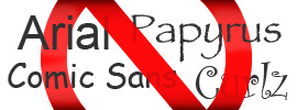
Fonts are like celebrities—some are famous, while others can be downright infamous. When an audience sees a font in your print media design that they just can't stand (be it overused, ugly or unreadable), you can lose their attention in a heartbeat. We've already discussed how to properly use typography in your print media project, but there's one more rule that print designers should take to heart: avoid using notoriously bad fonts in your designs. To that end, we've provided you with a list … [Read more...]
Are These 18 Presentation Folder Mistakes Costing You Money?
When you make one mistake while designing and printing presentation folders, you're likely actually making over 500 mistakes—because the error will show up on every folder you print. To save yourself the cost of an entirely new print job, be sure to avoid these common design mistakes and printing pitfalls to produce the best folder designs possible. Creating a Design 1. Using two PMS colors when one will do If your PMS presentation folder design uses different tones of the same color, … [Read more...]
9 Stylish Folder & Brochure Folds for Print Designers
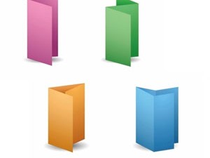
The reason paper makes for such a versatile medium is its ability to transform into something entirely different. As a child, you probably created airplanes, miniature footballs, or fortune tellers through paper folding techniques. Likewise, with a wide variety of folder and brochure folds, a single sheet of paper stock can become a cool tri-panel folder, a fancy multi-page brochure or practically any other form of print marketing. When creating marketing media, there are many different types … [Read more...]
RGB vs CMYK vs PMS: Deciphering Design’s Confusing Color Jargon
Every industry has its own unique lingo that can sound like complete gibberish to the uninitiated. The print design industry is no exception to the rule. You may have heard the terms RGB vs CMYK vs PMS in relation to color when designing for print, but you may not know what each acronym stands for—or, more importantly, why you should care. However, if you want your final design to look the way you intend, it's imperative that you educate yourself on each of these color profiles and the … [Read more...]
17 Essential Tips for Printing Fonts
Since visual elements are such a large part of print design, many designers make the mistake of focusing their attention on shape, line and color while neglecting the typography used in the design. However, text is one of the most crucial aspects of any print marketing collateral, as it provides the most information to the audience. Without taking special consideration when printing fonts, you can end up with a final product that looks unrefined and is difficult to read. Keep these tips in mind … [Read more...]
99 Best Free Fonts for Print Design
When designing print media collateral, a good font can grab the eye and captivate the audience—but the best fonts for print ads often require you to pay a licensing fee for use in commercial marketing. This can increase the cost of your print campaign and leave less money in the budget for special options like coatings, die cuts and embossed elements. Fortunately, there are a bevy of free fonts for print design that are beautifully designed and don’t cost a dime to use commercially. Keep in … [Read more...]
20+ Die Cut Design Ideas for Print (With Examples)
It's easy to find inspiration in a unique color, font or logo when creating print marketing collateral–but the shape of your media is one aspect of design and branding that is often overlooked when brainstorming for ideas. Need some examples? Consider the green soda bottle in the image to the right. Any idea what brand it is? You could certainly tell if it were labeled, but there's nothing about the shape itself that tells us anything about the brand. Meanwhile, the Coca-Cola bottle is … [Read more...]
21 Tips for Working With Your Folder Printer
For first-time buyers, the process of ordering custom presentation folders can be a bit confusing. Choosing the wrong option or neglecting a crucial design element can increase production time and cost for your folders and leave you with an inferior product. Your folder printer should be able to walk you through any aspect you're unfamiliar with, but your best bet for the perfect product is to know how to best work with your printer beforehand. Using a Template Make sure you understand … [Read more...]

