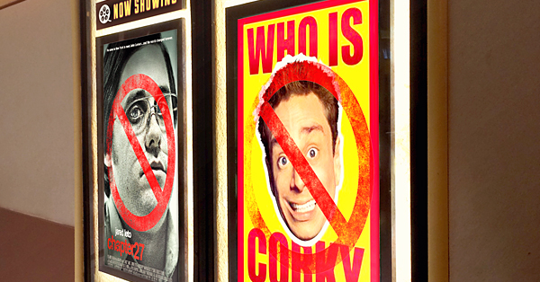
Want to see some of the worst print graphic design you’ll ever encounter in your life? Just take a trip to your nearest cinema.
Movie studios put so much money into promoting their products that we hold their marketing to a higher standard than practically any other form of print media. As a culture, we cannot abide bad movie posters. But when movie posters fail, they fail hard. Even a huge, multi-million dollar movie can somehow end up with a poster that looks like it was Photoshopped by a first-year design student.
As a designer, there’s a lot you can learn simply by looking at what other people have done wrong so that you don’t make the same mistakes. So grab some popcorn, take a seat, and get ready for some pain … here are our top examples of the worst movie posters of all time. And when your eyes can’t take any more, check out our round up of best movie posters of all time.
Million Dollar Arm
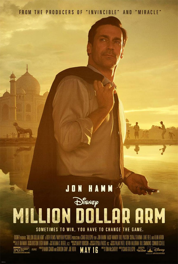
Jon Hamm is a talented actor, but you’d never be able to tell it from this overly posed movie poster for Million Dollar Arm. The jacket slung over the shoulder look is too cheesy for words and gives off the appearance of a catalogue model. But the worst sin of all is the cell phone he’s holding in his other hand—what’s up with that? Not only does it make him look like he couldn’t care less about being on the poster, but he’s not even looking at the screen.
The rest of the poster looks great- – Jon Hamm included – but that pose just ruins everything by being so stilted and obviously fake. No real human being would stand around like that. And that’s what you should take away from this movie poster blunder—always remember that photographs of real human beings should resemble real human beings.
The Fall
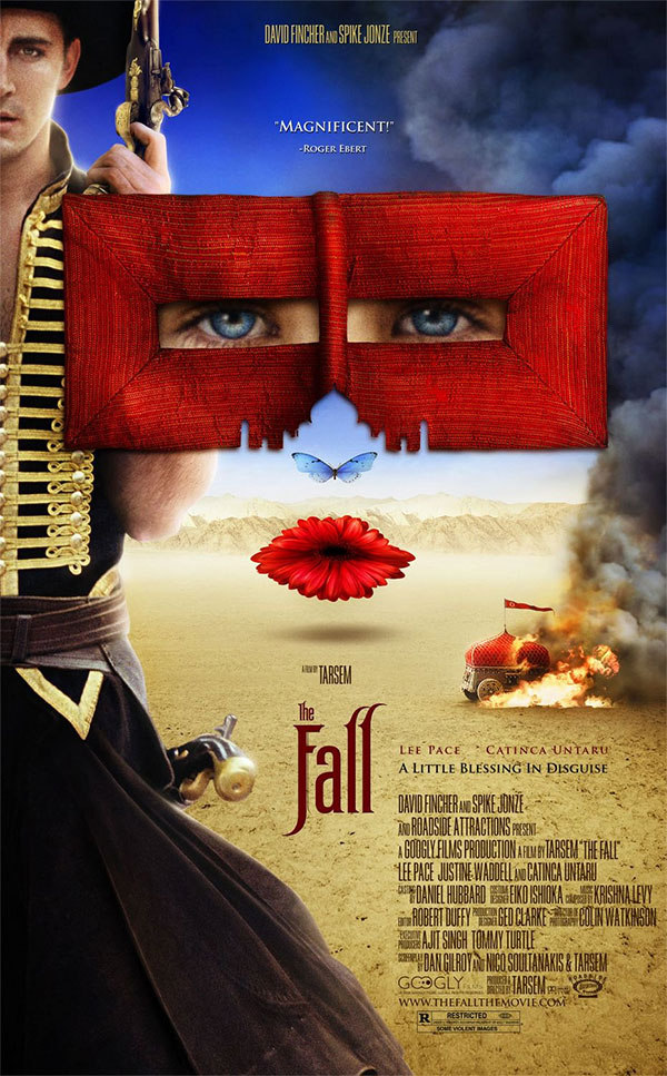
The Fall contains a lot of fantasy elements, so you’d expect the movie poster to have some level of whimsy and magic—but this design takes it too far. There’s a barrage of elements competing for your attention, many of which have hidden images inside, like a Russian nesting doll of confusing imagery.
Then you’ve got the lead actor kind of shoved off to the side. He looks like an interesting fellow, the kind of character the audience might want to follow around on a story—if they could see him at all. This poster has two hidden faces—the lead actor’s, which is hidden by the edge of the canvas and the one made out of butterflies and floating eyes.
There’s not enough for the audience to latch onto and yet, simultaneously, there’s so much sensory overload and overall strangeness that it causes the viewer to feel a bit anxious. You can be weird in your designs, but it helps to do it in such a way that your audience still knows what you’re trying to sell.
Dracula Untold
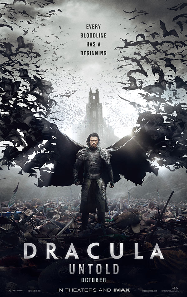
There’s a difference between paying homage to someone else’s work and flat out trying to replicate its success by copying it in every imaginable way. In Dracula Untold‘s case, the studio really wants you to remember how much fun you had watching the Dark Knight trilogy and hopes that you’ll equate the same level of fun to watching this movie.
The poster is the visual equivalent of saying “if you like Batman, you’ll love Dracula.” But to the audience, it comes off as “we couldn’t come up with anything original, so here’s a watered down version of something you already like.”
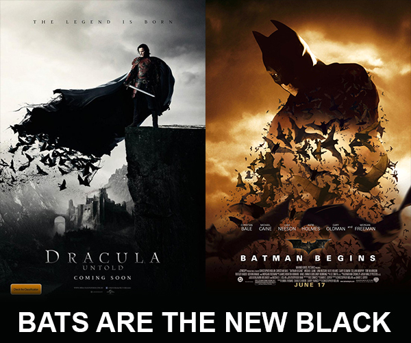
When the audience catches you copying someone else’s aesthetic, it creates feelings of distrust. It indicates that you’re so unsure of the brand, you need to piggyback on the success of another brand in order to sell it.
X-Men: First Class
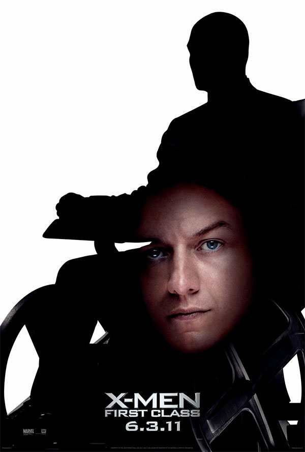
X-Men: First Class was a prequel movie featuring James McAvoy playing a younger Professor X, a role originated by Patrick Stewart. To tie these two versions of the character together, the studio released this teaser poster where James McAvoy’s head is literally just floating there in the silhouette of Patrick Stewart’s body.
To be honest—it’s not a terrible idea and kind of a clever way to connect these two versions of the same character. But in practice, it’s kind of an ugly mess. This is mostly due to the fact that James McAvoy’s face isn’t enough to fill in the space provided by the silhouette and it’s awkwardly cropped by the wheels.
Having a good idea is the first step towards a successful and effective design—but it can’t be the only step. With a little extra time, the designer could have likely found a way to make this work. Even so, a clever idea should never take the place of clean design aesthetic.
Fired Up
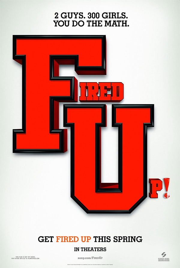
In this age of rampant movie spoilers, it can be a nice change of pace when the marketing for a movie withholds some of the details so that you can enjoy discovering them for yourself.
But that’s not the case when it comes to this poster for the movie Fired Up.
There’s nothing here to go on—we have the name of the movie and a vague idea that it might be about cheerleading, due to the varsity-style and the tagline. You wouldn’t know what this movie was called if you saw the poster from a distance, but you’d see the giant “FU” like the poster was giving you the middle finger.
Making good use of subtlety doesn’t mean you leave the audience scratching their heads—it means you provide just enough details so that they can come to the right conclusions on their own. Fired Up is a raucous college sex comedy—this is not the kind of brand you need to be subtle about.
Corky Romano
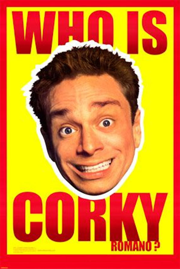
We’re sorry if you went temporarily blind after looking at this poster for Corky Romano—and we’re even sorrier to remind you that this movie existed in the first place. We get that the creator of this poster wanted to show how zany and campy the movie was by using a bright, attention-grabbing design. But there’s attention-grabbing and then there’s … whatever this nightmare is trying to be.
It’s like the movie poster equivalent of a used car dealership – the big cheesy grin, the McDonald’s-on-acid yellow and red color scheme – it does everything it can to try and get your attention. But the worst offense is that weird, tacked-on “Romano” at the end. It’s so awkwardly placed and so different from the rest of the poster that you can’t help but go “huh?”
Your goal as a designer is to connect with the audience, not punish them by blinding them with bright flashy colors. There are better ways to grab the audience’s attention than using the brightest yellow you can find for your background.
Killers
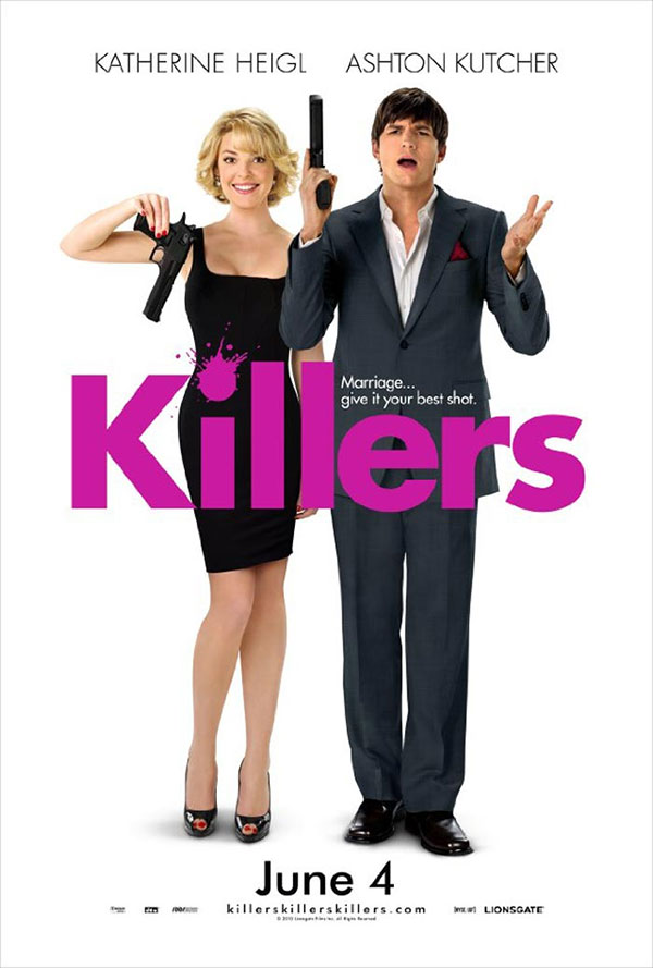
When you’ve got Hollywood movie stars looking like the cheesiest stock photo models that Shutterstock has to offer, there are serious flaws in your design.
This movie poster for Killers is everything but subtle with its attempt to make you understand the two main characters and their relationship to one another. Katherine Heigl’s “How do I shot gun?” look is so completely over-the-top ditzy, it’s insulting to women everywhere. No person in their right mind would ever hold a gun that way, and judging from Ashton Kutcher’s “Come on!” expression, he would seem to agree.
The way this movie poster portrays the relationship between its male and female stars is like a throwback to the 1950’s—these two could just as well be Lucy and Ricky Ricardo. And it has everything to do with how unnatural and cheesy its two models look.
Mickey Blue Eyes
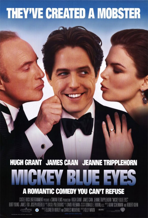
The Mickey Blue Eyes movie poster is the visual equivalent of a guy who always says “Get it?” after he makes a joke. We get it, Mickey Blues Eyes movie poster—we just don’t think it’s funny.
The quantity-over-quality approach is never good for comedy. The only thing worse than having to listen to an unfunny joke is having to listen to several of them in rapid succession. This poster’s first unfunny joke is the pun “They’ve created a mobster”—which you can only understand if you recognize the quote from Frankenstein. Otherwise, it just turns into a weirdly on-point observation about the movie.
The second unfunny joke is yet another quote from another film—this time it’s The Godfather, which is at least another mafia movie. To cap it all off, you’ve got James Caan pinching Hugh Grant in an effort to hit the audience over the head that this movie is supposed to be funny.
Designers wear many hats, and sometimes you’ve got to be a stand-up comedian to get the audience’s attention. But comedy can be hard to master, so don’t try to lay it on thick unless you know what you’re doing.
Star Trek IV: The Voyage Home
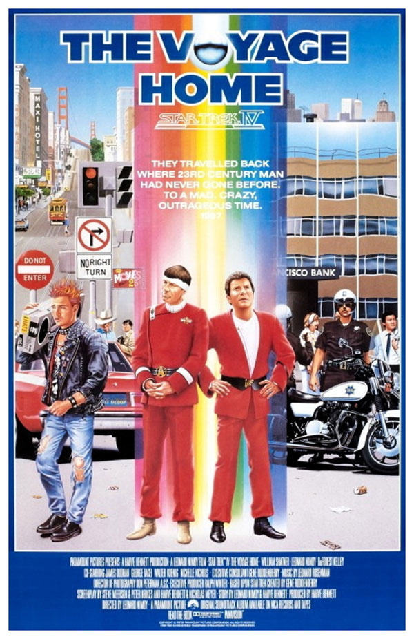
We’re not going to talk about how unbelievably 80’s this Star Trek movie poster is—because when this movie premiered, the aesthetic was pretty spot on. The audience for this poster was probably excited to see Kirk and Spock beaming down into modern-day America.
Instead, we’re going to talk about how this poster is basically unreadable. That rainbow design effect is colorful and brings a lot of energy to the design—but putting white text over it was a huge mistake. A darker color font would have been a better choice. Or at the very least, the designer could have moved the text to a different part of the poster.
Readability should be at the top of your list of priorities when it comes to adding typography to a design. Otherwise, what’s the point of adding it at all?
Chapter 27
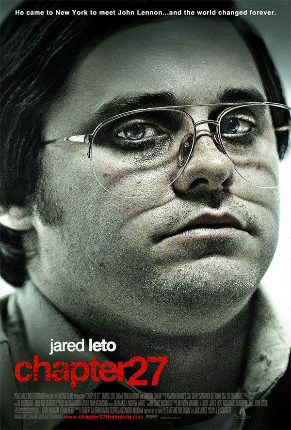
No.
You can’t do this to people.
We get that Chapter 27 is an unsettling film where Jared Leto portrays Mark David Chapman, the unhinged weirdo who shot John Lennon—but this is too much. Imagine this poster hung up in the lobby of movie theaters where children came to see cartoons. Chances are at least a few of those kids had nightmares after seeing this.
When you’ve got a product that’s kind of unpleasant, it’s hard to sell it to your audience through design. It’s natural to want to lean into that unpleasantness, especially when designing for a creative product like a movie. Technically, this poster does a fantastic job of setting a mood and creating an emotion.
But at the end of the day, it’s still a visual medium, and to connect with a design, people have to want to look at it.
The Last Song
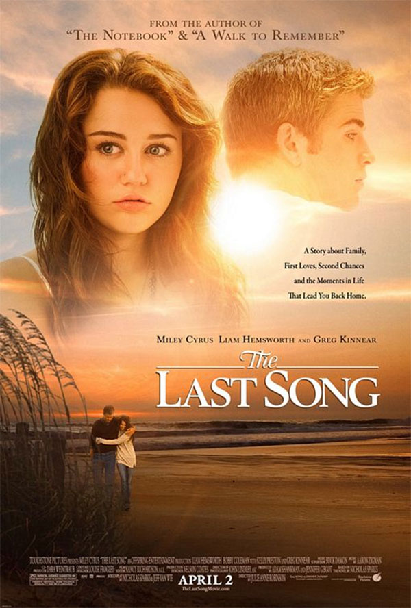
The Last Song is a romantic comedy starring Miley Cyrus and the disembodied floating head of Liam Hemsworth.
Whoever cropped these photographs went a little too far, to the point where poor Liam Hemsworth looks like Zordon from Mighty Morphin’ Power Rangers. Placing his head over the sun makes it even worse-it’s like some alien creature or a rocket taking flight. Once again, we’ve got a clear case of people who don’t look like people. Going crazy with the crop tool can lead to awkward designs like this one.
The Expendables 3
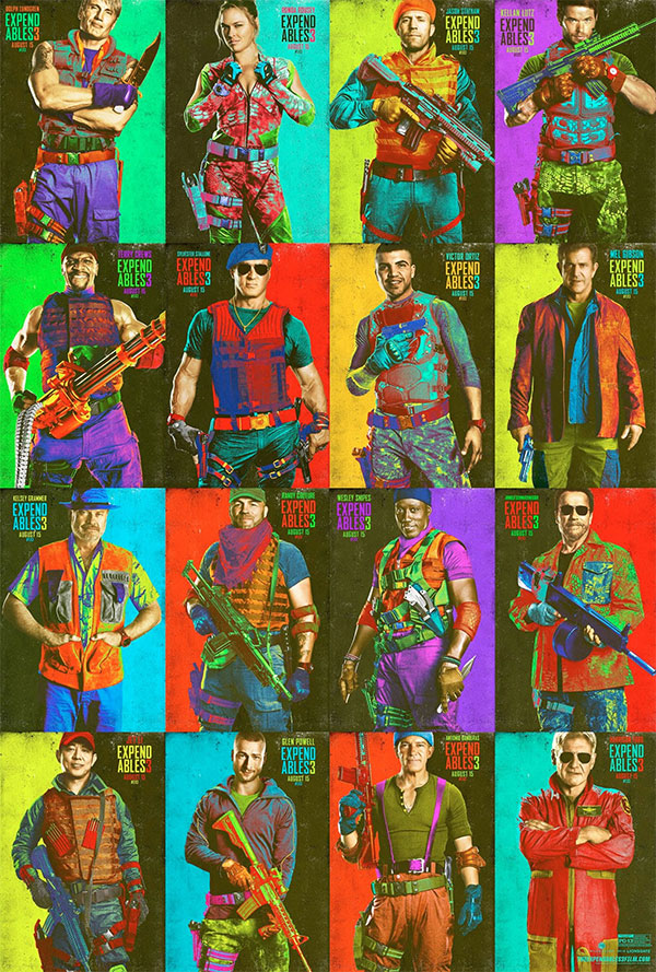
Is this a series of trading cards depicting the tackiest action movie of the early 90’s? No, these are the character posters for The Expendables 3, which came out in 2014. To the defense of the designer who created these posters, The Expendables 3 does features a lot of movie stars who were action heroes in the 80’s and 90’s, so it makes sense to pay homage to that era.
However, these character posters are either too much or not enough. The vibrant colors bring a lot of energy to the design, but those actors are just kind of standing around—they’re not doing anything with that energy. So it makes the design look like the designer accidentally added the wrong filter and just ran with it.
Adding a bunch of colors and filters for no reason can ruin a good design. If the actors had been given more intense, dynamic poses, these blindingly high-energy colors would have been much more appropriate.
The Heat
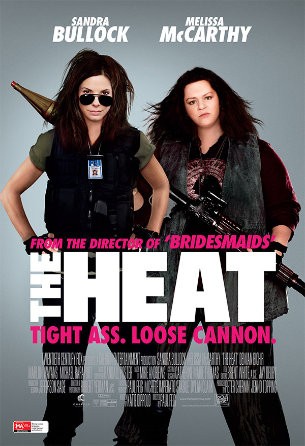
The Heat is an action comedy starring Sandra Bullock and what appears to be some sort of unknown actress—oh wait, that’s supposed to be Melissa McCarthy. This movie poster actually received a lot of flak for being so overly Photoshopped that it left one of its stars completely unrecognizable.
Melissa McCarthy is a bigger woman and the audience already knows that. They’re comfortable with that fact, the actress herself seems to be comfortable with that fact—it’s not up to some poster designer to try and alter reality.
Thor: The Dark World
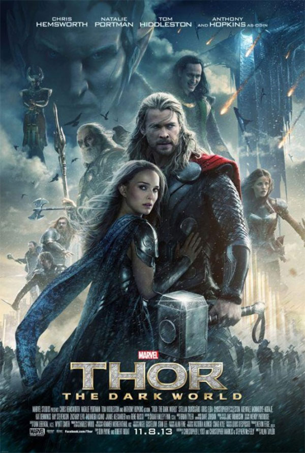
This poster for Thor: The Dark World is so loaded with characters that it looks like a Where’s Waldo book. The designer managed to fit ten characters onto this poster (not including the army of Dark Elves), but to do so, they had to sacrifice all sense of logic and reason. Idris Elba is standing on a cloud, for Pete’s sake.
There’s a lot of awkward cropping and fading happening in this poster, to the point where half of the characters look like ghosts. Cutting down the characters to just the two main leads and maybe the villain in the background would make this poster a lot cleaner.
Adding too many elements to a design will leave you with “Idris Elba Standing on a Cloud Syndrome.” Sometimes clients don’t care about clean design, they’ve got other agendas to worry about. It’s likely the designer was told to include all of these characters in one poster, but in a situation like this, it’s important to be honest about what’s feasible and what isn’t.
The Blue Lagoon
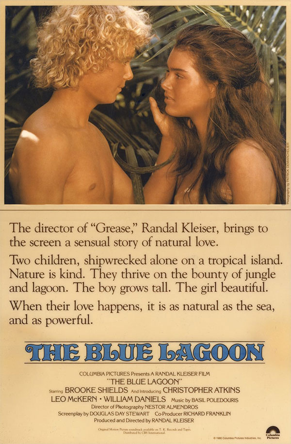
Ernest Hemingway once famously penned a piece of flash fiction using only six words. The movie poster for The Blue Lagoon uses 57 words to tell the audience that the movie is about shipwrecked teens falling in love on a tropical island.
If your design starts to look like a small novella, then it’s probably time to start cutting out extraneous information. Graphic design is a visual medium, and the movie poster for The Blue Lagoon would work a lot better if there had been more room to show the audience what the movie is about instead of just giving them a paragraph-long description.
Worst of all—the copy text on this poster is pretty subpar. It spends a lot of time trying to set the scene and create a mood, which is entirely unnecessary, considering that the picture does a good enough job of doing that on its own. Copy text is meant to sell a product—it’s not poetry, so don’t treat it like it is.
Frozen
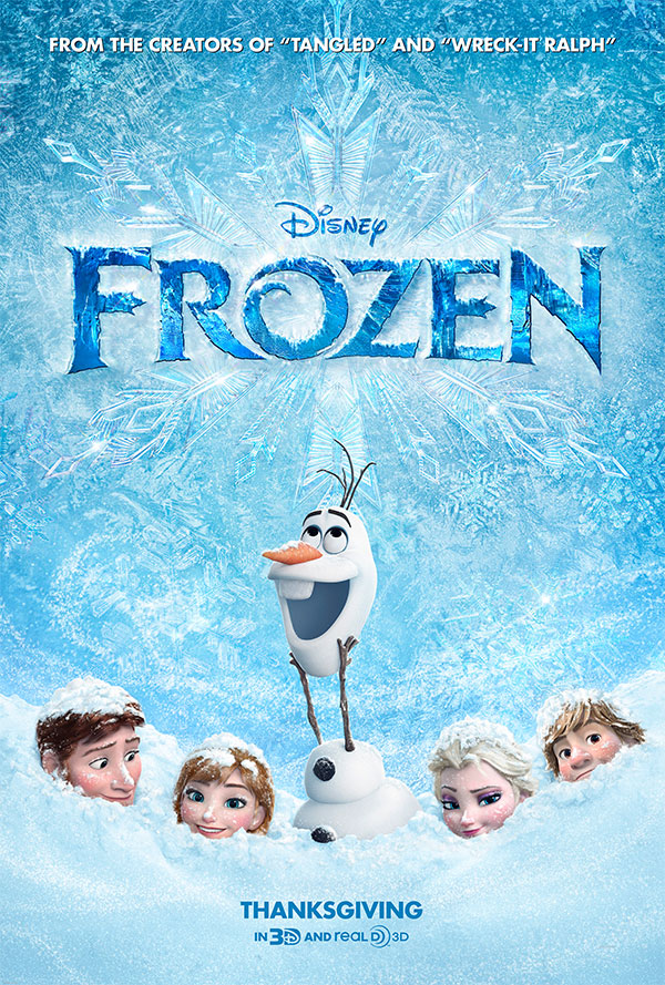
There’s nothing outright offensive about this Frozen poster—it’s a little silly, sure, but it’s also an animated movie for kids, so goofy is a strong selling point. The problem with the poster is the fact that it’s not an accurate representation of the product itself. That’s nothing new – people have been hiding the truth in marketing since marketing was a thing—but lying in advertising usually works for the product, not against it.
When you think of Frozen, you think of little girls dressed like Elsa and Anna, belting out “Let It Go.” Yet, this movie poster for Frozen decides to put Olaf (the comic relief side character) front and center and hides its most prominent characters, literally burying them under a pile of snow.
It’s possible that Disney had no idea the princess characters would resonate with young audiences as much as they did. Maybe they thought that putting the silly snowman front and center would fill seats. But when you consider this is the company’s past success with their princess brand, choosing not to play to their strengths seems like an amateur marketing strategy and shows a lack of faith in their product.
The Bling Ring
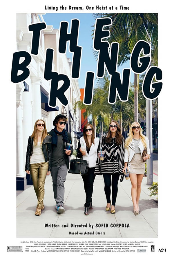
If you can’t read this poster, we’ll help you out—it’s advertising a movie called The Bling Ring. It’s kind of hard to decipher the name of the movie, what with the wonky kerning making readability a nightmare. The letters are spaced out so far that your eye naturally wants to add letters from the other lines to the line you’re trying to read.
Even worse, the lines are so tightly overlapping that some of the letters bleed into one another. Since these letters are close together and the rest are so far apart, your eye wants to treat these groupings like words while ignoring the actual words because they’re too spaced out to read properly.
Playing with the kerning can add a bit of character or personality to your text, but take it too far, and you end up with alphabet soup.
Bangkok Dangerous
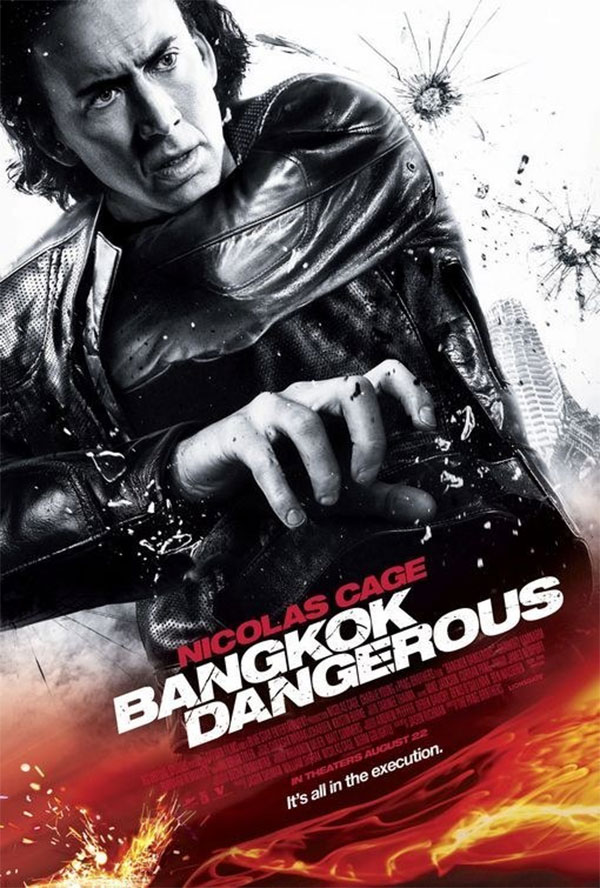
The poster for Bangkok Dangerous runs the gamut of the worst movie poster design ideas. It’s got that black-and-white filtered look with a bunch of generic Photoshop flames to make it look “extreme.” There’s random sparks, bullet holes, Nicholas Cage’s hamfisted expression—all the elements of a classically bad movie poster. It’s almost like a Mountain Dew commercial was spilled all over it. The designer goes so far to try and inject a feeling of excitement that it just comes across as generic and boring.
But the worst sin of all is the awkward Photoshopping—just look at his hand in front. It seems as though he was supposed to be holding something that was erased from the picture, leaving his hand in an unnatural pose. And what’s going on with his other arm—is he putting it down his other jacket sleeve? Whatever he’s doing, he sure doesn’t look comfortable.
Victory
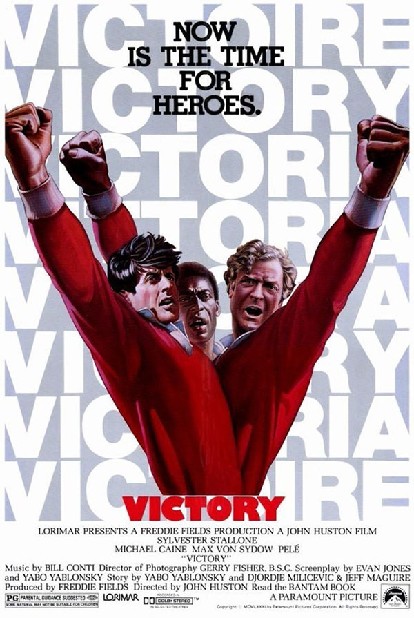
Victory appears to be some sort of horror movie about a three-headed torso monster without legs. In actuality, it’s a soccer movie that few of us still remember … and this unsettling poster might have something to do with that.
We won’t reiterate that people should look like people—you know that by now. Instead, let’s focus on the background, which has a repeating pattern featuring the word “victory” in several different languages. While it’s a clever idea, it doesn’t work with a word like “victory” because the variations are all too visually similar to one another.
Your eye hardly notices the difference, which kind of ruins the effect—at first glance, you just assume it’s all in English. And the fact that there’s a Cronenberg monster in the foreground drawing your eye away from the background probably doesn’t help either.
Outrageous
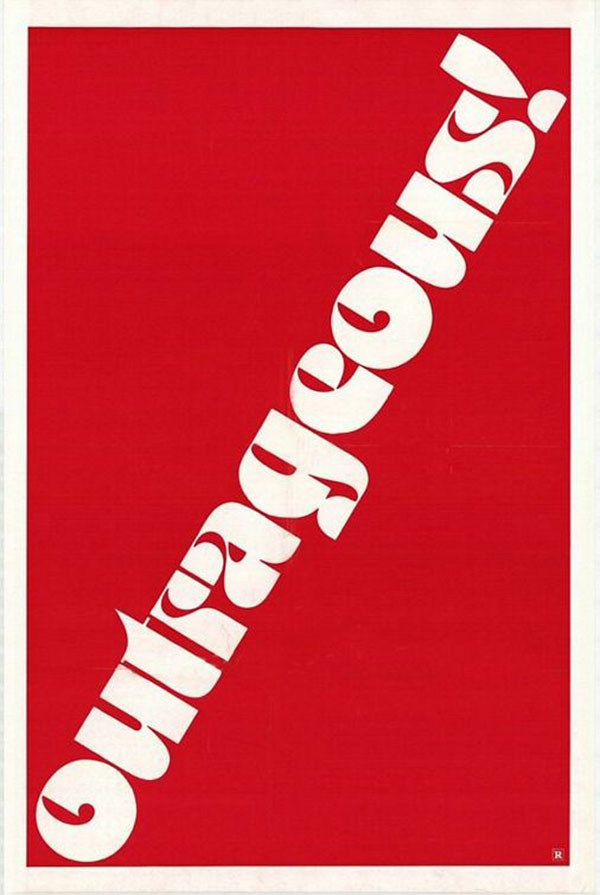
What’s really outrageous about this poster for the movie Outrageous is that it was one of the first wide-released films about gay protagonists—and yet this movie poster is still hiding in the closet.
Maybe the subject matter was too risqué at the time to do a full-on marketing campaign—perhaps the studio was relying on word-of-mouth over collateral to sell the movie. Maybe they thought they could trick some apprehensive homophobes into seeing the movie if they never revealed what it was all about.
Whatever the case, it’s a shame that such a groundbreaking movie had such a bland, forgettable poster.
The Other Woman
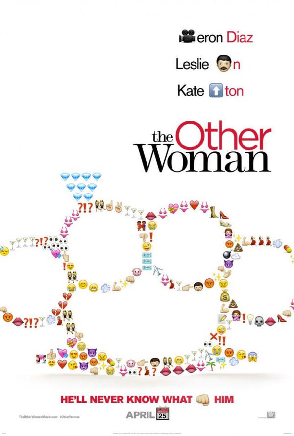
Be honest … doesn’t it just kill you to think that some graphic designer actually got away with straight up using emojis in this poster for The Other Woman?
The concept is kind of cute in an eye-rolling sort of way, but it doesn’t say much about the movie and—let’s just be honest here, it’s just plain lazy design. There’s a reason we don’t typically use emojis in illustration—they’re made for digital screens and they don’t fill up enough space in print. These emojis have that shiny web button look, which adds a ton of extra white to this already bland poster.
But worst of all is that the designer added emojis to the actual text too, turning the whole thing into some godforsaken rebus. When you ask your audience to solve a puzzle in order to understand your message, you run the risk of delivering the wrong message. Consider the fist emoji in the tagline and let your brain imagine what else that fist could represent, other than the intended message.
Takers
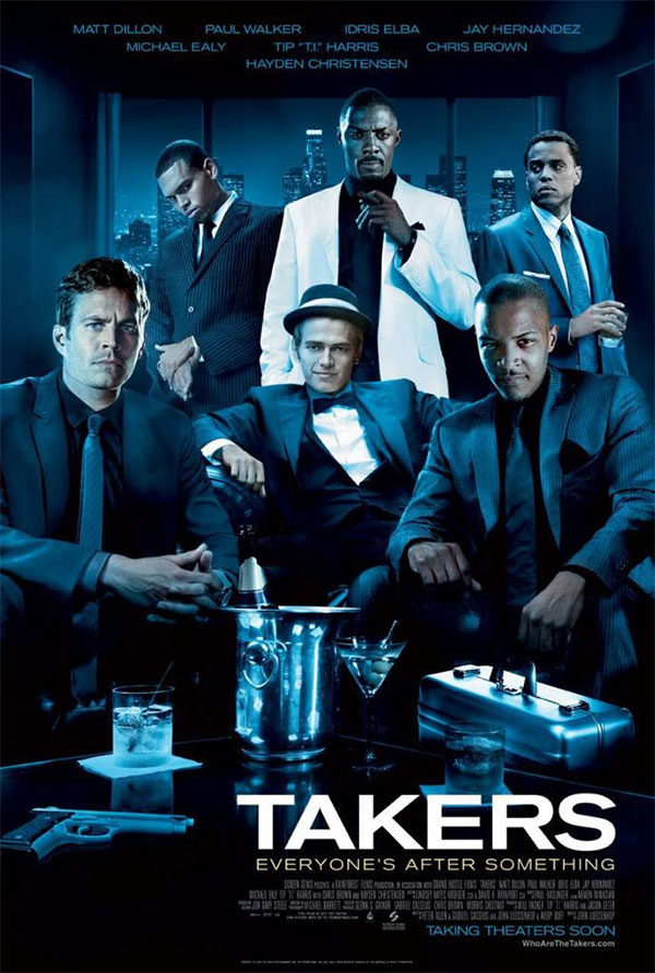
This poster for the movie Takers would have you believe that the cast of the movie are all together in one room. If that’s true, then that room has some out-of-this-world light sources.
It’s inevitable—at some point in your design career, you’ll be forced to Frankenstein together a bunch of photos to make one cohesive image. And sometimes, the only elements you’ll have to work with will all be wildly different from one another.
You have to be smart about how you combine elements like these. The Takers poster highlights its flaws by trying to make the poster look like a natural scene. Even if the designer had decided to just make the poster a series of separate character shots instead of a group scene, it may have been boring, but it would have at least looked more realistic and less airbrushed.
The Whole Ten Yards
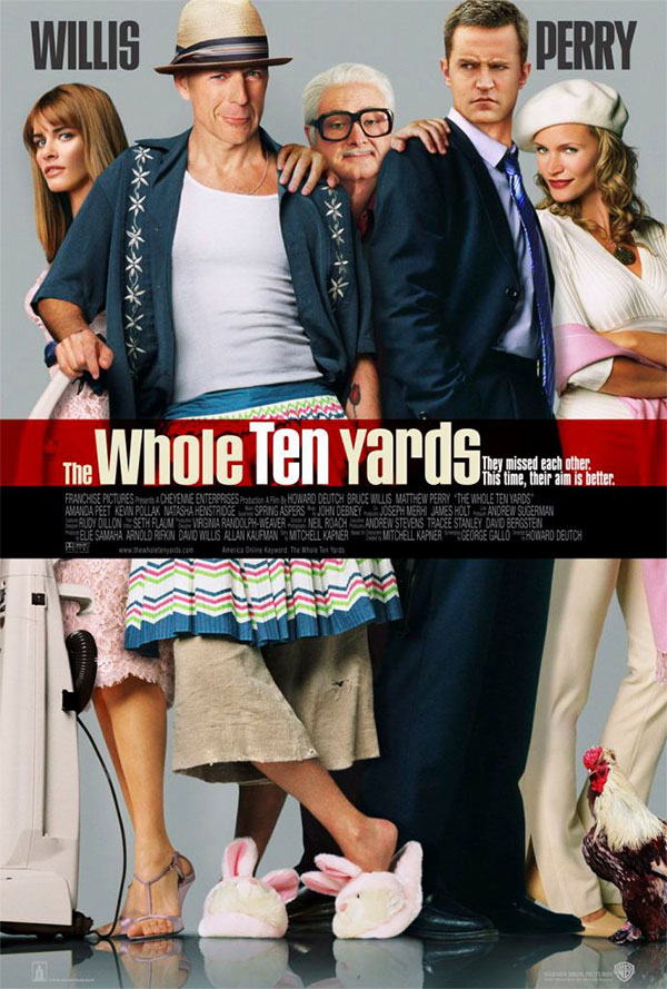
When you first look at this poster for The Whole Ten Yards, you can’t help but feel like the entire cast had their legs separated from their torsos. Looking in greater details reveals a whole horror show of Photoshop blunders.
Matthew Perry’s head is way too small, while Bruce Willis looks like he had his face pasted onto an old woman’s body. Splitting the cast in half at the waist makes everybody look too elongated and unnatural. Amanda Peet’s body is weirdly covered up by Bruce Willis’s arm, but just a tiny bit of her is peeking out in a weird way.
All of the actors look like they don’t really want to even be there. They’re all supposed to be sort of wacky and cheesy, but nobody has any energy—not even the rooster.
Mistakes happen
Movies are a multi-million dollar product, so movie poster designers are sometimes thought of as being in the upper echelon of the design world. But these awful posters just go to prove that there’s no such thing—there are ugly designs everywhere and in every industry, no matter how much money is put into the marketing. Even top-tier designers have bad days once in a while. Nobody can be perfect all the time.
So instead of stressing out over a design that didn’t go exactly as planned, just remember that a bad design does not make you a bad designer. And keep in mind that the best way to avoid repeating history is to stay aware of the mistakes that others have made.
For some more background about why so many posters are so bad (as well as some extra examples and common poster tropes), check out this video from GoodBadFlicks:
What do you think about our picks for the worst movie posters ever? Do you agree? Do you disagree? Got any more examples of posters you think belong on our list? Leave us a comment and let your opinion be heard!


I feel like this article falls horribly short of real solid design advice. First of all, you shouldn’t look at posters designed over 5 years ago as a “Don’t do this”, because they’re from an entirely different era, IE the Outrageous poster. Maybe the poster stood out in that era. You’d really have to compare it to other posters of the era. Same reasoning goes to Corky Romano/Star Trek. You CAN glen good info from this, but it’s put in an unfair comparison.
I take offense to the Jared Leto comments as well. It’s a solid poster. In fact, I’ve never heard of this film until now, and that poster alone makes me want to see the film. Leto is overweight, which looks different. The ultra high def/contrast makes for a striking image. Will kids be traumatized by the design? Probably not. How about a Chucky poster via 1989? Did that scare the crap out of me? Yes. Yes it did. But I wouldn’t call it bad design, nor would I tell a designer “Design this poster about a murderer so that if children see it, they won’t be scared.”
I understand this article is more about principles of design, but I’d still focus on pulling from a current era. There is a LOT of material to pull from.
Design can be subjective, and I think you’ve added a little too much of your own opinion rather than considering audience/relevancy.
Holy highbrow.
I try to be careful with movie poster critique. For the studios, I think they’re just trying to address the two main selling points as fast as possible: who’s in it, and what is it about (generally). Since every designer on the planet has done a movie poster redesign project, I think they often become the subject of unfair criticism.
However, “Idris Elba Standing on a Cloud Syndrome” is definitely catchy.
Also, big red “NO” circles over some posters as the header image. Just saying.
Totally different Article and some very interesting points. I also think that the Thor Movie poster is so trying to be a star wars film poster.
Your so right when you double look at the “Takers” poster, They all look like they are in a different scene.
Very interesting views, however, I don’t agree with what you said about The Fall. The element you called “the one made out of butterflies and floating eyes”, is actually inspired by Salvador Dalís Face of Mae West (Which May be Used as an Apartment), and the film gives many associations to Dalís work. But what would I know, I’m just a first-year Graphic Design student..
The “X-Men: First Class ” poster looks like one of those Olan Mills photos where somebody’s face was superimposed over another person or persons photo.