 Where would McDonald’s be without their golden arches, UPS without their brown shield emblem, or Coca-Cola without their iconic cursive script? Each of these logos perfectly encapsulates the associated brand, and yet, each is an entirely different type of logo design.
The same way that food falls into basic food groups, logos fall into 5 basic styles, each with their own unique strengths and weaknesses. Here’s a definition of each logo type, along with some tips on how to choose one that properly represents your company.
Want some help deciding which logo style will work best for your brand? Our logo services team will evaluate your brand and create an original logo that speaks to its core identity.
1. Wordmark (Text)
 In a recent study of logos belonging to the top 100 brands in the world, 37% of them consisted only of text, often stylized using a unique font. These are known as wordmarks or sometimes logotypes (since they are logos composed entirely from “type”).
Wordmarks work best when the name of the company is very distinctive. Google has a simple, minimalist logo design, but it works for them in part because their name is so quirky and memorable (not to mention short). The same can be said for Yahoo, Pinterest, and other brands that use relatively simple text as their company logo.
Text-only logo styles are an excellent choice for smaller companies who are just getting their feet off the ground. When getting the word out about your business is crucial, it’s not a bad idea to have a logo that very clearly communicates the name of your company.
2. Lettermark (Initials)
 Simplicity is key when creating a logo, and lettermarks are about as simple as it gets. They’re similar to wordmarks in that they’re comprised of text, but highlight the company’s initials rather than their full name.
This can be handy if your organization’s name is difficult to pronounce or especially long. After all, “IBM” makes for a much catchier and more concise logo than “International Business Machines.” When you know that you’ll have minimal space available for branding (like when working with a very small product), lettermarks are a good way to save on size and still provide an indication of your brand’s name.
Additionally, using a lettermark logo design assigns equal visual weight to every word in the name of your company, which may make them easier for customers to remember. “EA” acts as a simple mnemonic device that helps to familiarize people with the “Electronic Arts” brand.
3. Brandmark (Symbol or Icon)
A symbol can express certain ideas much more effectively than text. Think of how well traffic signs are able to associate images with information (“merge left,” “school crossing,” and so forth) and, without a single word, compel you to take action (hopefully).
In the same way, brandmark logos (which consist only of a symbol or icon) can give your audience a clear representation of your company’s identity without the use of words or letters.

This makes them very useful for global companies, since consumers in other countries can associate the logo design with an identity regardless of what languages they understand.
For a brief period, the musical artist presently known as Prince was entirely branded with a symbol and no name.
They’re also helpful when the name of your company is very long and doesn’t lend itself well to an abbreviated lettermark; a group called the “Pediatric Ophthalmology Organization” might prefer a brandmark that doesn’t draw attention to their unfortunate acronym.
However, a brandmark logo type can be a risky move. Since it’s only a symbol, a person looking at it won’t be able to see your company name (unless maybe you’re The Company Formerly Known as Prince). That means it might not be the best choice for a new startup or a smaller company that’s trying to get people more familiar with their brand.
Note that in that same study of the world’s top 100 brands, only 6% of them consisted solely of a symbol, suggesting that this type of logo works best for very high-profile companies that are influential enough to be widely recognized by a symbol alone.
4. Combination Mark (Text and Symbol)
 56% of the top brands’ logos incorporate both text and a symbol. Combination marks (occasionally known as iconic logotypes) are the best of both worlds, so it makes sense that they’d be so popular; they spell out the name of a company while simultaneously associating it with a visual icon.
Because combination marks are more complex, they require more time and thought to design effectively. But that extra work gives you a logo design that’s more versatile than most. These logo types can often be split apart, giving you the ability to use the text or the symbol independently if the situation calls for it.
From a legal perspective, combination marks tend to be easier to trademark than symbol-only logos, which can often look a bit similar. Making a logo that resembles a red five-pointed star puts you at odds with every other company with a similar registered logo (Macy’s and ReverbNation, to name a couple), but including unique text can help set you apart.
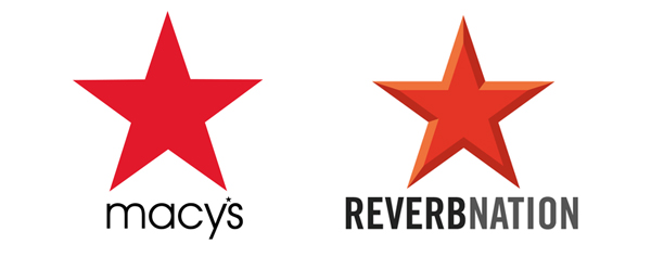
Adding text to your logo can help you distinguish yourself from other companies who may use similar symbols.
5. Emblem (Text Inside Symbol)
Unlike combination marks, which position text and symbols side-by-side, emblems involve placing text inside of a symbol so that the two are practically inseparable.
They tend to resemble the look of an official badge or seal, making them a common choice for government and political organizations, but they’re also used by well-known private companies like Starbucks Coffee and Harley Davidson.

Emblems are a bit on the inflexible side, since they can’t be separated into individual elements the way that a combination mark can. In exchange, you get a more compact logo design that can more easily fit both your graphical symbol and company name into tighter spaces.
Still, you need to be careful with emblem logos, especially when working with print. Since the text needs to be small enough to fit inside of the symbol in the first place, these types of logos may not always print legibly at smaller sizes.
Conclusion
Deciding on a basic logo style should be one of your very first steps in developing a visual brand. Once you decide which type of logo design will work best for your company, you can choose a logo color scheme, font and other details to represent your identity.
Is there one logo type that you prefer above the rest? Have you noticed any particular trends in the logo styles that companies use? Please leave your thoughts in the comments below!





Nicely put together. Would be interested on your take on logos/identities for colleges, universities, higher education.
I have a client that want’s a logo in the style of a medical illustration. How do I find a happy medium between her wants and my need to create a professional looking logo?
That mostly depends on what her wants are. This post from Creative Bloq might help you out: https://www.creativebloq.com/career/clients-love-you-123617
What are your thoughts about using a name within the logo? Does that detract from the presence of a logo or is it very low impact?
Combination logo designs are a great way to build association and brand awareness between your name and a visual icon. When done well, the name and symbol can each stand alone. However, without this association established, a symbol on its own may not be as effective as a wordmark logo or a combination mark.