 Fonts are like celebrities—some are famous, while others can be downright infamous. When an audience sees a font in your print media design that they just can’t stand (be it overused, ugly or unreadable), you can lose their attention in a heartbeat.
We’ve already discussed how to properly use typography in your print media project, but there’s one more rule that print designers should take to heart: avoid using notoriously bad fonts in your designs.
To that end, we’ve provided you with a list (and some visual examples) of the absolute worst fonts ever created for print.
Comic Sans
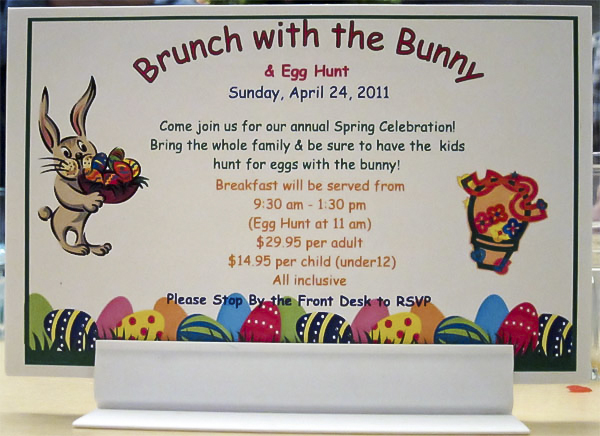
Using Comic Sans is an easy way to make your design look childish and unprofessional.
Photo Credit: Carbon Arc
Let’s start with the most obvious choice for inferior typography. Comic Sans is by far one of the most reviled and ugly fonts in graphic design. What began as a fun imitation of comic book lettering quickly became the awful go-to font of choice for children’s birthday party invitations, lost dog flyers, garage sale signs and sadly enough, a number of failed start-up businesses.
Comic Sans instantly reminds people of amateur graphic design, which can be detrimental to both your client’s brand image and your career as a professional designer.
Arial

Atrocious punctuation aside, the Arial font used on this flyer is rather flat and boring.
Photo Credit: Carbon Arc
Since Arial was the default font for Microsoft Office for a long time (it has since been replaced by Calibri), it’s gained a reputation for being boring and lazy.
Aesthetically, there’s nothing especially wrong with the font. It’s clean-looking, simple and an almost-passable imitation of Helvetica—but unfortunately, it’s also passé and plain. Arial no longer has the pop it once had, and some would argue it never had pop to begin with.
Papyrus
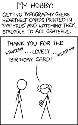
As well-reviewed as Avatar was, the film’s marketing was heavily criticized for its use of Papyrus.
When it comes to the worst fonts for print, Papyrus is a two-for-one special. Not only has it been heavily overused in print media design, it’s also a hackneyed, unprofessional and ugly font that has never looked good to begin with.
You can find examples of Papyrus on everything from movie posters to birthday cards, which annoys critics of bad typography to no end.
The imperfect, grainy effect that makes Papyrus look like an ancient Grecian tablet also makes the font difficult to imprint using embossing or foil stamping.
Brush Script

The Brush Script font used for the headline of this postcard makes it look quite dated.
Connected fonts with little flourishes (such as Brush Script) can also pose problems when printing with certain methods. However, that’s not the only reason why Brush Script is a horrible font. It’s an outdated typeface that’s been used in print media since Baby Boomers were actually babies.
Nostalgic typography can be a great boon for your printed designs; some of the best free fonts for print that we’ve compiled have a retro, nostalgic look. But in the case of Brush Script, it’s a trip down memory lane that nobody (especially younger audiences) wants to take.
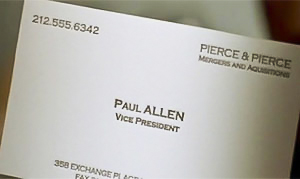
Tired, overused Copperplate Gothic was notably featured in that over-the-top “business card scene” from American Psycho.
Copperplate Gothic
Speaking of old, bad fonts, Copperplate Gothic is practically ancient. The font draws influence from both Roman stone carvings and Victorian era sign printing and has been boring audiences since the early 1900s.
The thin serifs of this font can make it difficult to emboss or foil stamp correctly, and the letters themselves can be hard to read since they’re all so similarly designed.
Curlz
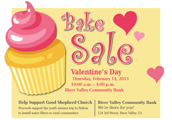
People often use the Curlz font in an attempt to give their marketing collateral a fun, festive look, but it usually ends up making it look cheesy.
The only time you should ever print something in Curlz is if you’re making invitations for a 6-year-old girl’s birthday party—and even then, you owe it to that little girl to use a more creative font.
Curlz gives decorative fonts a terrible reputation with its overly-whimsical, overly-saccharine curlicues, which are very problematic for imprint methods that can’t handle fine detail. Worst of all, Curlz has an association with immaturity, and it can give off an impression of cheap gaudiness.
Vivaldi
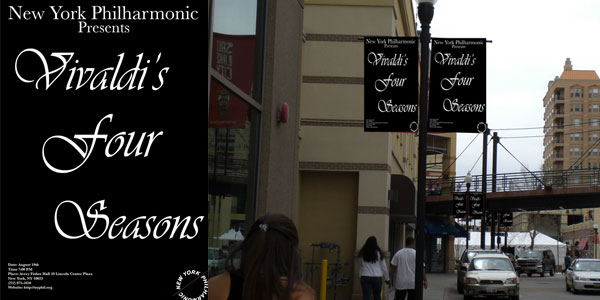
Though the Vivaldi font seems rather fitting in this situation, it also makes this poster incredibly difficult to read. Photo Credit: Michael Sporl
If you want your print media to look like someone’s wedding invitation, use Vivaldi. Whereas the curlicues and flourishes in Curlz makes it look silly, the same elements in Vivaldi makes it look unnecessarily dramatic.
Vivaldi is often the go-to font for mimicking handwritten calligraphy and as such, your audience will no longer be fooled by this pale imitation of the real thing. Not to mention it can also be a headache to try and read through all those loops and curls.
Bradley Hand

Bradley Hand makes this sign for a tanning salon look more like a messy rough draft. Photo Credit: Jane Dominguez
Bradley Hand represents the opposite end of the handwritten font spectrum; it attempts to look like a note that someone quickly jotted down, but it just comes across as tacky and out-of-touch.
The imperfections in Bradley Hand are designed to make it look more like authentic handwriting, but these imperfections can also be hard to print correctly, leaving a jagged fuzzy edge around each letter.
Impact
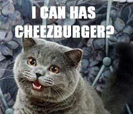 There’s nothing innately wrong with Impact-it’s a nice bold font that can be easily printed, embossed or foil stamped. However, it’s also the default choice any time an amateur designer needs a bold font.
Because of that, Impact is the official font used in funny cat pictures and Internet memes, which puts it among the worst fonts of all time if you’re trying to appear professional. Unless you’re purposefully trying to invoke the feeling of Internet subculture in your print design, avoid Impact.
Trajan
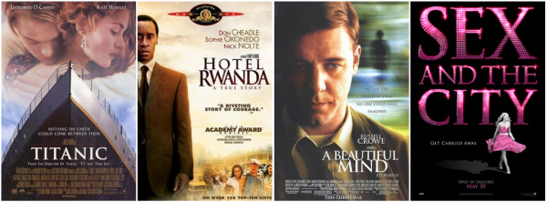
The problem with Trajan typography is its incredibly common use in movie posters.
Since Trajan is one of the defaults in Adobe’s Creative Suite, it’s among the most overused fonts in print marketing—especially when it comes to movie posters. From Titanic to Sex and the City, this font has been used so many times in Hollywood marketing campaigns that it’s been dubbed the “movie font.”
This can be a negative for your print design as it distracts the audience, especially when they finally figure out where they’ve seen the font before.
Courier
This image from a gallery of iconic logos written in Courier shows just how bland the font can be compared to other options.
Courier is always the default choice when inexperienced designers need a font that resembles typesetting, so it’s been woefully overused in amateur print marketing and design. But even if that wasn’t the case, the font just isn’t that interesting-looking to begin with.
This font works for making a large block of text look more readable, but it’s not something that’s going to catch the audience’s eye when it’s used to carry the design itself. Stay away from it (and other serif font choices) when creating headlines or other large text.
Conclusion
Perhaps one of the reasons why these bad fonts continue to plague print design is this: they’re so widely available, it’s practically guaranteed that both the designer and printer will have them on hand. Don’t be afraid to use a rare, unique font if it enhances your media; just be sure to always package any font files used in your design when preparing your print-ready artwork.
What are some of your least favorite fonts for print designs? Do you have a different opinion about any of the typefaces we’ve listed as the worst fonts ever? We want to hear what you have to say, so leave a comment below!





An enjoyable read – even though I had to try cover some of the images 😉 The curlz font is, in my book, the worst font of the lot..Maybe it’s my disposition to not like pink and the connotations associated with the font but it just irks me..Cheers for the post though – was worth the brief irking. Rob
I was surprised of the “11 Worst Fonts” because 3 of the 11 are fonts I use. Yes, some are dated, such as Copperplate Gothic ( which I like) and Arial can be a bit boring. Trajan stands out and works well because of that. I agree with Vladimir some are silly, Curlz, Comic Sans, and Bradley Hand.
Remembering we are in the communication business, the most important thing is that we make it “readable”.
Respectfully,
Jim Lund / Lund Bindery Consultants
This is why you’re a consultant and not a graphic designer.
“Remembering we are in the communication business, the most important thing is that we make it readable”
Sorry, I have to disagree. There are rules to typography. You must be able to differentiate readability from legibility, which are two completely different concepts.
so, out of 6,000+ fonts available, you picked my favorites as the DONT USE. Where is the top 10 “use them” and why?
You may want to check out our list of the 99 best free fonts for print design: https://www.companyfolders.com/blog/99-best-free-fonts-print-design
Unfortunately, I am an occasional user of Arial and this weekend for my “Candy Station,” Curlz. I do believe that Curlz should be used close to never on anything business oriented. Arial should also not be the typeface of a business. But, when no font works for you, Arial is a pretty appropriate go to.
You forgot Mistral *gag* I hate the font. Hate it Hate it Hate it. The last time I used Curlz was in high school. Comic Sans probably in middle school.
I think the author’s choice of font says it all. If you want people to read it use a good serifed font.
It depends on the job. Book typeface is a completely different animal than magazine or flyer typeface. Never mind display type or script.
These kind of articles are just silly and clearly misdirected and coming from someone who has only gone through the start-up phase of actually learning something. Instead of focusing on the typeface or tool the emphasis should be on how well the communication works. Sure, Comic Sans, Papyrus and Impact might be a worse alternative than most in most communication but as an example I really don’t think that the choice of Comic Sans is a bad choice at all for that first image; actually it’s pretty darn close to the perfect choice of pre-installed fonts. Can you agree? And Impact, something I would never use unless it would have to communicate ”internet”, same? »If you have a problem with Comic sans, you probably have a problem with your typography rather than the font.«
On a technical level, most of these fonts look just fine in a vacuum. But once you start noticing them popping up in media over and over again (especially by those working at a novice or amateur level), they start to develop a bad reputation.
I like to think of it in terms of catchy pop music. A song might sound great the first time you hear it, but once you hear it over and over again on the radio, in TV commercials, and over the speaker in department stores, it can just make you sick.
That’s not to say that you should never use any of these fonts. But as a general rule, if you’re going to use a font that many have used before, it’s better to use it for a reason–not just because it’s readily available to you.
LOL, are you actually defending Comic Sans? You ave basically typed out a thought along the lines of “who cares about different styles, context, jobs, clients, legibility, readability, or aesthetic value. Let’s just all do the exact same thing.”
Actually, I expected Times New Roman to lead this list …
Haha, I like this. Impact is so sad, because it wasn’t born evil. But then it got taken over by memes, ew.
Courier can be okay though when it’s not being used to look typewritten (because it’s so obviously Courier, not a typewritten). The original Courier is a little iffy (especially in bold), but Courier New and Courier Sans are solid. I don’t think new designers should fear using Courier, they should just have a damn good reason to use it.
This article focuses far too much on how OFTEN a font is used, and not enough about why that font is a bad choice. To say Trajan is a bad font is simply wrong. Its a great font, and because its great is partly why it is so popular. Popular does NOT equal bad, necessarily. There are some fonts here that are simply bad, but many of these are very appropriate when used in the right situation.
Popularity as reasoning is bad in itself, you really don’t need any more explanation that that. Using something because it’s popular, especially in design, reeks of laziness and unoriginal design.
Never mind the rules of typography that are being broken. If the author of this article went into the details of typography, this article would be five pages long.
Amusing. I fess up to having a soft spot for copperplate gothic, and I would say as long as you know your audience, ignore all this, trust your judgement and choose whatever typeface suits it.
Oh, Thank You. I thought I was the only one banging his head in frustration at seeing Papyrus popping up EVERYWHERE.
This nailed it. Exactly my list of unusable fonts. I’m not so sure about Trajan, it could be replaced with Times New Roman or Calibri, but the rest of the list is dead on.
This is one of those subjective assessments – one “experts” idea isn’t necessarily correct – if there is a correct – so you don’t like these fonts – so what! I like many and use them – and I have significant experience in printing and graphics. I get tired of being told by “experts” what is good and what is bad.
Correct. Only because someone says, that a particular font is bad (take Papyrus), it does not mean, that it is bad. Let’s use these articles as what they are: The believes of (experienced) designers and an advice to beginners. most of the examples here are not bad because of the font used, but they are bad because of bad design. Other examples are simply beautiful!
The problem with Trajan is that it is a magnificent letterform that is distinctive and monumental and is misused constantly for purposes that are totally inappropriate to its aesthetic.
The Arial example (#2 in the list) is doubly instructive because it also shows how NOT to use apostrophes and quotation marks!
Either that or someone let a few monkeys loose at the keyboard …
And Algerian isn’t on this list. How can that be?
I was hoping someone would pick that up. I despise Algerian. Lived in NM and ALL the small businesses in town used it; they even used it at work, a government facility. I especially despise it in churches. Those little pitchforky things at the top of V, W, and Y make it look evil, and I don’t get those bent ladder A’s. It’s creepy and harsh on the eyes. Worst font ever!