The shape of your medium is often an overlooked design element.
When we think about design, we often think about the color and images we see on the canvas, not the shape of the canvas itself.
Unique die cut designs allow you to manipulate the physical shape of your marketing material, which in itself becomes part of the design.
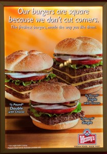
Think of a Wendy’s hamburger—their patties are a special square shape that makes them unique over other fast food restaurants.
The square hamburgers are an instantly recognizable part of their brand. One look and you’d know exactly what you were about to eat.
Shape might be an underrated design aspect, but a unique shape makes your marketing collateral stand out above the crowd.
They make your marketing materials stand out
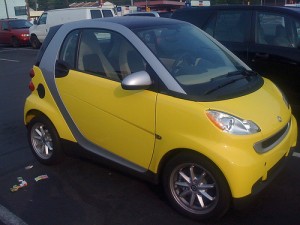 Although presentation folders, presentation binders and other materials come in a wide variety of styles and sizes, they’re awfully similar if you look only at their shape. In that respect, they’re a little like cars. Cars are a fairly diverse product that practically everyone in this country owns, but most of them look similar enough that when you see a car with a truly unusual body structure, you take extra notice of it.
Similarly, breaking away from the standard template gives your brand the leg up over those who use “fill in the blank” designs. A unique shape commands greater attention from your audience because it’s in stark contrast to what they’re used to.
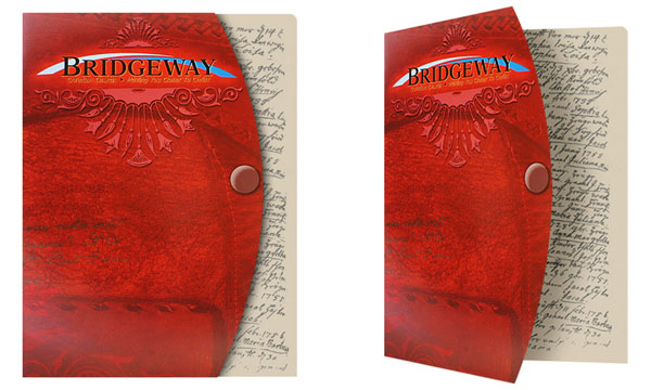
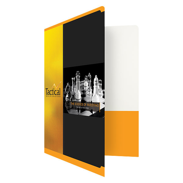
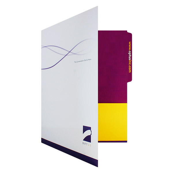
This custom-cut folder design commands attention because it’s a shape you wouldn’t immediately expect (SKU: 08-62).
People are also more likely to hold onto custom-cut marketing materials because they stand out over the rest of the junk that accumulates in their lives. It’s easy to accidentally toss out marketing collateral when it feels no different than any other piece of paper cluttering your desk. A business card or postcard that’s uniquely shaped, on the other hand, feels significantly more important; it’s more likely to go on a bulletin board than into a wastebin.
They build word of mouth
If you have close relatives with access to the Internet, you’ve probably received funny or unusual pictures in your e-mail or on your Facebook wall from time to time. That’s because when people discover something cool or interesting, they’re naturally compelled to share it with others.
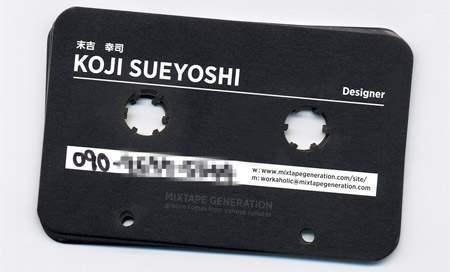
The person who receives this cool business card is likely to show it off to other people they know. Photo Credit: Creattica
You can take advantage of this fact with print media as well. Marketing materials with an unusual die-cut are more likely to get passed around at the office or between friends because people naturally want to show off unique things they discover. Creating unusually shaped media is one way to give it “viral” potential in the real world.
They create opportunity to be creative
With die-cuts, you’re not just applying a new artistic idea to a canvas; you’re creating an entirely new canvas to work with. Considering a unique shape for your materials opens up many more design possibilities for making them true works of art.
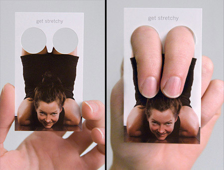
The designer of this business card used die-cuts in a highly creative way. Photo Credit: Ads of the World
If you’ve never used custom die-cuts before, here’s a fun opportunity to flex your creative muscles and think outside the box. Your audience is sure to take notice as well; this is especially important if you work in an artistic industry such as design, theatre or event planning.
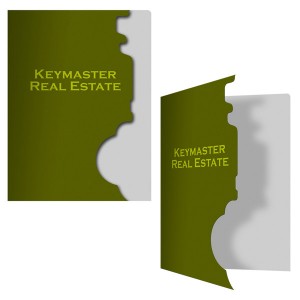
The key-shaped space left in the front page of this report cover fits well with the name of the company it promotes.
They strengthen your brand identity
A number of different factors go into creating a brand identity—from your logo and mission statement to the colors and fonts you use. Shapes that are unique to your brand also become part of your brand’s identity; when customers see the shape of your marketing materials, they’ll immediately recognize and associate it with your brand.
Custom die-cuts give you a better degree of control over how your brand is perceived by allowing you to highlight the the parts of your design that best represent your company. For example, you could create a negative space image related to your industry or brand name.
They help highlight your images
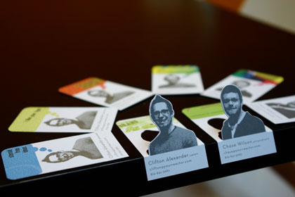
These business cards are creatively die-cut so that photos of their owners jump off the page. Photo Credit: Reactor
Die-cuts can be used to “trace” an image, giving it a three-dimensional look that pops. Use this technique to emphasize your most dramatic visual design elements—not generic stock photography or clip art. Custom photography or graphic art is better for building up your brand and can allow you to better plan your strategy by altering your visuals to match the type of cut you want to make.
They’re touchable and interactive
When you were a child, there’s an excellent chance that your favorite books were pop-up books. These were appealing because the images literally leapt off of the page. You didn’t just read them: you touched and interacted with them. That desire for play persists into adulthood; people prefer media that they can interact with on multiple sensory levels.
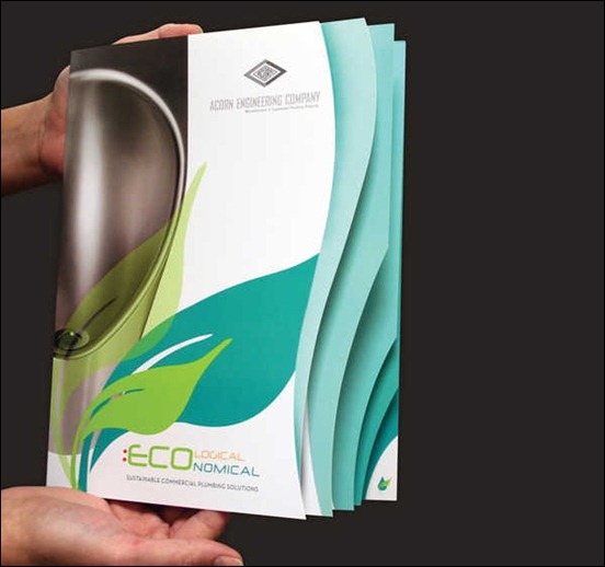
The die-cut pages of this brochure have a layered texture effect that encourages people to open it. Photo Credit: Can Van Hoang
Die-cutting creates a unique tactile element in your marketing media, which allows it to have a bigger impact on your audience. Using textured stocks or coatings in tandem with die-cuts can make your media irresistibly touchable.
They’re versatile
Die cutting techniques pair well with every type of printing method, including:
- Four-color process or PMS ink
- Embossing/debossing
- Foil stamping
You can even design your marketing collateral using nothing but die cuts. For example, instead of choosing an imprint method, you can have areas die-cut from the front of your brochure with a contrasting color underneath to make the design stand out.
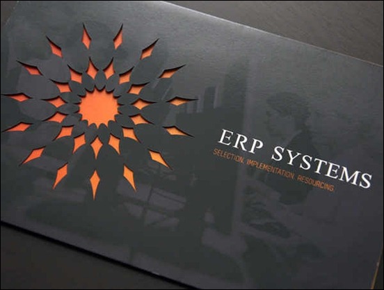
The intricate “sun” design on this brochure was created with die-cutting rather than printing. Photo Credit: Gregory Zychowicz
This versatility extends to the details of the design you plan to print as well. With a complex, dynamic design, cutting away part of it helps to add natural whitespace. In the case of a more simple, professional design, adding a die cut can make it look more stylish while still maintaining minimalism.
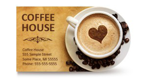
This distinctive rounded business card fits well with the included photograph, but it could also be used with any other round design element.
They’re reusable
Having a unique die created will require a financial investment, but you can reuse it as many times as you like. By creating a design that you’ll be sure to reuse in the future (such as a cut outlining your logo), you can save money on future print orders by reusing the same die.
This doesn’t mean you have to use the same design every time–just that you’ll have a uniquely shaped canvas to work within. For example, if your die cut included a rounded shape, you could use it for a round logo, an insignia, a cropped photograph or even a round object such as a ball, cake or cup of coffee.
Conclusion
Custom die-cuts are a worthwhile investment, but if they’re not in your budget, you can still use prefabricated dies to achieve some of the same effects. That is why we at Company Folders offer more than 180 die cut folders to our clients. This saves you money on your production costs, but forces you to think outside the box as fewer design options are available to you.
It all comes down to priority–if you have a stellar design idea that will bring in new business, you shouldn’t limit your creativity to just the standard options.


