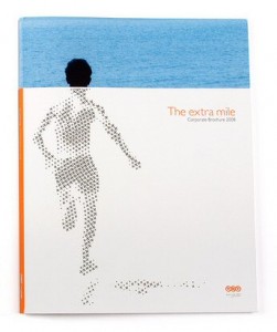
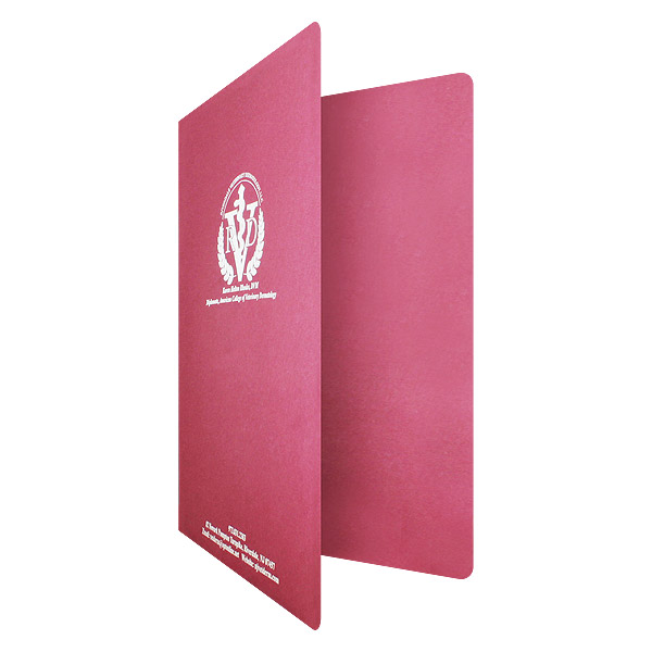
Without a cover page, your report is just a random assortment of papers, liable to get lost in the shuffle. A business report is your company’s chance to show off its accomplishments and get people excited about new directions and opportunities; it deserves to be presented in an effective way.
The best way to make your report shine is to give it a little design flair with a report cover that helps to grab the reader’s attention and establish a tone. Create a stunning cover page by keeping the following principles in mind.
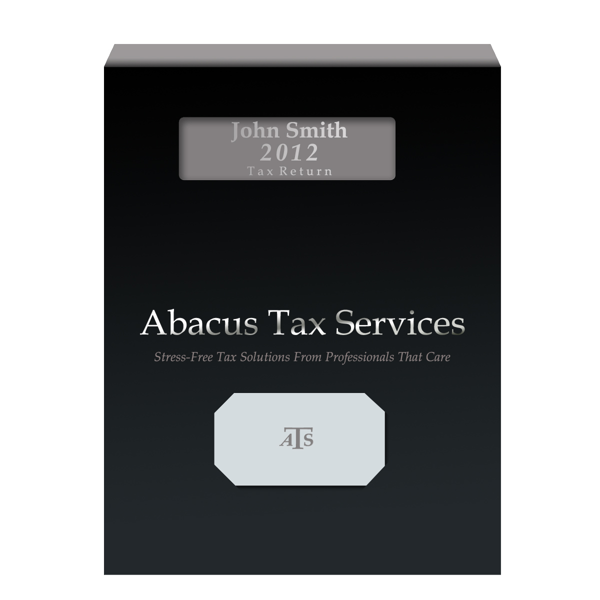
The design of your report folder will be determined by its use. A cover needs only a simple logo to look appropriate (SKU: 09-08).
Reflecting Your Content
This is your business’s opportunity to go bold and shine bright or to stay reserved and project a professional tone. Your cover page design should always be a reflection of the information inside. For example, a company tax report isn’t something that requires a bold design, so you can get away with something simple but sophisticated (like an embossed logo). Meanwhile, the design for an annual report should reflect where your company is heading and celebrate the goals you’ve achieved in the last year. In this case, you want something unique, visual and exciting.
Choosing a Stock
Select a stock that will best bring out the design elements of your project report cover page. If you have detailed, high-quality images and pictures, your cover will look best on glossy paper. If you want a simple design (such as a company logo or slogan), consider bringing in more color and texture through different stock options such as vellum, marblecoat or linen. If projecting an eco-friendly image is important to your business, be sure to select a stock made from recycled materials and with sustainable practices.
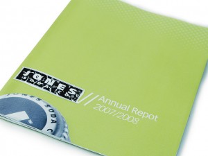
Your cover should be an extension of your brand identity. Photo: Jesse Diehl
Creating Branding
It’s important for companies to have a strong brand identity, which means extending this identity over everything you do. Chances are your office is littered with pens and letterheads with your company logo on it, so your report cover page should match to create brand uniformity. This means more than just adding a logo; it means the overall style, from the color scheme to the font type. Your brand doesn’t have to be the only visual element, but your visual elements should agree with your brand identity.
Selecting Inks
When it’s time to print your covers, you’ll have the choice between four-color and PMS ink. Four-color process uses a combination of cyan, magenta, yellow and black to create a wide range of colors. PMS inks are pre-mixed to create one specific tone. Your printing method will hinge heavily on the specifics of your design: full color images require four-color process, while certain colors such as metallic hues will require PMS ink.
If you have a particular brand color, you may require PMS ink to print it if you want 100% accuracy. In this case, you can choose to do your report cover in all PMS ink or use spot printing to add the PMS tone over a four-color print job.
Incorporating Project Names
If you want to have success in your business project, give it an identity that everyone can rally behind. A project name or mission statement adds a sense of inspiration to any cover design. Utilize embossing and metallic inks to bring forward these concepts so that they stand out above other design elements.
If you want to utilize the same cover design over multiple projects, add a die cut window. Not only does this let you easily swap out new project names by changing the first page of the report, but it actually brings visual attention to your project name, making it the star of the show. In fact, we wrote a post dedicated to design ideas for window report covers.
The cover page for your report should be designed with purpose, whether that’s to reflect a professional tone or get your team excited for the next big thing. Figuring out the purpose of your cover will increase the effectiveness of its design and ensure that your business report is a success.
This post is a part of our Report Covers 101 product guide.

