When designing the cover for your company’s annual report, you should take a peek at what others have done before you to draw inspiration. The best annual report covers use bold designs that tell the story of the past year while looking forward to the future. When you look at these daring cover designs, consider how you can apply similar creative thinking to your own designs to create an annual report cover that sticks with investors all year.
CGIAR
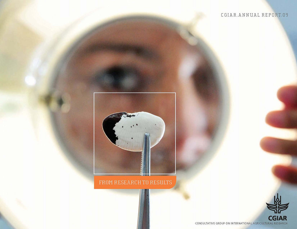
Photo: ILRI
Here’s an example of how high-definition photography can create a striking visual effect on your report cover. The design composite draws your eye directly to the center where the focus is on a seed pod, which reflects the company’s industry and is associated with growth and development.
TNT
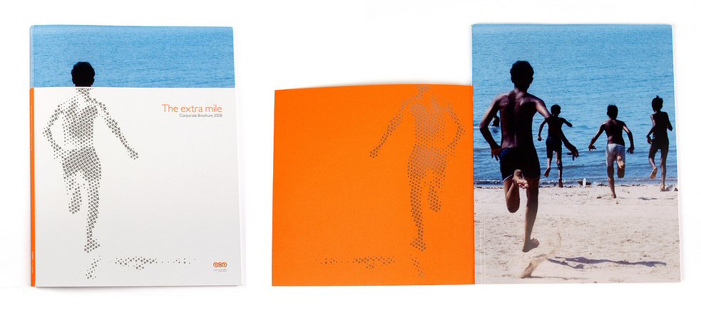
Photo: Nils Mengedoht
The wrap-around jacket for this report cover offers two different designs working together in unison. The jacket cover contains a strong mission statement which is reinforced by the visuals of a running child. When you open the jacket, the photo inside stands alone as its own statement, only now the running kid is joined by others.
TPMSE
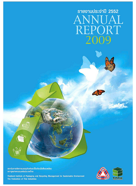
Photo: ANT Greenpoint
This cover design for a Thai recycling management institute communicates to the reader mostly through images and graphics. We see a map of the school superimposed on the Earth, which is wrapped in a recycling symbol. All three design elements compliment one another and tie together to create a statement about the school’s curriculum.
Ploughshares Fund
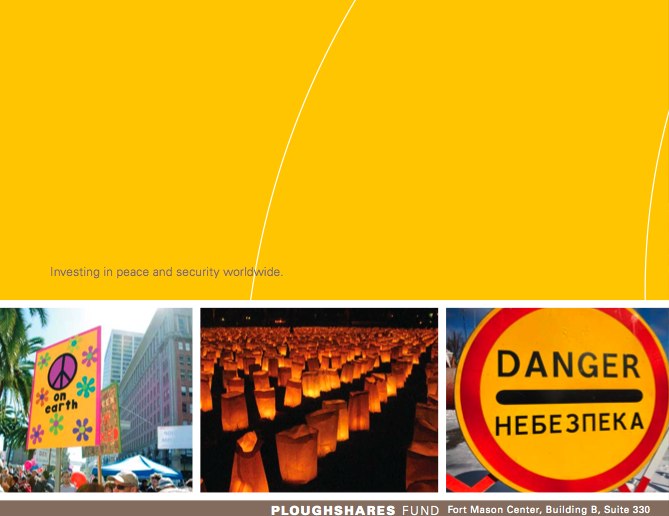
Photo: Steve Rhodes
The theme of peace and security is represented in this cover with a series of photographs that are associated with both harmony and conflict. The design has a strong color identity that is prevalent in all three pictures and the cover itself, which is a smart way to tie a brand and a theme together.
Levi Strauss
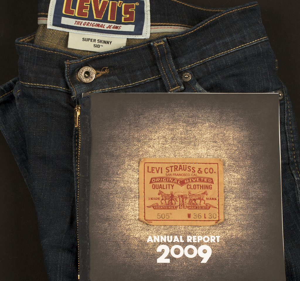
Photo: Jerod Husar
This conceptual design utilizes actual pieces of the product itself to bring texture and flourish to the cover. The faded-looking stock invokes the feelings of a worn-in pair of jeans, making the overall design look like a pair of pants that was transformed into a report.
State Street Corporation
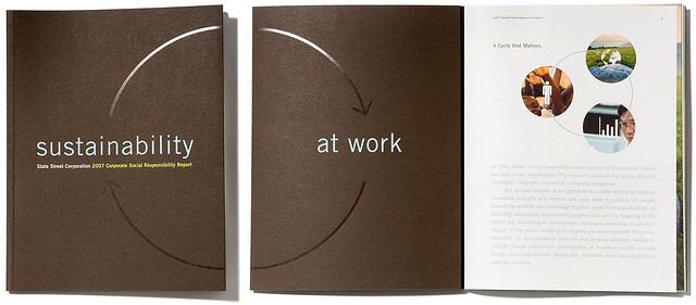
Photo: WhyDesignWorks
This double-sided cover design proves that simplicity can often be stunning. The design invites you to open the cover to read the full message and to get the full visual effect of the circular arrow graphic. The glossy coating makes the graphic elements really shine alone without the need for more pictures or copy.
Logica

Photo: Tom Raftery
The bonsai tree is the perfect visual cue for this mission statement because it’s a sustainable resource that is shaped by human hands. The high-quality image really makes an impact thanks to the addition of the white space, giving it a minimalist look not unlike the bonsai itself.
Feltron
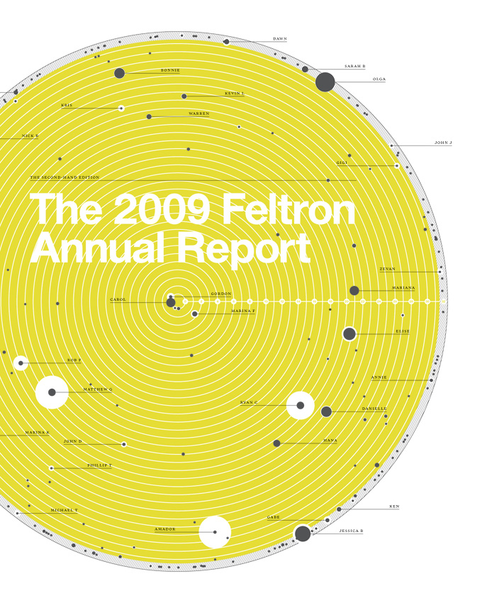
Photo: Nicholas Felton
Graphic designer Nicholas Felton creates his own personal annual reports featuring data from his own life. The cover uses raw data as a design element by organizing it into a circular, colorful graph. The graphics look like a diagram of the rotation of the planets around the sun, which ties into the theme of a yearly report since one rotation equals one year.
These are just a few examples of the beautifully creative report covers out there, so don’t be afraid to look and see what others are doing before committing to your own design. Design inspiration can be found anywhere if you’re open to ideas.
This post is a part of our Report Covers 101 product guide.





I love the simplicty and white space of the Logica cover.
The simplicty of State Street and colours of TPMSE are also really nice.
I agree that a good cover will tie the past and future with the brand, but it can’t be too involved or complex as it loses its power then IMO.
Good point; a simple report cover is often the best choice.