The travel industry is filled with tickets, key cards, maps and countless other important small-sized documents and objects. Travel document folders not only provide a safe place to keep these vital tidbits, they offer an attractive option for presenting these travel materials to your clients.
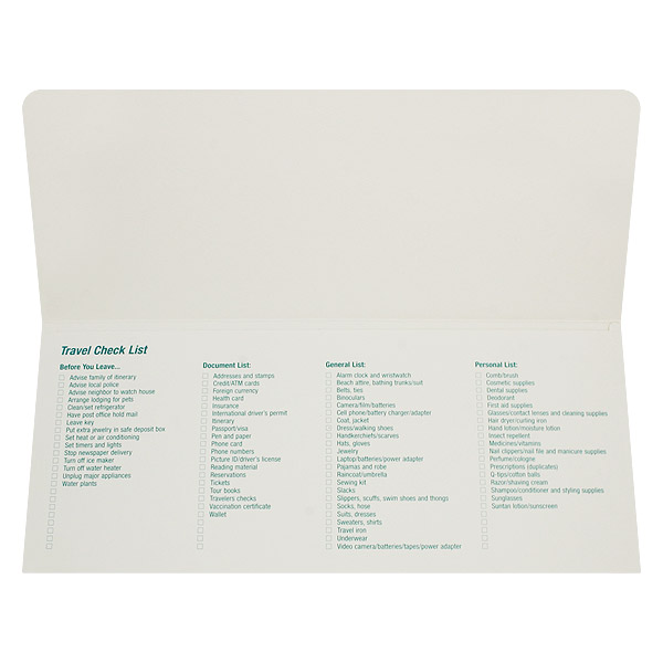
Add useful information to your travel document folders to establish yourself as an authority in the industry (SKU: 01-01).
Provide Useful Information
You want your clients to see you as an authority in the industry, so display your expertise by including useful information in your folder design. A list of travel tips, safety guidelines or luggage considerations will help your clients to feel at ease about their trip, which will in turn create a positive association with your brand.
Choose Appropriate Stocks
The foundation for any good document folder is the stock that it’s printed on. With a number of different colors and textures to choose from, it’s worth considering going with a different stock type over traditional white paper. Add vibrancy to your document folder with bright colors or create a sophisticated look with dark colors. If you do go with white, try a textured stock that you can feel with your fingers.
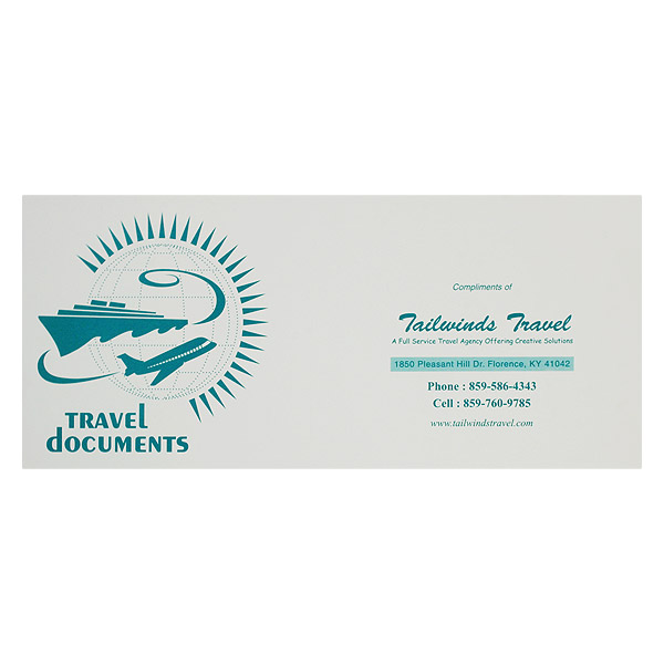
Incorporate contact info directly into your design so that clients can get in touch in case they need you (SKU: 01-01).
Make Contact Easy
Not every trip goes off without a hitch, so you want to be there for your clients whenever a hiccup does occur. Instead of making them frantically search for your information, put it directly in the design of your travel document folders. Use a folder with a business card slit so that customers have a second way to get in touch should they have questions, concerns or are just anxious to plan their next trip.
Match Folder Orientation to Contents
Travel folder orientation can go either way – portrait or landscape – so choosing between the two styles is dependent on the materials that you want to put inside. For example, airline tickets are printed horizontally, so they would go in a folder with a landscape orientation. Meanwhile, hotel card keys are printed vertically, so they would go in a hotel key card holder with a portrait orientation.
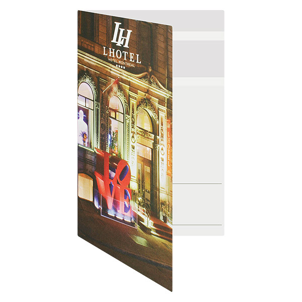
Full-color card folders make your clients excited for their travel and eager to visit again (SKU: 27-05).
Use Pictures to Excite Clients
Adding pictures of destinations, attractions and events in your folder design accomplishes two goals. First, it excites clients about their travel plans and gives them something to look forward to. Secondly, when a client returns home, every time they see the folder they’ll be reminded of their trip and, vicariously, your brand. This can lead to repeat business and customer recommendations. Full color pictures are best, especially if they show the subject in a particularly flattering light.
Remember Your Brand
Your folder design should be an accurate representation of your brand as a whole. That doesn’t just mean including a logo and mission statement, it means keeping your company’s style in mind at all times. Consider what you offer and to whom you usually service. A fancy 4-star hotel is going to need a folder that is elegant and sophisticated, while a family vacation resort requires a design that is exciting and playful. If you have a strong sense of what you offer and how it differs from the competition, you can easily design around that theme.
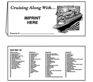
Change your folder design for different clients and situations; this particularly folder is used exclusively for cruises.
Be Versatile
Some brands have multiple types of clientele and services, which requires a different folder design for each unique facet. For example, a travel agency might have a different folder design for cruise clients than they do for general travel clients. A hotel might use a different type of folder for clients staying on business than those who are staying for pleasure. Flexibility and preparedness are key essentials in making an impact on your customers.
Travel document folders are powerful marketing tools, but they are even more powerful when paired with presentation folders, business binders and other presentation materials. Use all the tools at your disposal to create fully loaded travel packages, with your document holders as the centerpiece.
This post is a part of our Presentation Folders 101 product guide.

