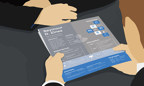
 When it comes to creating resumes, graphic designers are lucky. Not many fields allow for potential employees to directly demonstrate their work-related skills with the resume itself. Pastry chefs don’t get to bake their resumes into a cake, teachers can’t assign their resumes as homework, and lawyers aren’t given the chance to defend their resumes to a jury.
But graphic designers can – and should – treat their resume as they would a sample in their portfolio. The design of your resume can help potential employers and clients get a feel for your style and creativity, which is something you just can’t get from a standard letter-style resume.
Graphic design resumes can be challenging, since the standard rules of resume creation do not apply. Your resume has to ride a fine line between pizazz and professionalism—too much of one and not enough of the other can hurt your chances of employment.
Whether you’re just starting out your career or you’re an old pro who’s looking for new opportunities, these graphic design resume tips will help put you one step closer to your goal.
Writing Your Resume
Start with contact info
The very first item to include in your resume is your full contact info. Include your name, phone number, e-mail address and any pertinent URLs, such as your online portfolio or website. Depending on the situation, you may want to include more information. If you’re sending your resume via snail mail, then you’ll definitely want to include your home or office address.
Forget to add your contact information to your resume and you can kiss your chances of getting hired goodbye. Photo Credit: Charlotte Allen
Your contact info should be placed at the very top or bottom of the page so that it can be easily located. If your resume is two pages, be sure to include the contact info on the second page as well. This way, potential employers will still be able to contact you in the event that your resume pages are accidentally separated.
Skip an “objective” statement
A long time ago, someone decided it was a good idea to include an “objective” statement at the top of a resume—even though everybody knows that the objective of any resume is to find employment. As such, objective statements are starting to go out of fashion-frankly, you can take them or leave them. Graphic design resume already tend to have very unique formats; it doesn’t seem all that important to stay traditional when your resume itself will be anything but.

If you do decide to include an objective statement, make sure it’s not something generic like “Objective: I want to have a career as a professional designer.” Put your unique spin on your objective statement and personalize it for the job you’re applying for. Make the objective something that would benefit your employer as much as it would benefit you. For example, your objective could be to help new businesses create long-lasting, recognizable brand identities.
If possible, your resume should fit on a single page. Photo Credit: Anton Yermolov
Keep it brief
You’ve done a lot of great things with your life, both professionally and personally—but not every one of your achievements needs to be listed in your resume. Keep it simple. The person reading your resume has to go through several applicants, and if your resume is too long or too dense, you’ll hurt your chances of making an impression.
Think of your resume like a snapshot—a single photograph can tell a detailed, vivid story without needing extraneous details. Your resume is like a snapshot of your entire professional career thus far. It’s like a highlight reel that shows only the best of the best.
The best resumes are a single page, if possible. It’s entirely okay to spill over onto two pages if necessary, but it’s always a good idea to have a one-page version of your resume ready to go in case an employer specifies that they only want to see one-page resumes.
Be honest
There was a time when “everybody” exaggerated on their resumes, but that was before Google was invented. These days, employers and clients can and will find out everything there is to know about a designer before working with them, so resist the urge to embellish.
For one thing, if you’re caught in your own lie, it’s going to pretty much nullify your chances of getting the job. But the other factor you have to consider is that employers are going to hold you to whatever skill level you claim to have. If you can’t deliver the results they expect, the job may not last long even if you get it.

There are, however, some gray areas where honesty is concerned. If there are a few blemishes in your work history (such as being let go from a previous position), you can decide exactly how much information you want to reveal. Don’t feel like you’re obligated to showcase your worst moments along with your best.
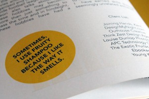
Unless you’re going for a truly offbeat presentation, employers could probably care less about your preference for fruity shampoo. Photo Credit: Luke Sutton
Don’t include extraneous details
Stick to the facts—your resume should be a representation of your professional experience and skill level. You don’t need to include extraneous details like your age, your part-time job in high school or your favorite hobbies. Your resume should focus on the information that makes you look like the top candidate for the job.
However, there are a few details you may want to include that don’t necessarily line up directly with the job you’re applying for, but are helpful for understanding you as a person. For example, if you served in the military, you’d want to consider including that detail if your military experience helped to inform the way you conduct your work as a designer (you’re used to taking orders and staying cool in high-pressure situations).
Show your results
Make sure to be detailed when talking about your past work experiences and clients. Recruiters want to know what you did for past employers, but it’s not enough to just list a bunch of tasks that you were responsible for. You also want to include the results of your hard work.
Just saying that you helped a past client run a print campaign isn’t going to excite anyone. But proving that your print designs helped drive up sales and conversions will definitely get people’s attention. If you can provide specific statistics to back up your claims, you’ll make a much bigger impression.

Don’t resort to cliches

Please do not call yourself a “graphic design ninja.” Please.
Unless you sell out stadium shows on a nightly basis or are somehow living in feudal Japan, there’s no reason to ever call yourself a “design rock star” or “design ninja.”
Recruiters hate this kind of stuff, and you won’t be the first designer to try and dazzle them with how cool and witty you are. And in doing so, you’ll automatically look the opposite of cool or witty—you’ll come off as an annoying slave to trends.
There may be the rare occasion when you see a job advertisement looking specifically for a “design ninja” or “rock star” or something equally weird. If that’s the case, then by all means, play to the room—but you’ll probably want to do that in the cover letter anyway.
Write a formal cover letter
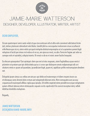
Photo Credit: Jamie-Marie Watterson
Do not underestimate the importance of a cover letter, especially when applying for jobs via e-mail. In many cases, your cover letter will determine whether or not the recruiter looks at your resume at all. It should be professional, informative and to the point.
One of the most common graphic design resume mistakes that people make is writing a cover letter that’s basically just a long form version of their resume. That’s not what a cover letter is for—it’s your introduction to the employer and a chance to explain why you fit what they’re looking for.
Your cover letter should be personalized for the business you’re applying to. When responding to a job listing or want ad, your cover letter should be a direct response to whatever it is the employer is asking for in a designer. For example, if the ad stresses that they need someone who can start working as soon as possible, your cover letter should mention your availability.
Keep the letter brief; it should only be one page, period. Use small paragraphs and get to the point as quickly as possible. You can assume your cover letter is going to be skimmed for information, so don’t make it too dense. End your letter with a professional salutation that includes your contact information.
Edit, edit, edit
When you’re done writing your resume, you’re not actually done writing your resume. You still have to edit for spelling, grammar and clarity.
Automatic spellcheckers aren’t infallible, and don’t always account for phrasing and proper nouns. You’ll want to make sure the names of your references and past employers are all spelled correctly. Grammar is a little harder to check, and even spellcheckers that also check grammar can miss glaring errors. It helps to read your resume out loud; when something doesn’t sound right, it can be an indication that the grammar is off. This also helps you catch omitted words.

If you don’t feel comfortable with checking your own work, have someone else do it for you. This is a good idea even if you do feel confident in your own abilities as an editor; a second pair of eyes will often catch something you never noticed before.
Designing Your Resume
Use the tools of your trade
Put away Microsoft Word for now. When creating the look of your resume, whip out design software such as InDesign or Illustrator. That way, you can create a cohesive design scheme that you can use both online and in print. This also helps make it easier for employers and clients to bridge the gap between your print resume and your online portfolio, since they have a similar visual brand.
Make it your own
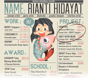
The look of your resume gives you a chance to show off the more unique parts of your personality. Photo Credit: Rianti Wong
Your resume design is an opportunity to show potential employers and clients a bit of your personality, both as a person and a designer. It gives the people you want to work with a chance to get a feeling for whether you fit in with their culture and identity.
Showing people your true personality is a bit of a risk. After all, there’s a chance you might not be the sort of person they want to work with. But that’s okay. In the long run, you’re going to have more success working for clients who understand and appreciate you and your work. It’s better to be rejected for being yourself than to try and fake a completely made-up persona because you think it’s what employers are looking for.
That being said, you still need to be professional and demonstrate to employers that you can use your style to sell a brand. In this case, the brand just happens to be you, so you should approach it from the same angle you’d approach any other client. Figure out what makes you stand out and inject those unique qualities into your work, but in a way that will reach your audience (who, in this case, are potential employers and clients.)
Be careful with templates
Templates are useful tools for making quick designs, but as a rule of thumb, you shouldn’t use templates to create your resume. For starters, you never know who else is using the same template. If a potential client or employer sees you have the same resume design as another designer, they’re likely going to ignore the both of you.

Worse case scenario: the employer is actually impressed by the template design, and then disappointed later on when they discover that you have a different style and skill level altogether. The design you pick for your resume should be representative of what you can do for a potential employer. Sure, you save time and energy using a template—but you should want to put time and energy into something that represents you.
If you do decide to use a template, you should at least make enough alterations to the design so that it doesn’t look like you used a template. Graphic design resume templates can be a good learning tool for figuring out techniques to use in your own design, but using a template like a fill-in-the-blank form is just going to hurt your chances of employment.
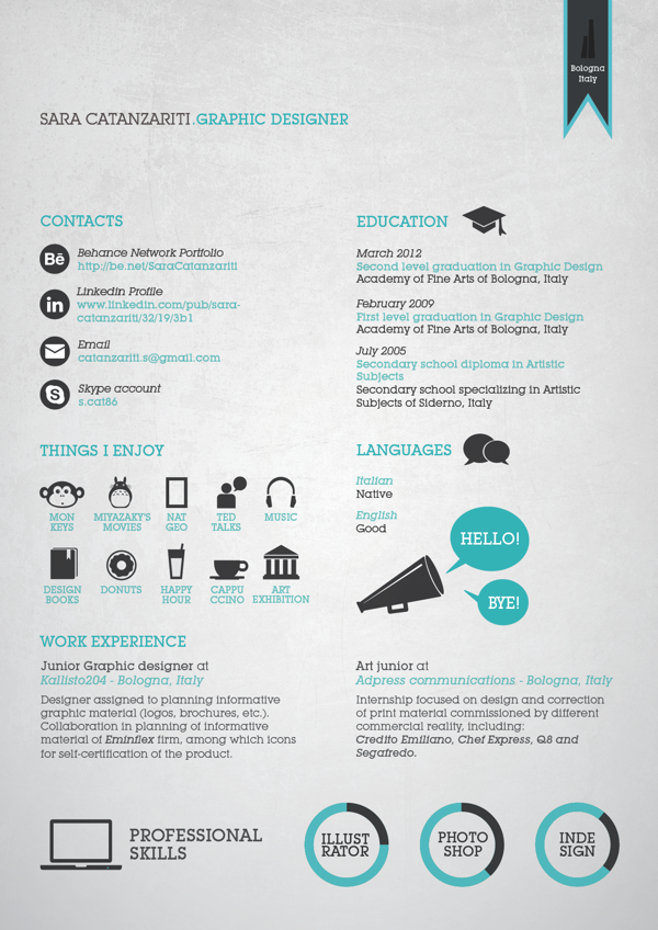
Color in your resume works best in small doses. Photo Credit: Sarah Catanzariti
Be smart about your color choices
Unlike other professionals, graphic designers get to inject some color and personality into their resumes. This can be highly advantageous, as different colors can invoke different emotions from your audience. Using the right colors in your resume can help you play to the recruiter’s emotions. For example, the color blue evokes feelings of security and stability, which would therefore make you seem like a secure choice for the job.
Use too many colors at once, and you risk muddling your message and making your resume look unprofessional. Again, you have to think of yourself as a brand; most brands only use one or two colors to represent themselves. Plus, using fewer colors gives you more printing options (see CMYK vs PMS printing) and makes the design easier to convert to black-and-white if need be.
Readability is priority one
When it comes to resumes, fashion should never trump functionality. At the end of the day, your resume is still a resume and it has to function as one, which means recruiters need to be able to read the important information you’ve included.
Fonts should be simple and readable. Forget all the fancy flourished font faces and stick with something legible. You should also make sure the font size is big enough, both in your digital and physical resumes. The layout of your resume should have a logical flow and arranged in a way that favors the way we read the page (hint: it’s left to right.)

Color can also be an issue, both font color and the surrounding colors used in the design. Some colors clash and can be hard to read, while others blend into one another in a way that makes them practically invisible. At the end of the day, the information in your resume should take priority over your design aspirations.
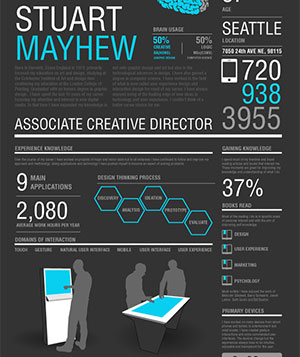
Infographic-style resumes can make a great impression, so long as the style doesn’t overpower the substance. Photo Credit: Stuart Mayhew
Consider an infographic
Who doesn’t love an infographic? They break down big picture ideas into easy-to-digest points, and do so in a way that’s entertaining and exciting. A lot of the best graphic design resumes contain the best elements of infographics, and some designers have excelled at completely converting their resumes into an infographic format.
Tread carefully if you decide to go this route. If you focus too much on the visual design, you’ll run the risk of overshadowing the important information your resume contains. If you go too far off the beaten path, you might find recruiters aren’t really reading your resume at all. Remember, these people often have piles of resumes to sort through, so if your resume takes more effort than most to read, it’s going to come off as a negative.
Use whitespace to your advantage
Another way to appeal to recruiters who have to read dozens of resumes at a time is to use ample whitespace. This is true for both your resume and your cover letter, even if you stick to a standard, text-only resume.
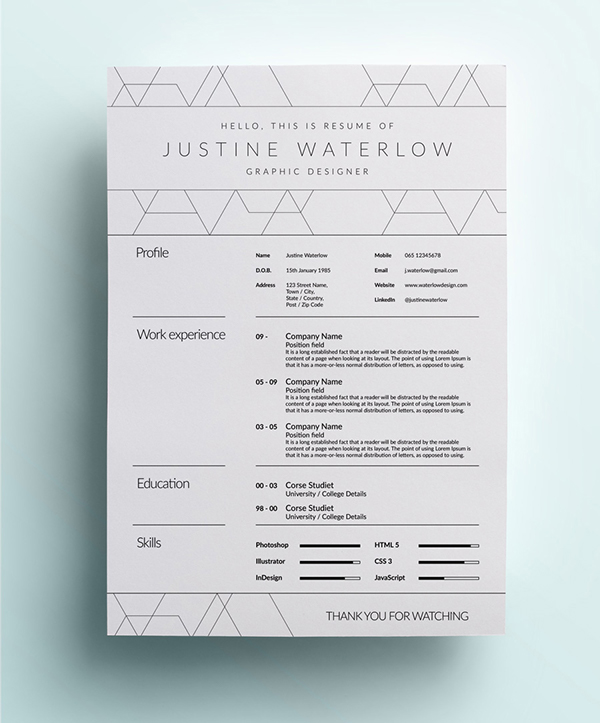
Whitespace helps break up your resume and makes it easier to read. Photo Credit: Dejmus
Whitespace makes it easier to quickly scan for information, which means that all the important points you make in your resume and cover letter have a better chance of actually being seen. Use lists to break up information and keep paragraphs brief.
When your resume is a wall of text, it exhausts the eye and makes the recruiter miss out on a lot of the most important points because they’re not reading every single word.
Be consistent in the way you present yourself
How many times in these tips do we have to say it? You are a brand, so treat yourself like one.
Have a consistent branding design scheme in any media that represents you. Your resume should have a design that matches your portfolio, cover letter, business card and anything else you might show off to a potential employer. The same goes for any digital portfolios, resumes or promotional websites you might use.
This demonstrates to recruiters that you have the ability to craft an entire branded identity, and that you can keep that consistent design quality throughout multiple mediums. It also helps keep your work all tied together in a neat little package. Recruiters never need to play the guessing game as to which business card goes with which resume; they can tell just by looking that the two are a match.
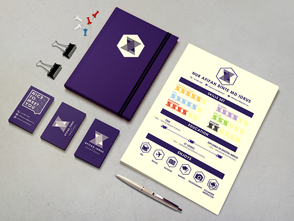
Your resume should match the brand identity of your business cards, portfolio and any other print media you use. Photo Credit: Afifah Idrus
Distributing your resume
Send a digital copy in PDF format
Depending on the situation, you may have to send a digital copy of your resume to potential employers. In this case, PDF is the best format. Why PDF? Well for starters, you never know what kind of office program your employer is used to, and there’s a chance that a text document that looks fine on your computer will not look the same on theirs due to compatibility issues. Sure, most people can open a .doc file, but it’s a somewhat unpredictable format depending on what program a person uses to open it.
Practically everybody can open a PDF, and it’s going to look the same across the board no matter what (provided you embed fonts correctly). You don’t have to worry about compatibility issues or whether or not they’ll have the right fonts. Most importantly, this allows you to have more graphical options for the look of your resume.
Just one pro-tip for sending a digital copy of your resume: avoid using a generic file name like “resume.pdf.” Instead, put your name right inside the file name itself, such as “John-Smith-Resume.pdf.” Keep it as simple as that. You might use other words in your file names to keep things organized (such as “John-Smith-Resume-Final-Draft.pdf”) but you want to keep these words out of the file that you actually send to employers.
Don’t use photocopies
Why would you go through the trouble of creating a resume that is colorful and visually appealing just to throw out all of your hard work by photocopying it?
Photocopies might be cost effective, but they’re not as effective at getting you the job, mostly because they strip away all the personality and charm your resume design once had. For starters, unless you designed your resume to look good in black-and-white, you’re going to lose a lot of the detail and impact your design once had.

Photocopies also tend to be extremely low quality. It’s hard to control the quality of the ink, so you often end up with results that look too dark or washed out. Photocopier paper is of cheap quality and it feels that way, too. Plus, photocopies always have that oily feel and strong smell from the ink that’s used.
The only time you want to use a photocopier is if you’re running off a text-only version of your resume or copying your cover letter. And even then, you’ll have better results just running it off of your printer each time, preferably on a professional-looking letterhead.
Your resume should be nicely printed on quality stock. Photo Credit: Ashley Spencer
Use high quality paper stock
You’re asking employers and clients to invest in you as a designer; the least you can do is invest a little in yourself. Make your resume really pop by using high quality paper stock. If a recruiter can simply feel the difference between your resume and everybody else’s, it will be a huge help towards getting it to the top of the pile.
Just like any other print media, the feel of your resume can say a lot about you to potential employers. A weak, flimsy stock portrays the message that you’re a weak, flimsy designer, even if that’s not the case.
You don’t have to go overboard. After all, you’re trying to make money here, not spend it. But you should see this as an investment towards your future. It’s worth the extra effort if the job or client is a big opportunity and every little thing you can do to demonstrate your value over every other designer is going to help bring you one step closer to your career goals.
Make sure your files are high-quality
For the best results when printing your resume, make sure the file is saved in a format with at least 300 dpi or more. This rings true for both printed and digital resumes, because there’s always a chance your employer will print your resume for one reason or another.
The importance of this step goes beyond just making sure your design looks its best—it’s also to ensure that your resume is easy to read. At a smaller resolution, your text can look blurry, and if your resume is hard to read, it’s going to end up in the trash.
Avoid annoying gimmicks
Sometimes being a little weird and pushing your creativity to the limit can be a huge benefit towards making you stand out from the crowd. But other times, it can just be annoying.
A lot of designers who take the high-risk/high-reward route when designing their resume get hung up on the “reward” part and forget the “risk” entirely. Stand out from the crowd, yes, but avoid being “that person” that goes down in infamy for sending an entire resume on a jigsaw puzzle with a note that says “figure me out.”
Believe it or not, graphic design firms are used to receiving unconventional resumes, which means you aren’t being nearly as clever as you think and you run a higher risk of being annoying than adored.
Creative, gimmick-based resumes can be effective, you just have to know how to reel in your ideas so that the creativity is a help, not a hindrance.
Take the sample resume below that was sewn together using cloth. It’s an original, unique idea that stands out from the crowd, but still has all of the pertinent information included. It’d be harder for a recruiter to throw something like this away than a paper resume; this is something you’d want to keep and show off.
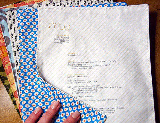
This sewn fabric graphic design resume is a cool gimmick that isn’t annoying. Photo Credit: Melissa Washin
Show it off to someone who isn’t a designer
There’s a good chance that the person who will be reading your resume first is someone who works in HR, not a fellow graphic designer. Even design firms have HR people who might know enough about the business to know what to look for in an employee, but not so much that they’re going to appreciate every little design idea you implement.
It’s worth having a second set of eyes review your resume—this is true for any person looking for a job in any field. But in the case of graphic designers, you should try to find someone who isn’t a fellow designer. This will give you a better understanding of how your resume will be received by your typical person off the street.

This is also a good litmus test for whether or not your creativity is overwhelming your content. Ask the person reviewing your resume if it’s easy to read and understand. You might even want to ask them what their overall impression of you would be after reading the resume. Don’t forget that the recruiter who receives your resume will likely skim it for information, so see if your test subject can infer the main points of your resume with a quick glance.
Don’t stop at one resume design
It’s always a good idea to have multiple versions of your resume available to suit any career situation you might encounter. This is especially important if you like to do work in certain industries or if you’re particularly skilled in one area of design. Try having a standard resume that will work for any occasion and a separate resume that’s specially designed for clients and employers in your field of interest.
Making multiple resumes also allows you to perform A/B testing to find out which of your designs get the best response. You may find you get a great response to one resume style, while another doesn’t do as well. You can then optimize your resume design so that it gets the most attention possible.
Be professional when presenting your resume
 Many designers make the mistake of focusing on the creation of the resume and preparing for an interview that they completely botch an important step in between: making contact and presenting the resume.
In some cases, you’ll be presenting your resume in person, either to a receptionist, an HR representative or directly to the client. No matter who you’re presenting to, you want to make a good first impression. Dress professionally, look neat and clean and be sure to conduct yourself in a polite, professional manner.
Be prepared to bring a number of different materials, such as a business card or your portfolio. You never know how an initial meeting with a potential employer will go, and many times you may be asked questions or have a chance to talk briefly about the position. Treat this like a sort of pre-interview.
In other cases, you’ll be submitting via e-mail, which is why it’s important that you have a digital copy of your resume. The same “pre-interview” rules apply; you may not be making face-to-face contact, but this is your chance to make a good first impression.
Structure your e-mail like a professional business letter and wherever possible, be sure to address the person you’re sending the resume to by name. If you don’t know who will receive the resume, try your best to find out. If you still don’t know, try using a formal title such as “Dear Hiring Manager” instead of something generic like “To Whom It May Concern” or “Dear Sir or Madam.”
Your resume is never truly finished
So you’ve put all the work into making your resume and you’ve found a new client or two, or possibly full time employment at a design firm. You might think that your task is complete, but there’s really no “complete” when it comes to a graphic design resume.
Keep your resume up-to-date, even when you’re already working. You never know when awesome opportunities will pop up that you’ll want to shoot for. Having your resume already updated and ready to go can be a big help, especially in a highly competitive industry where landing a job means being the first one to make an impression.

Every now and then, you may find yourself wanting to do a complete overhaul of your resume. Maybe you’ve grown so much in your career that you need more space to list your accomplishments. Or maybe you just want to update your design to better reflect your growth as a designer.
Whatever the reason, it’s a good idea to keep things fresh every now and then. Even the most impressive resume will start to lose its luster after a while. Taking the time to update your look helps to make you excited about your resume all over again—and if you’re excited, recruiters will be too.
Final Thoughts
At the end of the day, you want a resume that you can stand behind—something that you like and that you think fairly and accurately represents your personal styles and tastes. You may find that what you like and what your potential employers and clients like are wildly different.
But that’s okay. Because sometimes recruiters will be able to look past their own personal tastes and see your true potential.
Other times, they’ll pass on you and go with someone they think is the best choice for their brand. Rejection is an unfortunate part of the process, but in the long run, it helps you to find a career that’s the best fit for you. Otherwise, if you fall into a job that’s not a good match you’ll just be updating your resume and doing it all again in the near future.
Now we want to hear from you. We want to see your creative graphic design resumes, so post your samples and tips in the comments below. Who knows, maybe someone will see it and offer you a design job!



Wow this is an awesome guide! Thank you so much for sharing this. I’ve always told people to make sure that their resume looks good on a computer and in print. So many people ask for digital copies now a days, but occasionally I hand out a print copy.
Truly inspiring and superbly informative guide. As a Graphic Designer who is looking to update my resume and website that has always struggled with selling myself, I find this a great help. I shall post my results……
Very informative, and for us ‘crusty ole’ designers this is a breath of fresh air, well done and thank you 🙂
This is one of the most informative and well crafted guide about resumes. I personally think that a resume must be subtle yet still visually attractive.
Was misspelling “spellcheckers” intentional or just unfortunate happenstance? Edit, edit, edit
My thoughts exactly—I am OBSESSED with spelling (even as a designer)—so the second I read “spellchckers” I pretty much stopped reading this article. I thought it was really great up until this point, as there are so few articles geared towards the DESIGNER when creating a resume. I truly hope the pun was intended…
I have spent a lot of energy creating my designed resume, only now finding out that Applicant Tracking Systems will not read them correctly or at all. I have read that they might just get dumped before a “real person” will ever set eyes on it. And what makes it worse is that, I was told only 19% of pdfs are considered.
There are so many defined rules that need to be met and nobody is explaining this. Only 25% of resumes are making it through this process. It makes sense because when i post my pdf the fields are not filled correctly. Even my non-formatted Word doc does not filter in right.
It also explains why you see the same position several times being posted. But why not apply this to hiring, when we are now trying to get driver-less cars to be part of our lives.